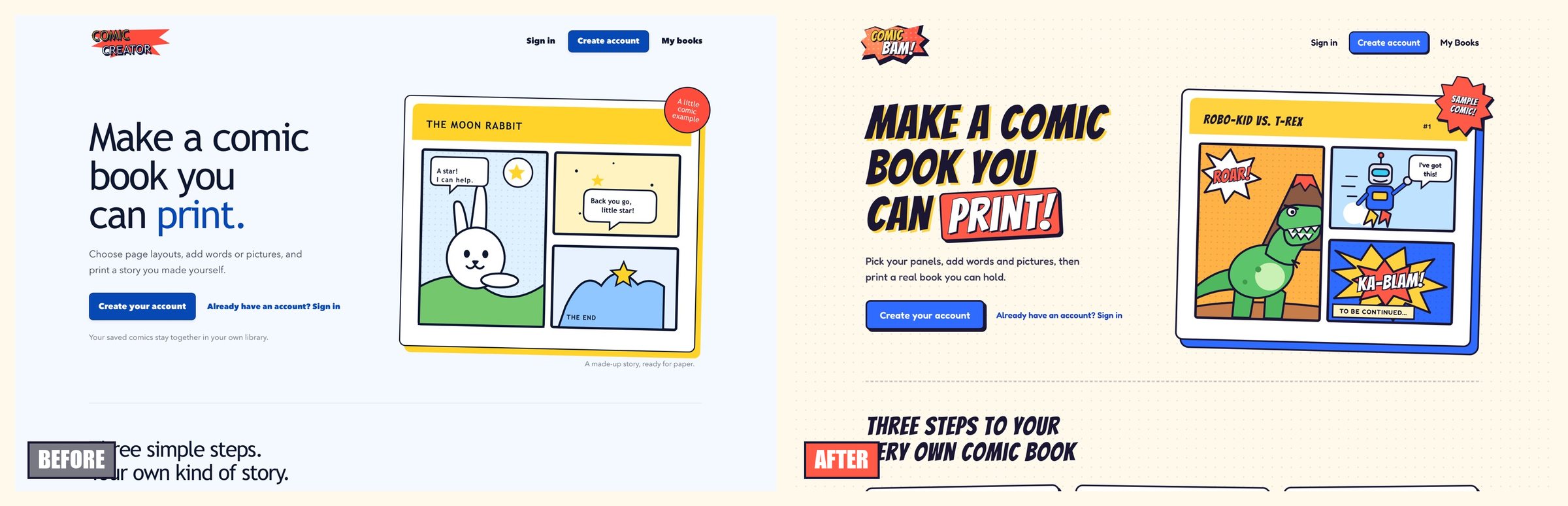
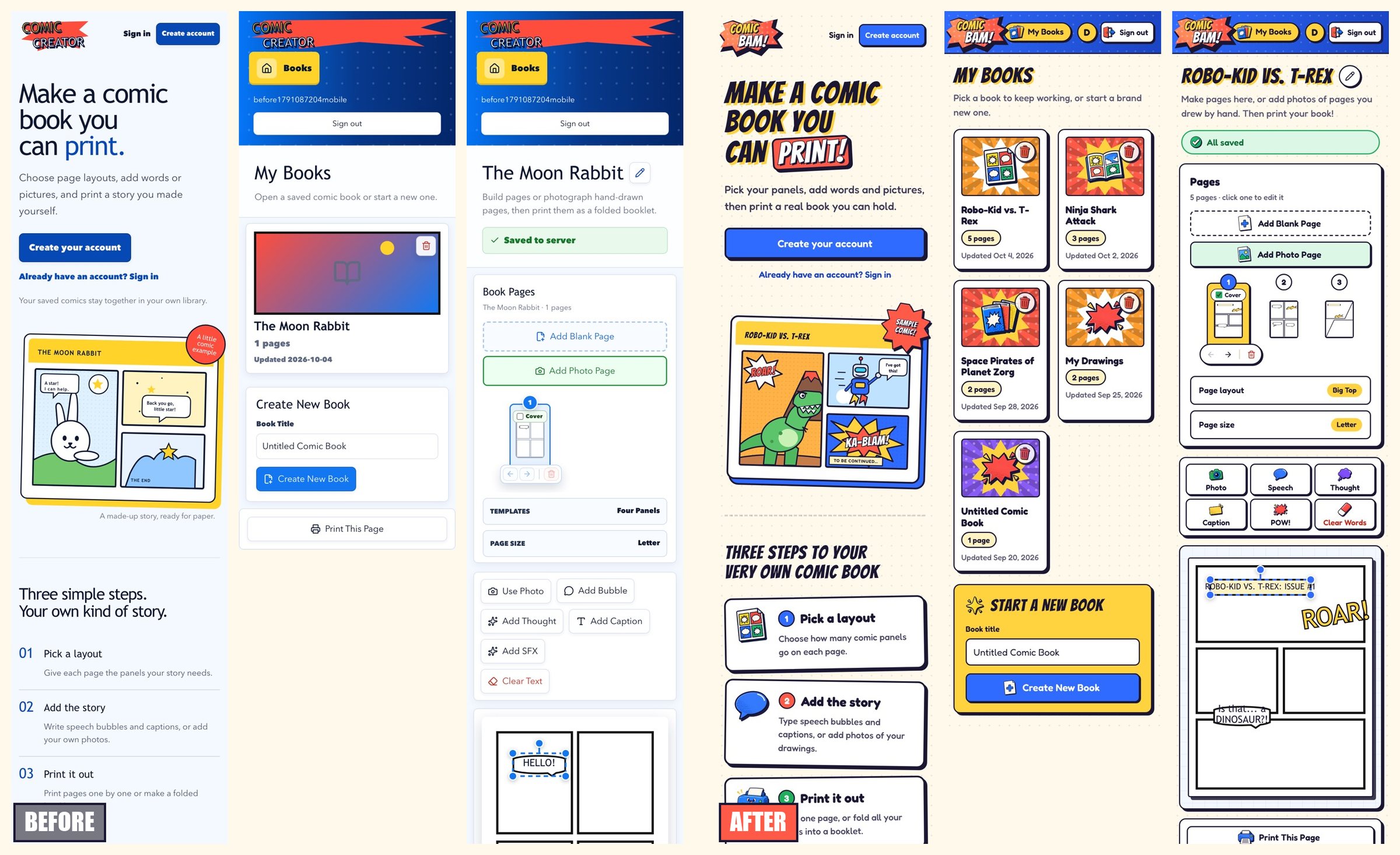
The comic book creator worked, but it looked like three different apps. The home page was pale blue with a thin sans-serif headline. Sign-in was a cream page with an Impact wordmark. The editor was a dark blue gradient with plain white cards. None of it felt like a place an eight-year-old would want to make a comic.
It also has a new name: ComicBam, at comicbam.com.
The one hard constraint for the refresh: don't move anything. The people using this are kids. If the Add Photo button changes places, that is a real problem, not a minor annoyance. So every control stays where it was. Everything else was fair game.
One look everywhere
Every surface now shares the same pieces: warm dotted paper, thick ink outlines, hard offset shadows, and a small set of bright colors. Fredoka handles the UI text because it is round and easy to read. Bangers handles the logo and page titles because it looks like a comic.
The text printed inside the comic pages did not change fonts. Bubble wrapping is tuned to the existing face, and a refresh that quietly changes how a kid's printed page looks would be worse than no refresh.
The sample comic on the home page changed too. A moon rabbit returning a star is sweet, but the main audience is eight-year-old boys. It is now Robo-Kid vs. T-Rex: a roar, jet boots, a KA-BLAM, and "to be continued."
The library
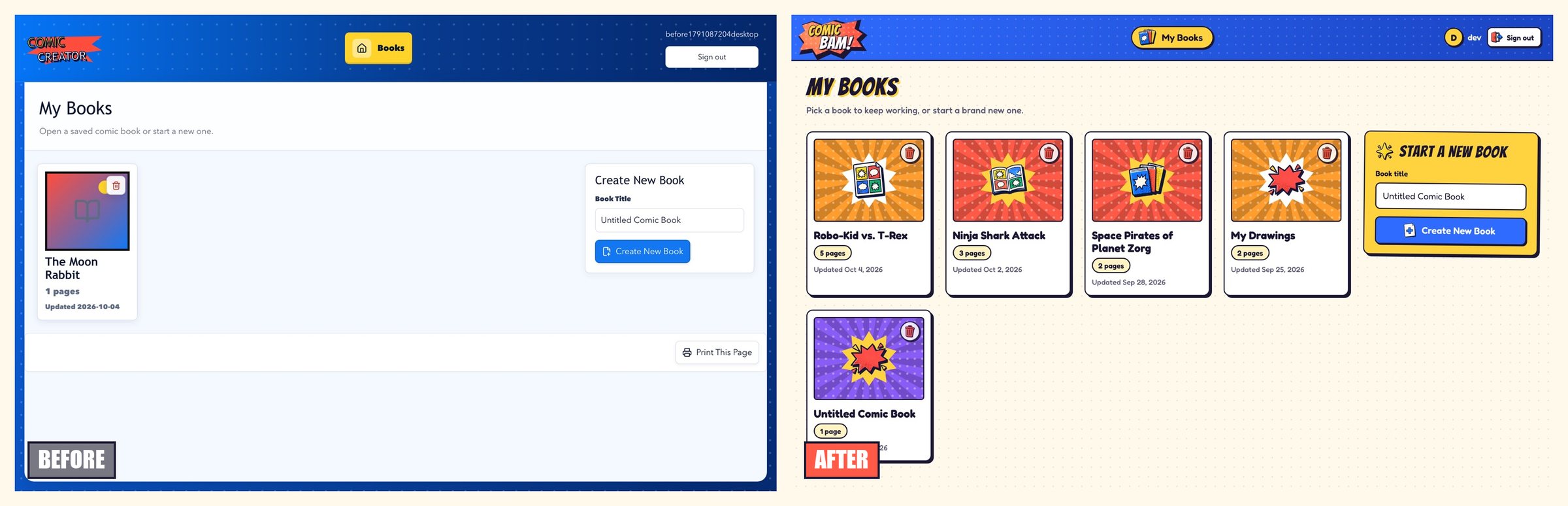
The old library gave every book the same gradient and the same outlined book icon. Now each book gets a colored burst cover and its own sticker, picked from a hash of the book ID so the server and the browser always agree. "1 pages" became "1 page." The create form became a yellow "Start a New Book" card.
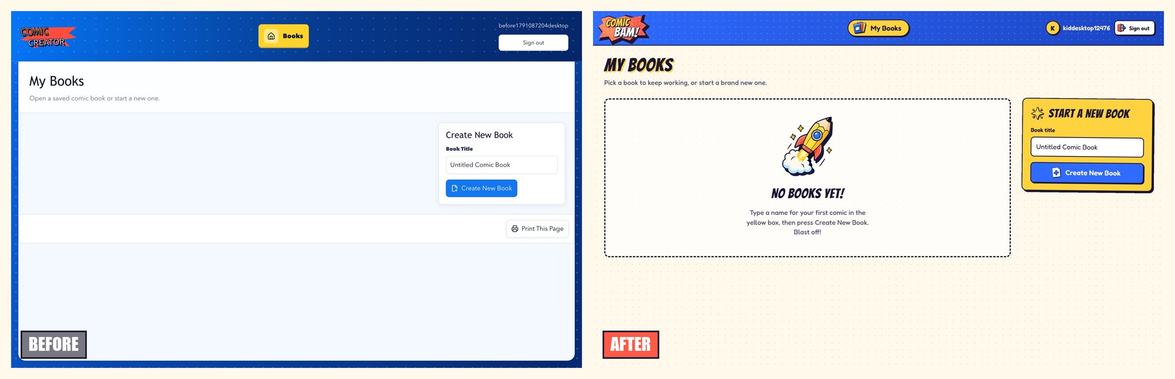
A brand-new account used to land on an empty white area with a form off to the side. Now it gets a "No books yet!" message that points at the yellow box.
The editor
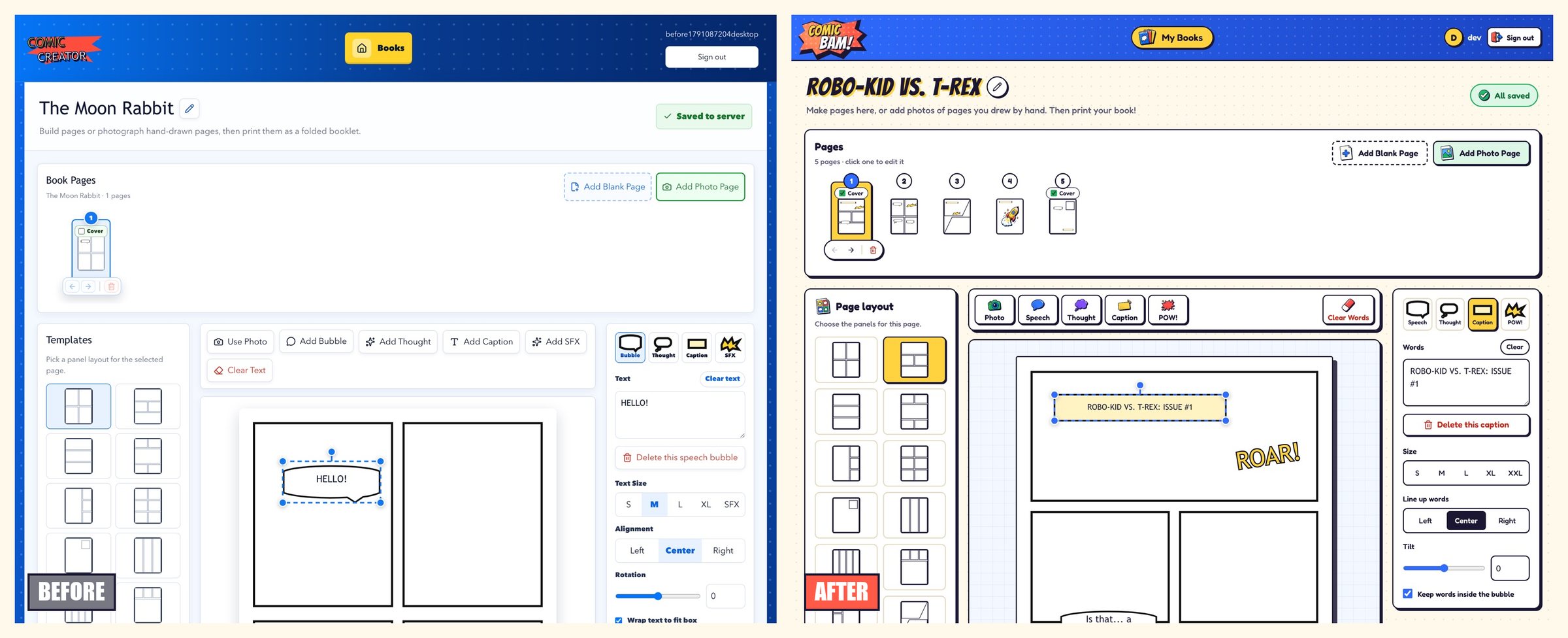
The editor kept its layout: pages across the top, layouts on the left, the page in the middle, and word controls on the right. Most of the change is in the toolbar. Each action now gets a sticker icon above a short word: Photo, Speech, Thought, Caption, POW!. On a desktop that fits in one row, and on a phone it becomes an even three-by-two grid. "Add SFX" became "POW!" because no kid knows what SFX means.
The rest of the copy got the same treatment. Rotation is "Tilt." "Wrap text to fit box" is "Keep words inside the bubble." "Crop & Deskew" is "Straighten & Crop." "Download draft JSON" no longer greets anyone when a save fails. Delete dialogs say "Yes, delete it" and "Keep it." Delete buttons used to be green, which is the wrong signal for an action you can't undo; they are now red.
The refresh also turned up a real bug. Clicking an existing speech bubble left the words box empty, so there was no way to edit what a bubble already said. It only looked fine when you had just added the bubble. That is fixed.
Sticker art, logo, and favicon
The icons came from an image-gen pass: four grids of chunky stickers in the same ink-and-primary-color style. Each grid was split into separate icons with the background removed, then saved as small WebP files. They show up in the toolbar, page buttons, nav, book covers, empty states, and the home page steps.

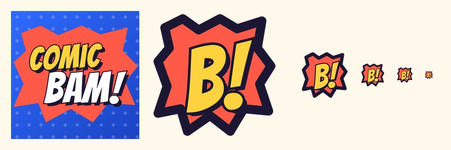
The favicon was the one real decision. A speech-bubble icon was also on the table. I went with building it from the site's own COMIC / BAM! logo, so the browser tab matches the corner of the page. The full lockup works for the app icon. At 16 pixels it can't be read, so the small sizes use just the burst and a "B!".
Seeing every screen without starting from scratch
Before this, checking the editor meant creating an account and building a book by hand every time. That is slow, and it hides the screens you only reach with real content, like a photo page or a five-page book.
There is now a pnpm dev:demo command. It builds a throwaway data folder with a dev account and a handful of books: a five-page comic, a landscape page, half-sheet pages, photo pages, and a blank book. A second account owns one private book, so you can check that accounts stay separate. The dev server starts already signed in. Auto sign-in only works on the dev server; a production build can't turn it on.
The useful part is not the seed data itself. It is that every surface is one click away. Most of the small problems above, like the empty words box and the green delete button, showed up only because the screens were easy to reach.