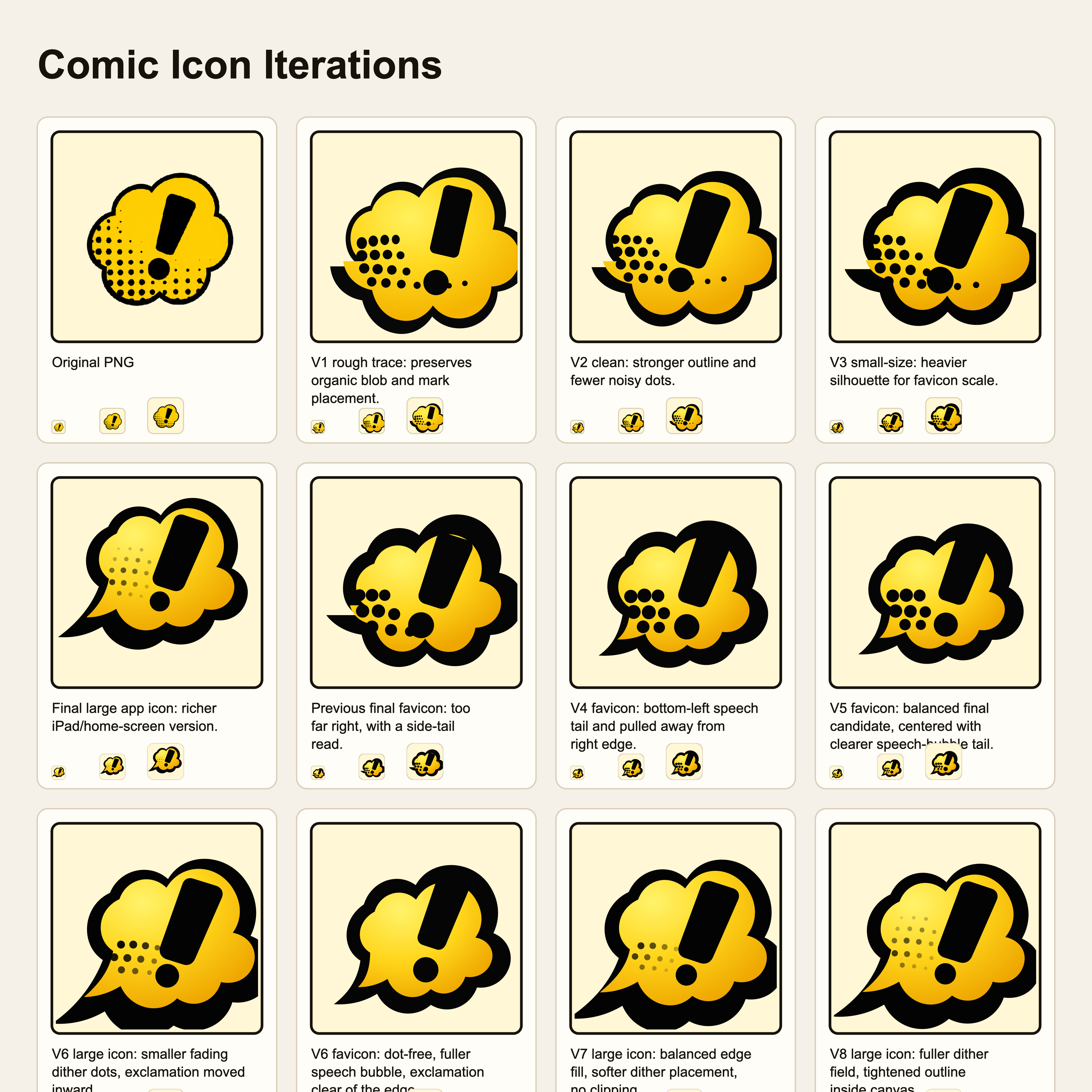
The starting point was a single generated PNG: a yellow comic speech bubble with a bold black exclamation point and halftone dots. It had the right personality for a kids' comic-book creator, but it was not ready to be a site icon. A favicon needs to survive at tiny tab sizes. An iPad home-screen icon needs a cleaner canvas, a reliable rounded background, and enough padding that the shape does not feel clipped by the OS mask.
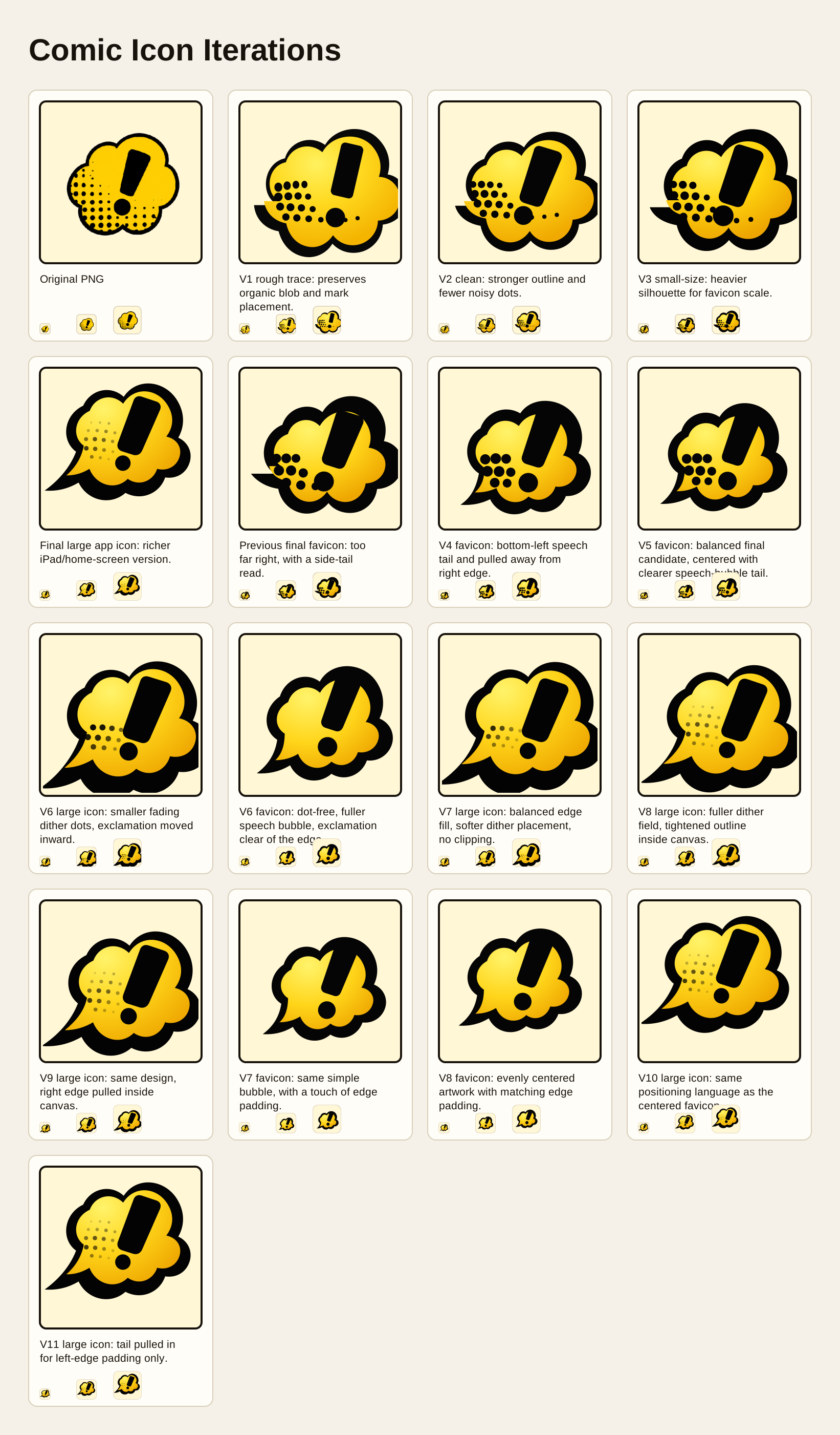
The useful workflow was to convert the image into SVG in small passes and keep every pass visible in one contact sheet. Instead of replacing one icon with another and trying to remember what changed, the sheet made the tradeoffs obvious: which version was too noisy, which one was clipped, which one had the speech-bubble tail in the wrong place, and which one still felt off-center.
Starting with the source image
The original PNG had a nice hand-made quality: chunky black outline, yellow fill, halftone dots, and an exclamation mark that read clearly. The first SVG passes copied those core shapes by hand rather than trying to trace every pixel. That made the asset editable. The flower-like speech bubble, tail, fill gradient, dots, and exclamation mark were all separate SVG shapes that could be adjusted independently.
The first few versions were intentionally rough. They answered basic questions:
- does the silhouette still feel like the source image?
- does the exclamation mark read at 16px and 32px?
- do the dots help, or do they turn into noise?
- does the tail read as a speech-bubble tail instead of a random spike?
The contact sheet included small previews under every large preview. Those tiny samples were important because several versions looked fine at card size but became cluttered as favicons.
Splitting the app icon and favicon
One useful decision was to stop forcing one SVG to serve every size. The large app icon could keep the richer comic-book texture: gradient fill, dither dots, expressive black outline, and a larger rounded background. The favicon needed to be simpler. At browser-tab size the dots competed with the exclamation mark, so the favicon became a dot-free version with just the speech bubble, yellow fill, and exclamation point.
That split made the rest of the process easier. The large icon could be judged as an iPad/home-screen asset. The favicon could be judged as a tiny symbol.
What the contact sheet caught
The sheet made several small problems easy to see.
The first final favicon was too far right. The speech-bubble tail also looked like a side spike instead of coming from the bottom-left. A later version fixed the tail direction but let the artwork run too close to the edge. Another pass added padding, but the mass sat a little low. The final favicon centered the bubble more evenly while preserving a full warm background canvas.
The large app icon had a different set of issues. The dots needed to feel like a fading halftone field, not random circles. Later passes made them smaller, softer, and spread farther up the left side toward the exclamation point. The black outline also kept almost touching or clipping at the right and left edges, so the final passes pulled those lobes and the tail inward while keeping the icon visually large.
Those are the kinds of changes that are hard to judge from a single file. In the sheet, each issue showed up immediately because the old version was still right next to the new one.
Final assets
The site now uses separate outputs:
favicon.svgfor the simplified browser faviconapp-icon.svgfor the richer app iconapp-icon-512.pngfor the web manifestapple-touch-icon.pngfor iPad and iOS home-screen use
The SVGs stay editable, and the PNGs are generated from the final large app icon. That keeps the production icons consistent while still allowing the favicon to be optimized separately.
The main lesson is simple: for visual assets, iteration history is part of the tool. A contact sheet turns subjective feedback into a concrete comparison surface. Instead of asking whether an icon is "better" in isolation, the sheet lets each pass answer one question: is the tail clearer, is the border clipped, are the dots softer, is the icon centered, does the favicon still read at 16px?
That made the final polish much faster than trying to judge one exported icon at a time.