Srcly has had a dependency view for a while. It was not useful. You pointed it at a folder and got a layered graph of every file, shrunk to fit the screen.
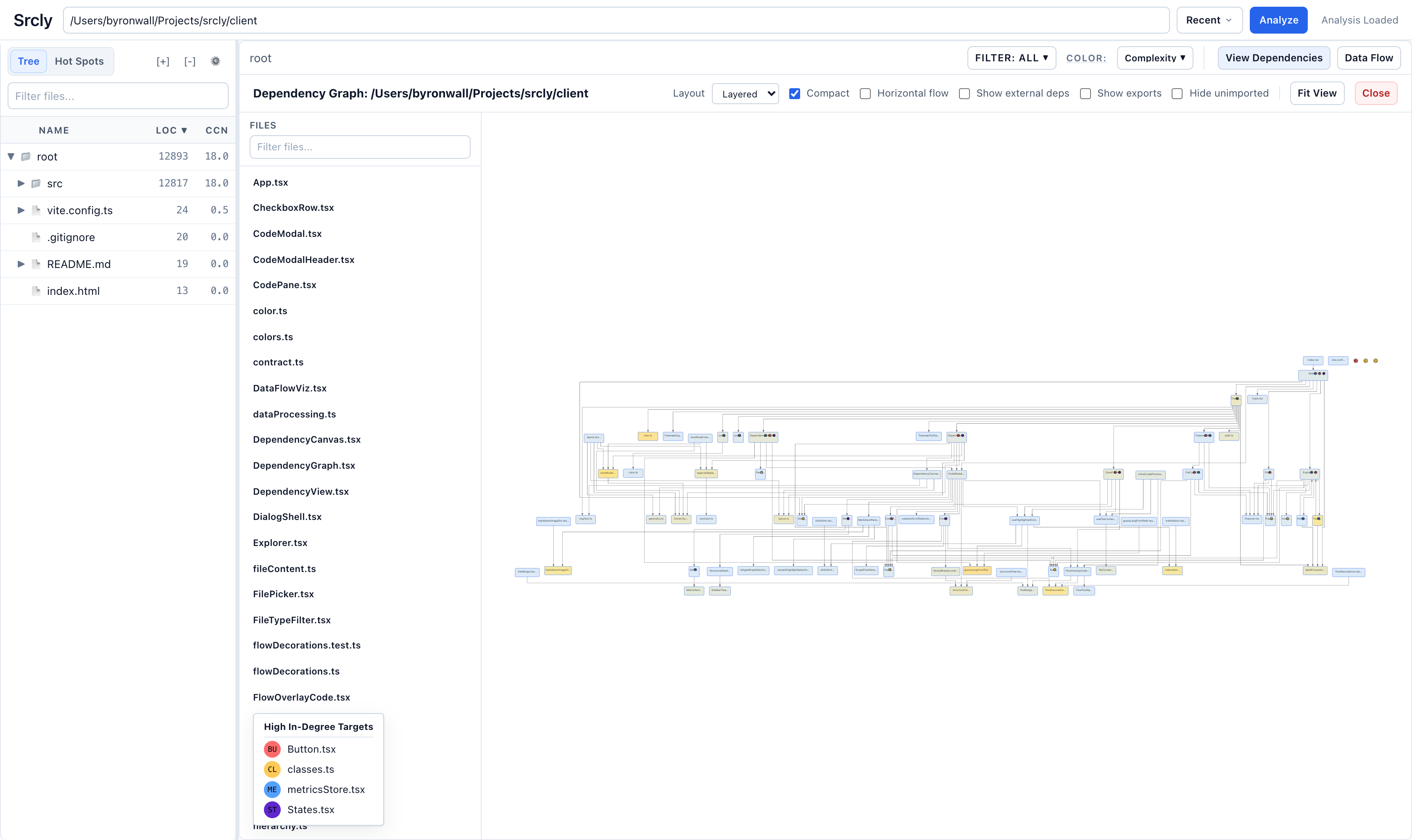
The question I actually have when I open a dependency graph is narrower: for this folder or file, what uses it, what does it use, and how big and how messy are those things? Over two days that question turned into about ten PRs. Each one shipped with before-and-after screenshots on the same repo, and those screenshots were how I judged the work. This post walks through them in order.
Focus first, with a layout I could steer
The rebuild starts from a focus. The view opens on the folder tree. Clicking a node makes it the focus, with importers on the left, the focus in the middle, and imports on the right. When a side has too many neighbors, they roll up into folders.
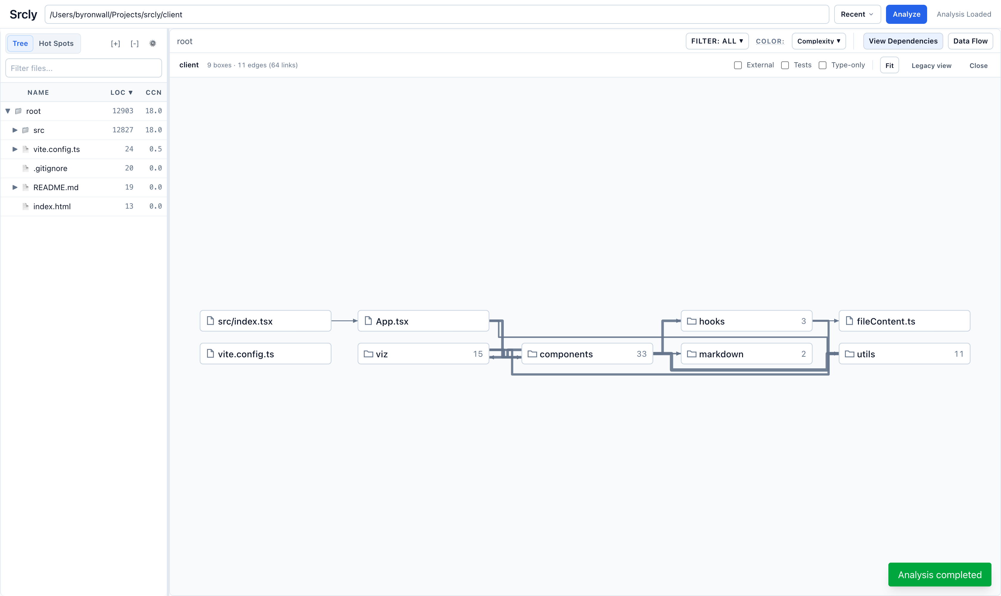
ELK was the first attempt. It never routed an edge through a box, but I couldn't steer its packing or bundling without endless parameter tuning. The replacement is a small custom grid layout. Boxes sit in rows aligned across columns. Edges run only through the channels between columns and the gutters between rows, so they cannot cross a box. It lays out in 1–10ms, which matters because drilling has to feel instant.
My reaction to that first version was that it was wildly better than before. Narrow views, with one file in the middle, already read well. Mid-level folders like components or services did not.
Use the screen's shape
Mid-level views came out as wide strips, 4:1 to 7:1, with every edge squeezed into one 30px channel. The fix ranks the possible packings (rows × how far each depth level folds) by how close their shape is to the viewport. The top candidate is then laid out for real, because routing changes the channel widths.
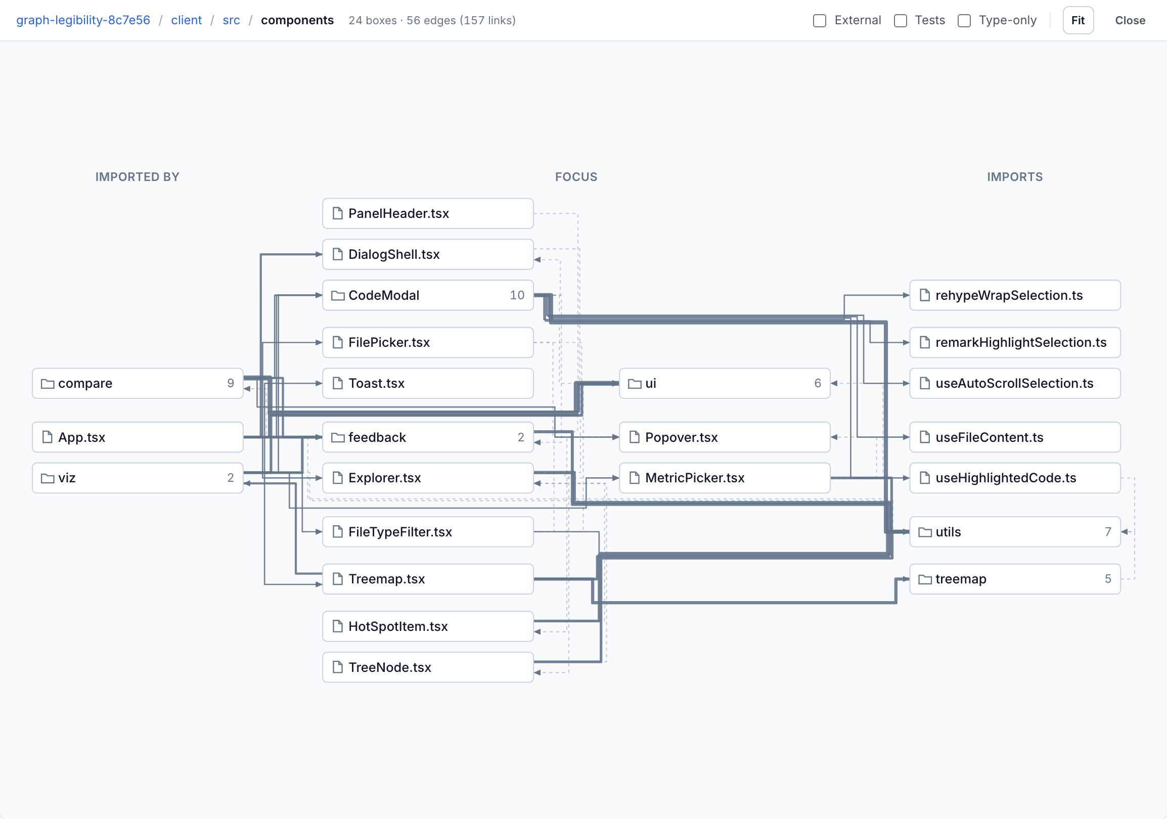
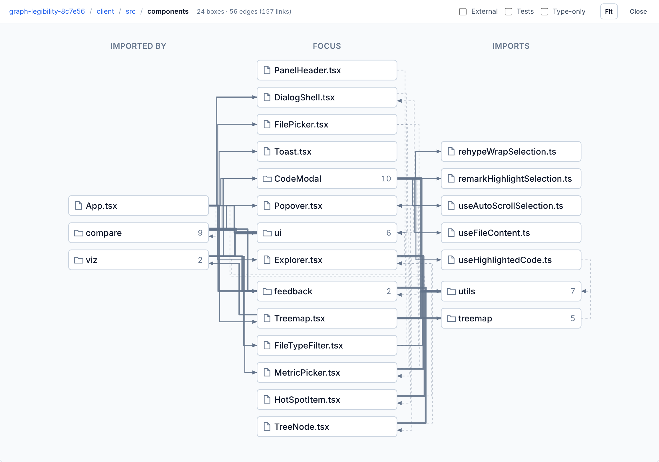
client/src/components before and after. The aspect ratio went from 2.28 to 1.38 and edge crossings from 143 to 118.
The PR includes a table of aspect ratios and crossings for each focus, measured before and after. server/app/services dropped from 167 crossings to 121. Some of the smallest views stayed as strips on purpose. Stacking an eight-box flow into one column reached the target aspect ratio but read clearly worse in the screenshots.
Make a box say what it is
Next, every box got a second line. A folder shows N files · M folders. A file shows its folder. A symbol shows its module and file. Folders got a tinted fill and a heavier frame so they stop looking like files.
The point I made most often was that related things need to sit together. So neighbors are grouped by package, then by file, inside light labeled frames. A file whose only outside use is one symbol is drawn as that symbol, so hooks show up as useFileContent instead of useFileContent.ts.
Then the graph started using the treemap's colors. Each box is tinted by whatever metric the treemap is colored by and shows its LOC. Switching the metric repaints the boxes without moving anything:
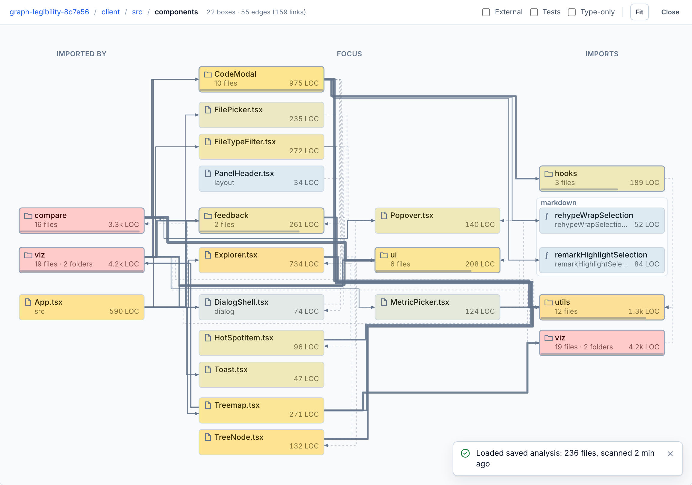
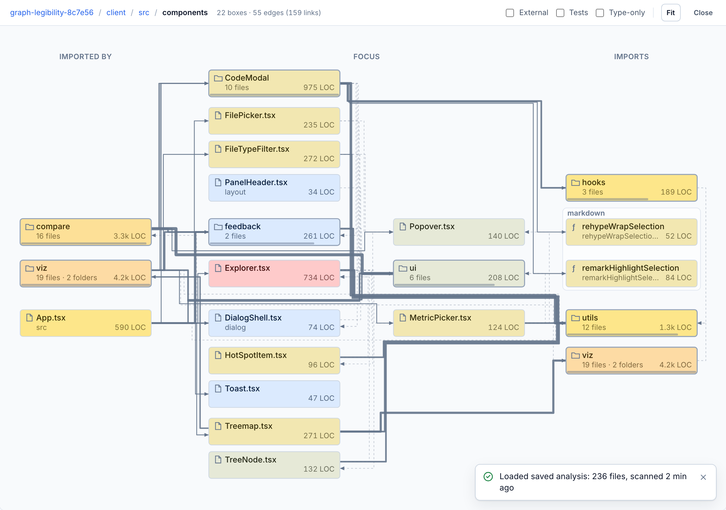
Complexity, then nesting. 22 of 22 boxes re-tinted, 0 moved, and the zoom didn't change.
That makes the graph and the treemap two views of the same data. When a red tile in the treemap is also a red box in the graph, I don't have to translate between them.
Spread the edges
Bundled edges were spaced at 8 / n pixels, so a 20-edge trunk collapsed into what looked like one thick line. Channels now grow with the bundles they carry, and each edge picks a gutter that avoids cutting through another package's frame.
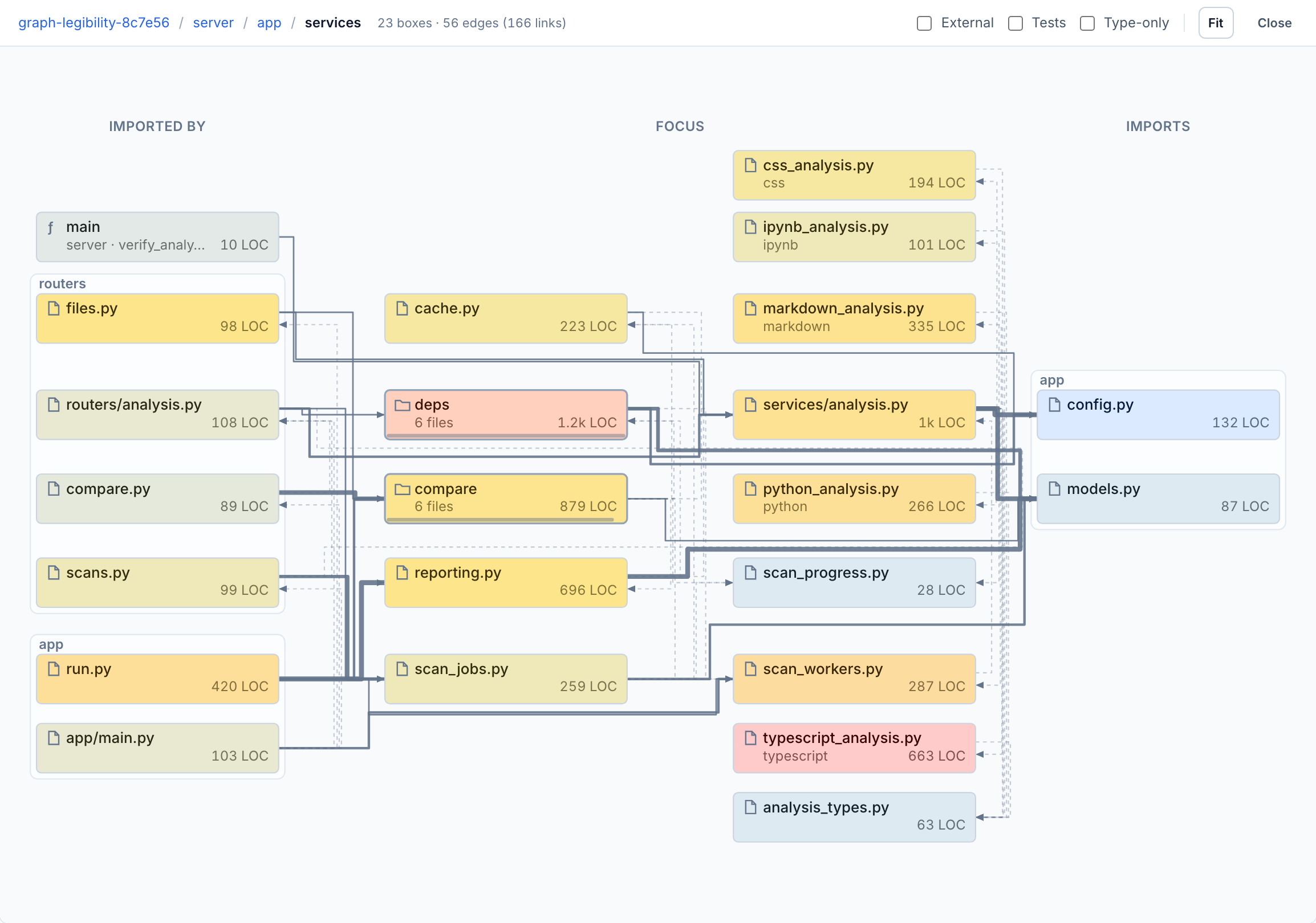
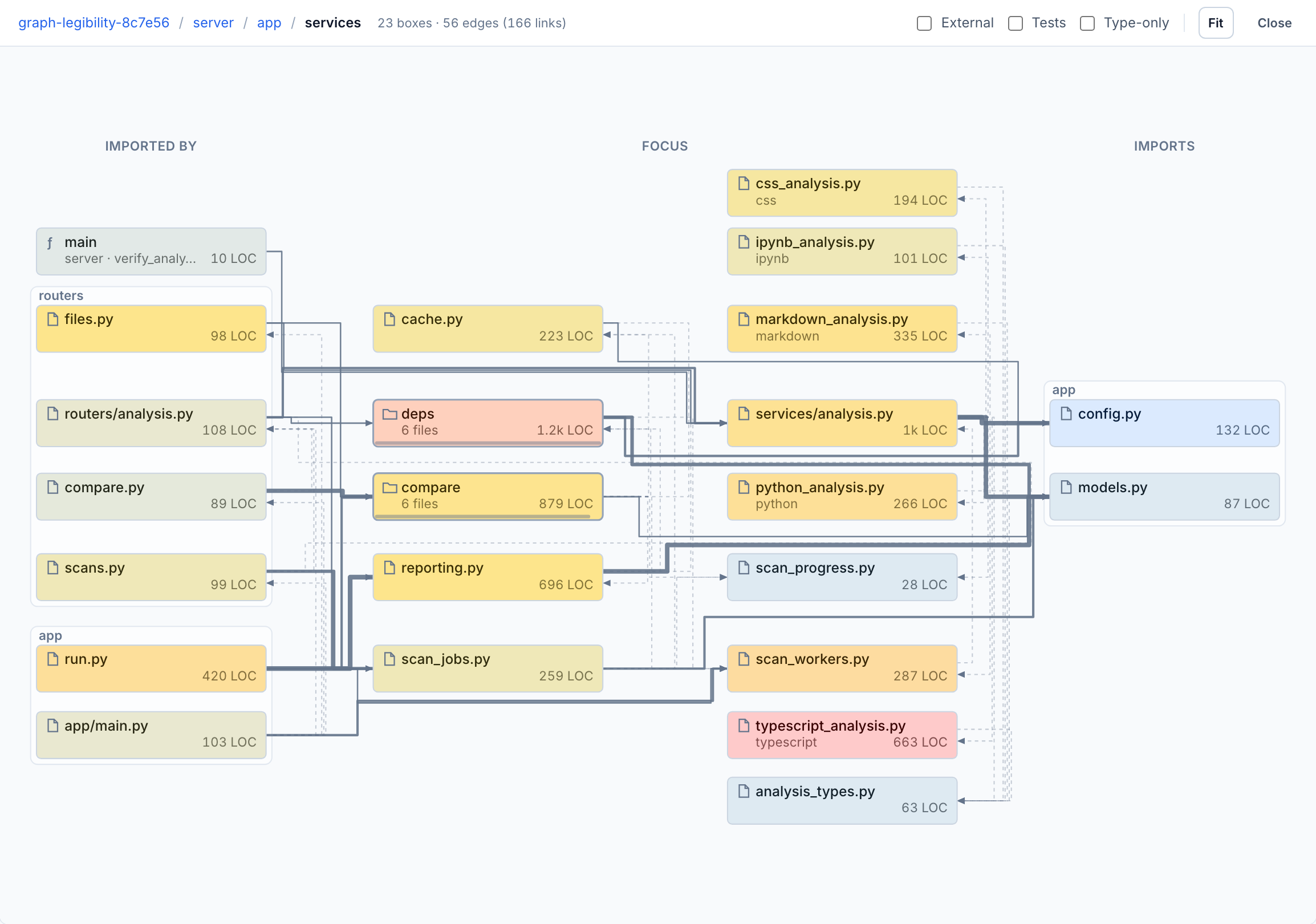
server/app/services: the trunks into config.py and models.py spread into bands you can follow.
There's a measurement catch here. Spreading the bundles raised the raw crossing count on large views, by up to 80% on a 91-box stress view. Edges that used to sit on top of each other now cross as separate lines. Those crossings were always there, just hidden in the pile, so the tests now count crossings per bundle.
Hubs instead of fan-in
The last round went after the biggest source of noise: files that everything imports. A ui folder with 75 incoming links draws 75 edges, and they don't tell you much.
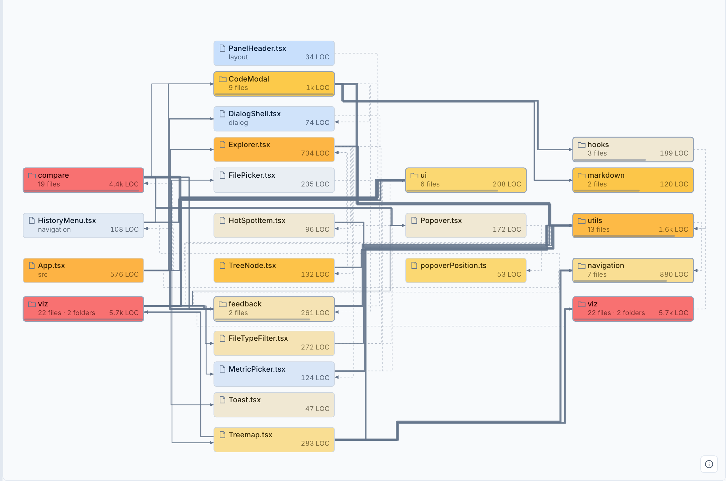
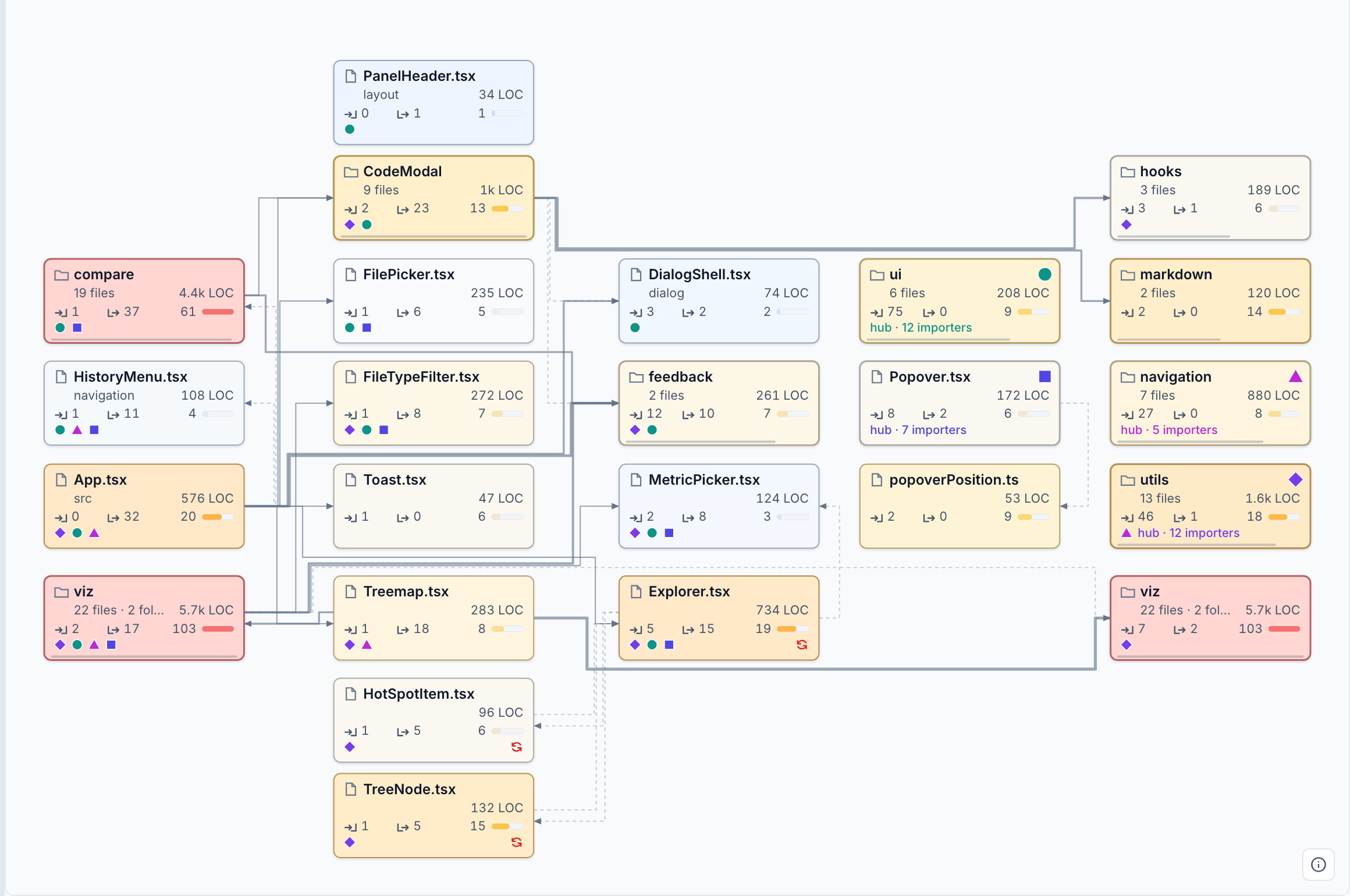
Same focus. 60 drawn edges became 32, and segment crossings went from 280 to 65.
A target becomes a hub when at least 5 boxes import it and either 30% of the boxes do or it's among the three heaviest targets by edge ink. There are at most four hubs, and the focus never becomes one. Each hub gets a shape-and-color badge, and every importer repeats that badge. Hub edges still shape the layout but aren't drawn. Hovering a hub or one of its badges brings them back in the hub's color:
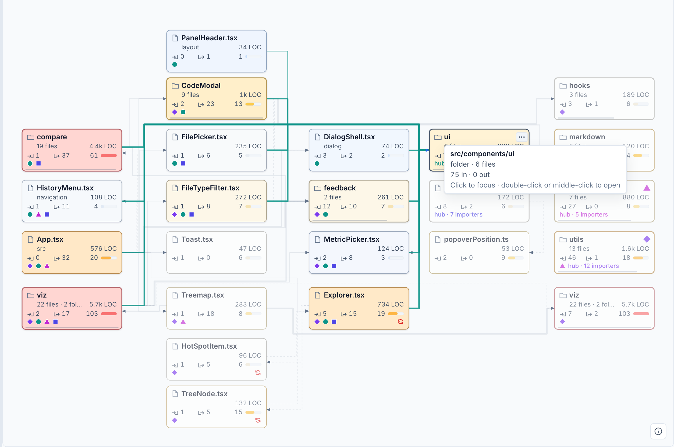
ui hub. The hidden edges come back only when you ask for them.The boxes also got taller, with four rows: name, path and LOC, in/out box counts with a metric bar, and badges for hubs and mutual imports. Most of what the edges used to show is now printed on the boxes, so the graph needs fewer edges.
A color bug the graph exposed
Coloring the treemap by LOC turned almost every tile red. LOC had no scale of its own, so it went through the complexity scale, which tops out at 50. Any file over 50 lines was maxed out. The fix puts each metric's scale in one table, with stops taken from this repo's actual distribution: LOC's ramp breaks at 200 and 800, and the file median is 82. Folders are colored by their per-file average, because a sum would outgrow any per-file scale.
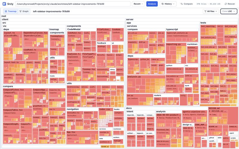
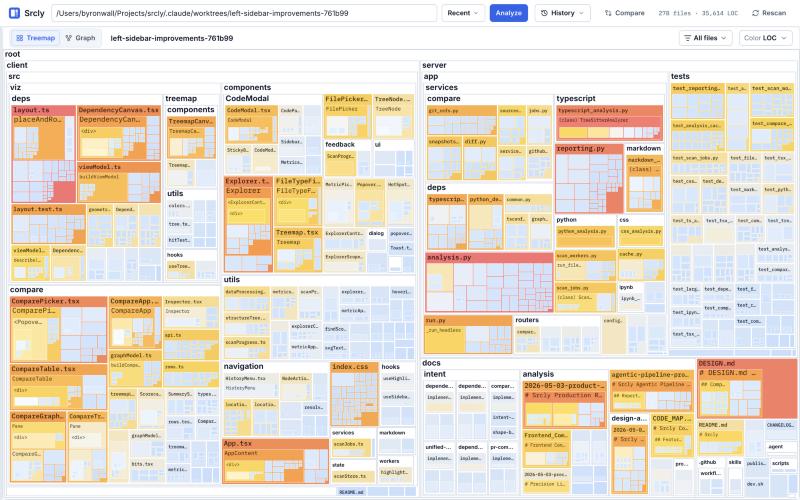
Color: LOC, before and after.
Where it stands
Every round kept two guardrails: no edge through a box, and no slower first open or drill (about 100ms and 9ms on Srcly). Crossing counts are locked into layout.test.ts as baselines, so later changes can't quietly bring the mess back.
Some things are still open. Many faint dashed edges sharing a trunk can read as a hatched band. I'm also not convinced the dashed context edges help at all. Expanding a neighbor in place, without refocusing, is still just an idea, and I suspect it wouldn't look good.
Source: byronwall/srcly. Try it with uvx srcly.