The first version of User Flow Workbench was a diagram tool. It helped describe actors, inputs, processes, handoffs, and deliverables in a form that an agent could inspect and revise.
That was useful for the shape of an idea. It was less useful for the shape of a screen.
An agent can produce a convincing description of an interface very quickly. It can also produce a lot of plausible text around that description. The harder question is whether the proposed screen still matches the product it is meant to explain. A clean diagram helps compress an idea, but it does not tell you whether the idea belongs in the existing project.
The wireframe work started as a way to close that gap. The goal was not to generate production UI. It was to make a proposed screen visible, place it beside a real screen, and use the difference to decide what to change next.
The useful accident was a drawing script
The first wireframes were not produced by a language. A Python program wrote SVG elements at fixed coordinates. It built a small review gallery around the existing workbench, then showed several possible additions: a capability overview, a capability inspector, a linked flow, and an alternate product direction.
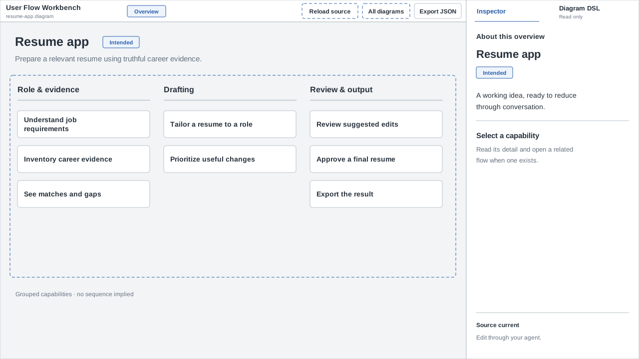
The source was not something I wanted to maintain. Widths, positions, and line breaks lived in drawing code. But the output did something I had been missing. It forced the product idea into one screen. It also kept the existing interface beside the proposed one, which made the changes easier to judge.
That changed the question. I did not need a general drawing language. I wanted the discipline of the gallery with source that an agent could change by meaning: keep the board, change the inspector, open this popover, or show this flow inside the screen.
The first language proposal was too close to a small CSS system. It owned shells, arrangements, sizing, wrapping, and overflow without a complete layout engine. A review of that proposal led to a smaller boundary: keep a semantic authoring layer, use browser layout underneath it, and prove the renderer before writing the parser.
Start with the smallest visual proof
The first step was an isolated browser experiment. It used typed fixture objects instead of a parser and rendered six different cases: the current workbench, a capability detail view, a linked flow, a settings form, a narrow error state, and a progressive disclosure example.
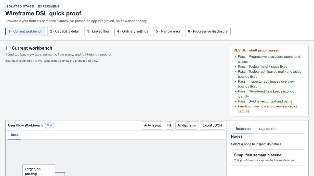
That order mattered. A text language is easy to design before knowing whether its output will hold together. The experiment tested the more difficult part first: could browser layout produce a useful screen, and could the same measured regions become a standalone SVG without losing the result?
The proof used browser Grid and Flex layout for geometry and browser text measurement for wrapping. The renderer owned a small set of layout tokens. Authors controlled the viewport and a few meaningful dimensions, such as the content width or inspector width. They did not provide arbitrary coordinates, CSS, or style escapes.
This made the experiment fairly plain. It also made failures useful. A narrow screen exposed horizontal overflow. A long label showed whether a bar could remain fixed height. A popover showed whether a proposed state could be represented as a real interaction instead of a painted screenshot.
The experiment passed its basic checks in Chromium. It rendered all six screens at their declared sizes. The narrow case kept its bar at 44 pixels and exposed the content that did not fit. The popover worked with click and keyboard activation. The proof also checked stable IDs and vector output.
Some limits stayed visible. Browser Blob downloads were wired up, but the test environment did not expose a download event, so saved-file inspection was still unverified. The SVG proof showed that the representation was possible. It did not prove that every future screen would be easy.
A screen needs evidence
The next change was to put real site references beside the wireframes. The recipe planning example became a useful test because it had several related screens with different shapes: a recipe library, a planned meals calendar, a shopping list, an AI recipe generator, and recipe details.
The wireframe document records those images as references. Each screen declares whether it is observed, source-based, or proposed. An observed screen points to the image that supports it and keeps the captured state alongside the title. That makes the evidence part of the artifact instead of an explanation that disappears into a conversation.
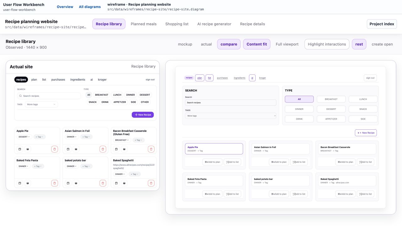
The comparison changed what counted as progress. A wireframe could contain all the controls that seemed reasonable and still be wrong for the product. The observed recipe library had a navigation bar, search and tag filters, meal type controls, a new recipe popover, and a grid of recipe cards. Those details were not interesting because the DSL could list them. They were interesting because their arrangement showed which parts of the screen were persistent, which parts were local, and which actions belonged to the current state.
The DSL stays compact enough for an agent to read in one pass. This excerpt is taken directly from the recipe site fixture:
screen recipes "Recipe library" basis=observed reference=recipes-site {
  shot rest
  shot create-open open=new-recipe-popover

  frame page content=1320 {
    body {
      bar navigation {
        start {
          badge "recipes"
          link plan-link "plan" goto=plan
          link list-link "list" goto=shopping
The excerpt says enough to reconstruct the start of the screen without pretending to encode its pixels. It names the observed screen, its resting and open states, the page frame, and the navigation. It does not turn application logic into fake button behavior. Only goto changes the gallery screen; the other controls depict the proposed state.
Repeated comparison beats speculative completeness
The calendar view made the boundary clearer. A calendar is not a special primitive in the language. It is a seven-column grid with day panels, headings, cards, and add buttons. That is enough to compare the structure of the observed screen while keeping the language small.
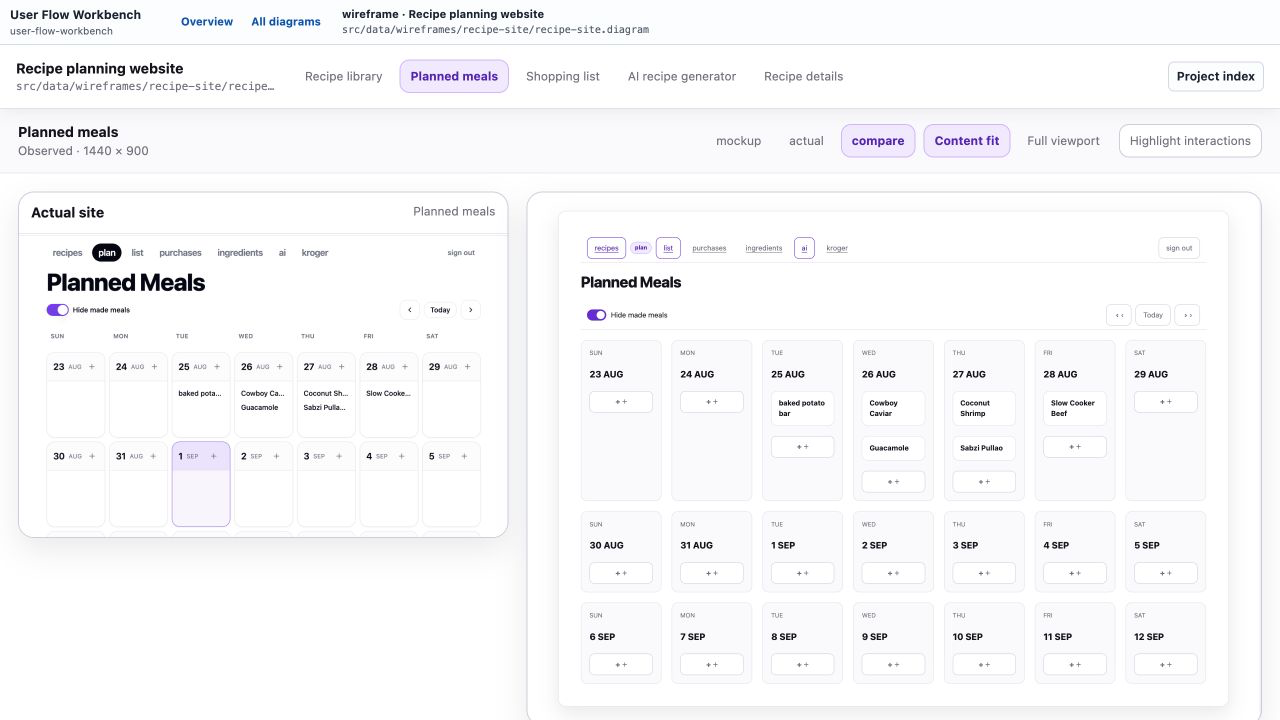
The point is not to reproduce every behavior. The point is to notice what the actual screen requires. The planned meals view has a different density and a different failure mode from the recipe library. A grid that looks reasonable in one screen can overflow in another. Long labels, fixed bars, and independent scroll regions become visible when the reference stays beside the wireframe.
Recipe details exposed another kind of mismatch. The screen is mostly two content regions: ingredients and instructions. It also has a title, metadata, actions, and a destructive action. That is a different composition from the card grid and the calendar, even though all three belong to the same small product.
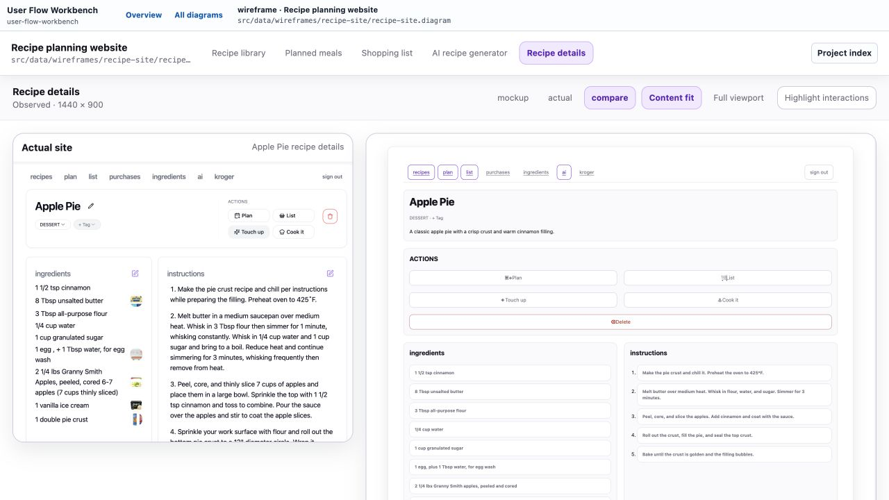
Repeated comparison gives the agent a tighter target. The agent authors the DSL. The visual output is the thing to inspect. A revision can then be small: change a label, reorder a field, reuse a navigation part, or adjust one screen's inspector text. The implementation plan records these edit experiments and the regions that should move or stay fixed.
This is a better use of a wireframe than trying to make it complete in the abstract. Completeness encourages the language to grow around every possible control. Comparison shows which rules are doing useful work and which ones are just accommodating a guess.
Keep the source small and the evidence honest
The wireframe language shares the .diagram envelope with the flow and overview documents, but it has its own payload model. A flow describes semantic relationships. A wireframe describes a screen frame, controls, states, references, and a few gallery transitions. Keeping those meanings separate prevents the viewer from becoming a second graph renderer.
The same rule applies to variants. Variants are useful when a live choice needs to stay visible while it is being considered. They do not need to become a permanent archive of every rejected idea. The wireframe plan keeps current ideas and real alternatives, then lets discarded ideas leave the source. The project should reflect the product as it is being reasoned about now.
There is also a deliberate ceiling. The language does not include arbitrary styles, coordinates, parameters, themes beyond renderer-owned presets, nested shared parts, or production bindings. If a screen needs those features to look useful, that is evidence that the current approach has reached its boundary. The right next step might be a fixed template or a static drawing helper. It does not automatically mean adding another layer of syntax.
The useful loop is conversation → visual → revision → small implementation. The visual reference makes the conversation less dependent on plausible prose. The comparison makes revisions concrete. The small implementation can then follow the evidence instead of carrying an imagined product forward.
For now, that is enough. A wireframe can show what a screen is trying to be, an observed image can show what the product already is, and the gap between them gives the next change somewhere to start.
Source: byronwall/user-flow-workbench