When you import data into explorEDA, the summary table is the first thing you see. It gives you one row per field so you can decide where to look next. The old version did not line up well enough to scan.
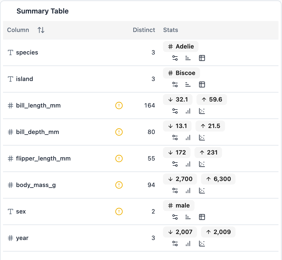
Each row had gray stat badges with the chart buttons wrapped underneath, so every row was two lines tall. Nothing lined up, so you could not read down the low values or the high values. Text fields showed a "most common" badge with a # icon, which looked like a number. Date fields also showed a most common date, which is meaningless for most date columns. Missing values were hidden behind a yellow icon, so you had to hover each field to find out how many rows were affected.
After
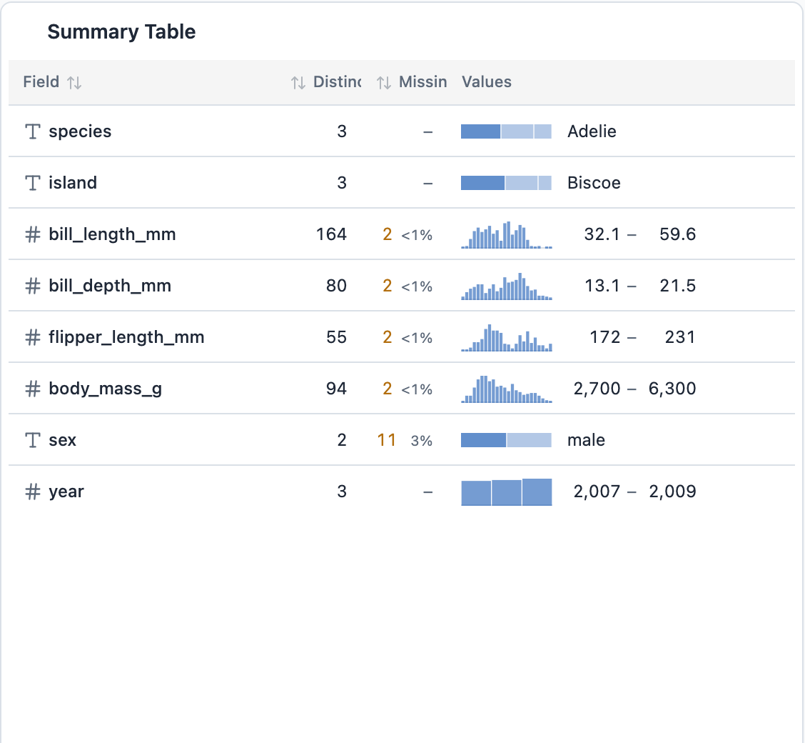
Each field now fits on one line, and the readings sit in columns:
- Numbers get a small histogram plus the low and high values. There is also a median when the panel has room.
- Dates get a histogram plus the first and last date.
- Text gets a share bar plus the most common value and its share.
- Missing is its own column, with the count and percentage. In the penguins data, 11 rows (3%) have no
sex, and the four measurements each have 2 missing. You can see that without hovering anything.
The low and high values sit in columns sized from the longest value in the table, so they read as a grid. Field, Distinct, and Missing sort ascending, then descending, then back to the source order.
The histograms explain themselves on hover. Point at a bin and you get the range, row count, and share:
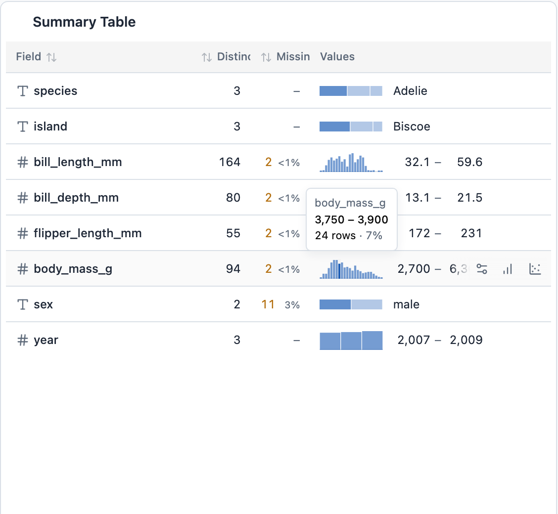
The row actions (field settings, chart, scatter) float in at the right on hover or keyboard focus. On touch screens they stay visible.
How it works
CompactSummaryTable is now a fixed-layout table with a colgroup. The widths of the reading columns come from CSS variables set on each table, and that is what keeps the low and high columns aligned.
summarizeField turns a FieldProfile into three things: the graphic, labeled bars for hover, and a structured reading formatted with the field's shared formatter. Numeric profiles now carry equal-width bins. Small integer ranges get one bin per value, which is why year shows three solid blocks instead of a sparse histogram. The unused StatBadge component is gone.
The table adapts to its panel width with container queries rather than viewport width. When the statistic no longer fits, it drops from every row at once instead of wrapping in some rows. On very narrow panels, Distinct and Missing move into the field details tooltip.
Still rough
The screenshots above come from the default penguins layout at 1440 px wide. The summary panel there is only about 560 px wide, and that shows some rough spots:
- The Distinct and Missing headers are clipped ("Distinc", "Missin").
- The median has already dropped out.
- On hover, the row actions cover part of the high value. In the hover image,
6,300shows as6,3. yearshows2,007 – 2,009with a thousands separator. The old table did the same thing, so this is a formatter problem the polish did not touch.
None of these hide the data. The clipped headers and the covered high value are the obvious next fixes.
This came from a thread in the same Claude Code project that reworked the landing page. The landing page post covers how that project was run. The change is pull request #29.