You have a dashboard with several charts. One pattern looks interesting, but you need to check the field behind it. What values does it contain? Are a few large values hiding the distribution? Did your filter change the shape, or just reduce the number of rows?
The recent explorEDA upgrades make those questions easier to answer beside the chart. The field inspector now opens on a Values tab, with distributions and a comparison against all rows. You can also open it from chart axis labels.
The new field list makes every available field visible without adding a summary table to the dashboard. Both upgrades are now merged into main. The screenshots below show the current interface with synthetic order data.
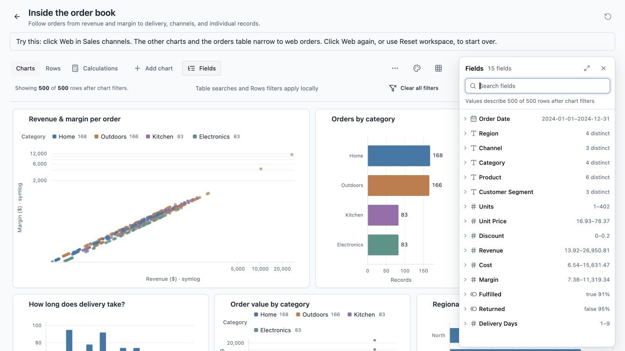
One workspace view for context. The Fields panel stays open without changing the chart grid. The remaining images isolate the new controls.
Start with the values
The inspector still includes Display, Type, and Preview tabs. Values is now the first view because a quick inspection usually starts with understanding the data.
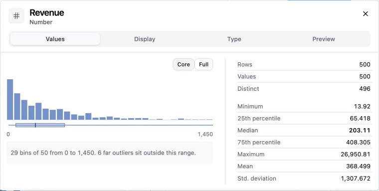
Revenue across 500 synthetic orders. The core view sets aside six far outliers, while the statistics retain them.
The display follows the field's type:
- Numbers get a histogram with readable bin boundaries, a quartile strip, and statistics. Minimum, maximum, mean, median, quartiles, and standard deviation answer different questions about spread and typical values.
- Dates get a time histogram. This makes gaps and concentrations visible without reading a list of timestamps.
- Text and booleans get value frequencies. Common values appear first, with the remaining values grouped below them. You can expand the list and search larger sets.
- Counts show rows, usable values, distinct values, and missing or excluded values where applicable. A distribution needs those counts: an attractive shape can conceal how much data it leaves out.
Numeric bins also support arrow-key inspection. You can read individual bin counts without placing a pointer over a narrow bar.
Keep outliers visible without letting them flatten everything
In this example, the maximum revenue is 26,950.81. The median is 203.11. A histogram spanning the entire range can squeeze most orders into a few bars.
Core shows the typical range and reports how many far outliers sit outside it. The rule identifies values more than three interquartile ranges beyond the middle half. Full restores the complete range. Statistics continue to use every usable value in both views.
This gives you a useful shape without silently deleting the extremes. The tooltips explain the rule and the difference between the controls.
Compare a selection with its baseline
A filter should leave enough context to explain what changed. The inspector draws filtered rows over a quiet silhouette of all rows. Both populations use the same bin boundaries.
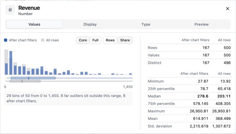
Web orders retain 167 of 500 rows. Share mode compares each population's shape against its own total.
There are two useful readings:
- Rows compares absolute counts. A small selection produces smaller bars.
- Share compares the proportion within each population. A small selection can still reveal a different distribution.
The counts and statistics sit beside the plot in separate columns for all rows and rows after chart filters. Here, the filtered median is 278.6, compared with 203.11 overall. That is a concrete change you can inspect alongside the visual shape.
The scope is explicitly chart filters. A local table search or Rows filter is a separate restriction. Keeping those scopes named prevents a field summary from appearing to describe a different set of rows.
Categories need the same comparison
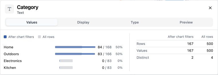
The Web selection contains Home and Outdoors orders. Electronics and Kitchen remain visible with zero selected rows.
A category that disappears from the selection still belongs to the field. Keeping it visible makes the filter's effect clear. The frequency view shows selected counts alongside overall counts, with bars that compare population shares.
For larger category sets, the initial view shows eight values and an aggregate for the rest. Expansion shows up to 200 matches, with search available for larger lists. An all-unique field also gets an explicit explanation. That helps distinguish an identifier from a field with useful repeated categories.
Reach the field from the chart
Command-click an axis title or tick label to inspect its field. Use Ctrl-click on other platforms. The inspector opens beside that label, so the chart remains the context for the question.
The axis context menu also offers:
- Inspect to open the same field inspector.
- New chart of the field for numeric, categorical, and boolean fields supported by this action.
- Copy field name to copy the underlying source name.
The direct keyboard path uses Command/Ctrl+Enter on a focused field label. Closing the inspector returns focus to its anchor. These paths reduce the trip from a visible chart to the field behind it.
The inspector header now leads with the field label and type. It also shows the source name when the display label differs. The wider Values view places the distribution beside its statistics. The header and tabs stay fixed while the body scrolls, with edge shadows indicating more content.
Understand the field, then edit it
The settings tabs keep their existing roles:
- Display sets a label, description, format, precision, unit suffix, and currency code where relevant.
- Type shows inferred and effective types, plus valid, missing, and failed counts. Source fields support type overrides, date input presets, and null tokens.
- Preview shows raw values beside runtime values and lists failed conversions. You can inspect more failed rows before applying a change.
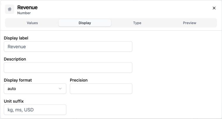
Display settings stay in the shared inspector. Opening it does not require an edit.
Calculated fields use their formula to determine runtime type. Their inspector supports display settings and value previews; type changes belong in the formula editor.
Applying a type, date preset, or null-token change clears filters for that field. The inspector explains this before application. Invalid conversions become missing values and appear in the preview.
The Apply footer now appears only when a draft differs from the saved settings, or needs correction. Discard restores the applied settings. A spot check should not look like an unfinished edit.
The same upgrade also carries field labels, formats, and units into filter chips, field details, and pivot cells. Filter bounds gain precision when rounding would make different bounds look identical. Pivot counts remain plain row counts. The reason is consistency: a field should mean the same thing as you move between its chart, filter, and summary.
The field list: make quick checks possible anywhere
A chart-only workspace still has a discovery problem. Axis inspection reaches fields already in a chart. It does not show the fields you have yet to use.
The field list intent starts from that gap. Fields are a unit of work during exploration, so they need an entry point of their own.
A small list for quick checks
Open Fields from Charts or Rows, or press F when you are not typing. The panel floats over the right edge and stays open until closed. At narrow widths, it becomes a bottom sheet. Opening it does not resize the chart grid.
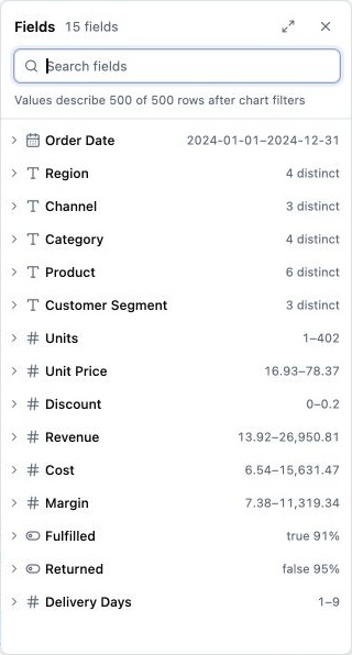
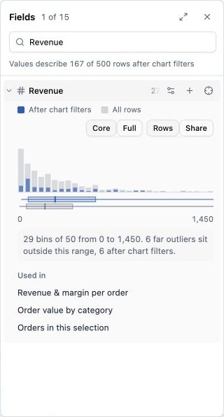
The compact list supports scanning. Search and expansion turn it into a focused field check.
Each row shows the field label, a type icon, and a useful reading. Numeric and date fields show ranges. Text fields show distinct counts. Booleans show the most common value and its share. Calculated fields carry their calculation marker.
Search matches both display labels and source names. The shown-of-total count tells you how much the search has hidden. The scope line names the rows behind the readings: rows after chart filters.
Select a row to expand its distribution. Only one row expands at a time, which keeps the surrounding list readable. This uses the inspector's Values display, including all-row context and the current filtered population. Collapsed rows avoid the extra distribution work.
Used in lists charts that reference the field. Hovering or focusing a link highlights that chart. Selecting the link scrolls to the chart and focuses it. This connects a field to its existing uses before you create another view.
The Inspect action opens the same inspector used by tables and axes. Field settings stay there, so the list does not become another settings editor.
Expand to see every distribution
The expand button, or Shift+F, opens a full field overview. This is the place to compare fields visually without expanding rows one at a time.
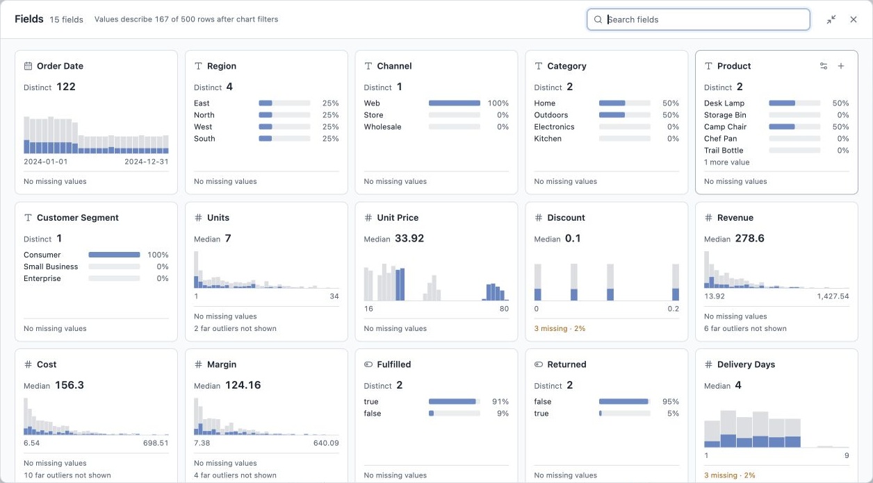
The Web filter is active. Numeric and date histograms retain the all-row silhouette. Category cards show the current population's shares.
Each card includes the field type and name, a distribution, and a compact reading. Numeric cards show the median; other cards show distinct counts. Missing-value counts and percentages sit below the graphic. Numeric cards also report far outliers omitted from the core histogram.
These details make it possible to scan for a sparse field, a concentrated category, or a distribution with extreme values. An all-unique category gets an example and explanation instead of a set of meaningless equal bars.
Search is shared with the side panel. Collapse returns to the panel, while Close dismisses the field view. The overview also includes Inspect and Add chart actions, so a useful field can lead straight to the next step.
Create a chart from the field
The Add chart action offers a short menu based on field type:
| Field type | Chart choices | Why these choices? |
|---|---|---|
| Numeric | Bar chart, scatter plot | Inspect a distribution or start a relationship between measurements. |
| Text | Row chart, pivot table | Count categories or compare grouped values. |
| Date | Pivot table | Start a grouped view from the date field. |
| Boolean | Row chart | Compare the two groups. |
For a chart with more than one variable, start from the selected field and choose the remaining variables in chart settings. This keeps the list's action small. Creating a chart from the overview returns to the side panel; the list remains available.
Replace an axis without rebuilding the chart
The field list also includes Use on a chart axis. It lists supported charts and their replaceable axes, with the current field named in each choice.
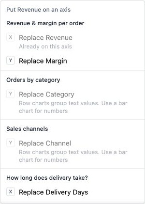
The menu explains why an axis cannot use Revenue, including axes that already use it.
This is useful when the chart already has the right type and layout, but you want to try another variable. Replacement preserves the chart type, position, filters, and other fields. It clears the replaced axis's custom label so the new field name can appear.
The available targets include an ungrouped bar's x axis, a row chart's grouping axis, scatter axes, line x axes, a single-series line's y axis, and a box plot's measurement axis. Choices that need numbers reject text, dates, booleans, or numeric fields without finite values as appropriate. The menu gives a reason instead of leaving the user to guess.
Mouse users can also drag a field row onto a supported chart axis. The drop performs the same update as the menu. Keyboard and touch users use the menu. Dragging onto empty grid space is not included.
Keep a quick check separate from a saved edit
Opening Fields, searching, expanding a row, opening the overview, and inspecting values leave the saved layout unchanged. Creating a chart or replacing an axis is an explicit edit. The panel's open state and search are temporary view state, rather than part of the saved analysis.
That boundary follows the original intent: checking a field should not require adding a table or rebuilding a chart. The summary table and field list share filtered profiles. The inspector and expanded rows share distribution logic. A field should report the same result wherever you inspect it.
The more ambitious field-understanding plan also called for distributions and chart and calculation usage indicators in every collapsed row, plus named calculation uses with jump actions. The merged compact list shows type and a summary reading; expansion shows distributions and chart uses. The overview supplies the broader distribution scan. Calculation-consumer navigation remains a further step, distinct from marking a field as calculated.
Date inspection has a separate open improvement: calendar-aligned bins. The current histogram uses equal time widths, so a bin can start halfway through a month. Days, weeks, months, or years would make those ranges easier to read.
The useful path now runs from the field to its values, its existing charts, and the next chart action. You can do a quick check and return to the analysis without changing its arrangement.
Implementation references: field inspector upgrade, PR #36 and field list, PR #42. Try the workspace at exploreda.dev.