SKILL.mdbyron-ui-taste/SKILL.md
---
name: byron-ui-taste
description: Byron Wall's recurring UI and diagram preferences — density, borders, layout stability, links, truncation, hierarchy, interaction, control states and design tokens, and diagram layout. Use before designing, restyling, "punching up", or reviewing any interface or technical diagram for Byron (planning viewers, data apps, dialogs, dashboards), and compose it with `impeccable`, `high-quality-application-ui-design`, and `emil-design-eng`. These are corrections Byron has given repeatedly; apply them by default instead of waiting for him to ask again.
---

# Byron UI Taste

Byron reviews UI on a large monitor and works through it quickly. He wants calm, dense, stable screens where the most useful thing is obvious. Each rule below is a correction he has made more than once. Treat a violation as a bug.

## Density

- Default to dense. "Over-padded", "airy", "floaty", "too cardy" and "over drop-shadowed" are his most frequent complaints. Tighten padding before adding anything.
- Group with sections and whitespace, not with stacked cards. Never nest cards or borders; find an inline treatment instead.
- Keep buttons sized to their job. Large generic buttons (search, open draft) read as wasted space.

## Borders, pills, and color

- No border around content that is one line tall. Bordered one-liners read as "chipification".
- No side or left accent borders on cards, contents lists, or callouts.
- Pills only where they carry state, and sparingly. A screen full of pills is "a mottled mess".
- Prefer an icon or color on a consistent left rail for status over a text pill that pushes titles around.
- Code blocks are light, not black, and wrap by default.
- Never dump raw text into an unstyled monospace `<pre>` box. Prose such as an agent prompt, a message or a note renders as Markdown on its own surface (a pale tint or a raised panel), so it reads as something special. Real code (SQL, a rule, a command) gets a highlighted code block. ("Just dumping raw text monospaced… that's pretty much never good", Nov 2026.)
- Fills are soft and low-chroma: panel, row, node and group backgrounds use pale tints, never saturated color. Save saturated color for data marks (a metric's value, an edge, a status dot). Text on a tint must read easily; blue text on a blue fill is a common miss. ("Background colors are too strong and saturated"; "too saturated… almost look like nodes".)

## Layout stability

- Zero layout shift. Results arriving, an icon appearing, a confirmation showing, or a toast firing must not move other content. Reserve space and use fixed heights.
- Toasts go in a corner, not as a banner.
- Use popovers instead of disclosures that expand content at the bottom of the page.
- Progressive columns get a fixed width each; widths must not change as content changes.
- A copy action confirms with a subtle animation on the clicked element, not with inserted text.

## Links

- Links are colored text only: same weight as body text, no underline, no background fill.
- All link types share one subtle hover. Do not give one type (for example tasks) a different hover.
- Never break a link across lines.
- External references get a small source icon (GitHub, Linear, Jira, Slack, task). Detect references only when they are standalone tokens, never inside branch names or paths.

## Truncation and disclosure

- In lists, show the full text. Lists are for reading, not inline references.
- Truncate only inline references, around 28–48 characters, and back them with a hover card (not a `title` attribute) that adds information beyond the name.
- Every truncation needs a way to see the full content.
- Hover cards sit close to the trigger and above everything else. Remove hover cards that only repeat what is visible; Byron finds them annoying.

## Entity hover cards

Byron likes dense hover cards on entity links (a company, person, project, or task). The goal is to understand the entity without navigating to its page.

- Add a hover card to most entity links whose page holds more than the name. A card that saves a page visit is better than a link alone.
- Open after a slight delay, about 400–500ms, so a passing pointer does not open it. Open at once on keyboard focus.
- Keep it open while the pointer is on the link or the card, with a short close delay (about 150ms) to cross the gap. Links inside the card must be clickable. Esc, blur, and click close it.
- Make it dense. Pick the facts most likely to be useful in this context, not a copy of the page. For a company seen from one of its products: what it does, size, location, concerns, and its other products with the current one highlighted.
- Use a compact layout: a header with logo, name, and status badges; a label/value grid with joined values (`Founded 2016 · San Francisco · 200–500 people`); clamped notes; a short ranked list with "+N more"; a footer link to the full page.
- Render it in a portal with fixed position, so a scrolling pane cannot clip it. Flip it above the trigger when there is no room below. Keep it about 400–450px wide.
- Read from data the page already has (the shared index). Do not fetch on hover when the data can come with the list.

## Hierarchy and placement

- The most useful content goes at the top. Completed and deferred items are hidden by default behind a toggle and rendered below the active work when shown.
- Primary actions sit at the top, aligned with the content they act on, not at the bottom or far right.
- When something has low value, remove it rather than restyle it. He regularly deletes secondary links, unused pages, decorative logos, and sidebar buttons.
- Offer the same action everywhere the same item appears.
- Persist selection in the URL so a refresh keeps it.
- Every breadcrumb segment is clickable, and a child document always offers an obvious path back to its parent.
- Keep prose at a comfortable reading width; let tables bleed wider than the text column.
- In two-button dialogs, spread the buttons so the next action is clearly the primary one.

## Signal rows and drill-down

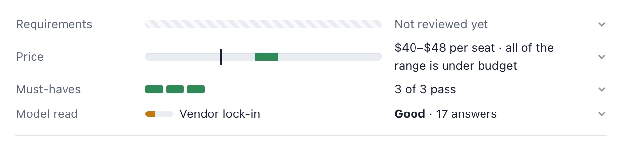
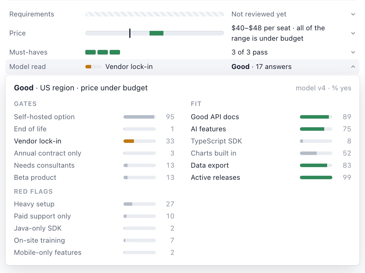
Byron called the result of these rules "awesome" and "really nice" (Nov 2026). Snapshots of a vendor review: [rows at rest](references/snapshots/signal-rows.png), [the model popover](references/snapshots/signal-rows-model-popover.png), and [the requirements popover](references/snapshots/signal-rows-requirements-popover.png).

- One row per signal: a label column, a small fixed-width mark (bar, scale, or pips), and one line of text. Related signals share one grid and one row style, with no dividers or cards between them.
- Show the summary; put the full detail one click away. The whole row is the button. It opens a popover anchored under the row, over the content below, so nothing shifts. Only one popover is open at a time. Esc or an outside click closes it. A small chevron at the row's right edge turns when open; the open row keeps its pressed tint.
- When a signal has many parts (17 model answers, 10 requirements), the row shows only the few that matter most. Rank misses first, then unsettled answers, then the strongest wanted features. Leave out parts that are nearly always the same; they say little.
- Color only what needs attention: red for a miss or red flag, amber for an unsettled answer, green for a wanted feature, neutral gray for everything else. A screen of green "all fine" marks is noise.
- Show a probability as a thin bar plus a tabular number. Group the full set under small caps headers (Gates, The work, Red flags). Byron liked this grid enough to keep it, but in the popover, not inline.
- When items in a one-line summary may not fit, let them wrap onto a hidden second line (`flex-wrap` with a fixed height and `overflow: hidden`), so an item drops out whole instead of being cut mid-word.
- Replace a guessed signal when better data exists. Rows that guessed role and location from the title went away once model answers from the full text were available. Do not show both.

## Interaction

- Never use `window.alert`, `window.confirm`, or `window.prompt`. Ask for input (a reason, a note, a name) in a popover anchored to the control that started the action, with an auto-sized text area, Enter to submit, and Esc or Cancel to back out. Confirm a destructive action in that popover or with an undo. Show an error as an inline message or a toast. ("Very gross … just terrible", Nov 2026, about a `prompt` dialog.)
- Every interactive element has a visible hover and pressed state (see "Controls and states"). Use `emil-design-eng` motion: short color fades of 120–160ms, no `transition: all`, respect reduced motion.
- A dialog containing typed text does not close on a backdrop click; require Cancel. An empty dialog may close on any outside click.
- A dialog or menu with a text filter focuses it on open, and only Esc (or ×) closes it. No letter key closes or toggles it while the filter has focus, including the key that opened it; every letter must be searchable.
- An investigatory click never navigates. Clicking a row, step, or reference to find out what it is opens a modal, popover, or peek over the current page, with the selection in the URL; leaving the page takes an explicit "Open" action. ("An investigatory click is jumping you around, which is not what we want", Nov 2026.)
- Text areas auto-size so the full contents are visible.
- Graphs get an expand control that opens a full-viewport view with drag-to-pan and wheel zoom. Zoom keeps the focal point under the cursor stable, and the view opens fitted to the whole image.
- Save actions clear the previous status or error immediately so stale messages never imply progress.
- Status text uses real names users recognize, not internal IDs.

## Controls and states

Byron called the result of a controls pass with these rules much better than before (Nov 2026). [references/controls-layer.css](references/controls-layer.css) is a copyable template of the tokens and state model.

- Build states as one system. Put one `:root` token block at the top of the stylesheet. Put one "Controls" section at the end that sets every state for every control family. Delete the scattered `:hover`, `:active`, and `:focus` rules that it replaces. Several `:root` blocks in one file mean earlier passes added patches instead of fixing the system.
- Tokens cover color scales and semantic names, type, space, control heights, radius, elevation, focus, durations, and easings. Keep the app's colors. Organize them; don't rebrand.
- Use one state model everywhere:
  - Hover is one step stronger, and only under `@media (hover: hover)`.
  - Press is two steps stronger, plus `scale(0.97)` on compact controls. It snaps in at the instant duration.
  - Selected uses the accent tint and switches at once. Only hover fades.
  - Focus shows only for the keyboard (`:focus-visible`). Compact controls get a 2px ring outside. Rows get the ring inside, because scroll containers clip an outside ring. Fields get a border and a soft halo.
  - Disabled is 45% opacity with a not-allowed cursor.
- A state must never change a control's size. Selected tabs, tags, segments, and buttons keep the rest font weight, border width, and padding. Bold selection made controls 1–5px wider and reflowed tag rows.
- All controls in one toolbar row share a height token. A segmented control's well is exactly one control height, not the segment height plus padding.
- Every target is at least 24px. Text and icon buttons are 24px tall. Small marks such as checkboxes get a larger hit area from an invisible `::before`.
- Content inside a control follows its state. Key hints, icons, and counts use `currentColor` so they change on hover and press.
- The whole field is the target. A click on a search box's icon or padding focuses the input.
- Style native checkboxes and selects into the system. Never hide a switch's input with `display: none`, because the keyboard can't reach it.
- On touch screens (`@media (hover: none)`), show anything that hover reveals.

## Diagrams

- Prefer wide, left-to-right layouts over tall ones.
- Run the core path as a straight spine down the center.
- Arrows land on node edges, not in the middle of a shape, and avoid crossing.
- Keep decision diamonds close to square with the text inside.
- Do not bake tables or checklists into diagram images.
- Choose a palette for the context instead of fixed hard-coded colors.
- Group labels must not collide with group borders.
- Titles, subtitles, labels and notes in a diagram meant for others are Byron's prose: run them through `write-byron-voice` before rendering.

### Diagram copy

Byron rewrites generated diagram copy on sight ("that subtitle is just slop"; "no meta commentary or the generation instructions leaking through"). Before the first show, reread the title, subtitle, group titles, legend and box labels as if a teammate wrote them for another teammate:

- **The title names the thing; the subtitle says what you found.** It is the sentence you'd say out loud if someone asked "so what?", not a description of the picture.
- **Never describe the drawing.** No "this diagram shows", no "Diagram 07 shows how they connect", no layout tour ("the happy path first, then the edge cases", "what works up top, where it breaks below"). The layout is visible; say what it means.
- **Never echo the brief.** Words from your instructions don't belong on the page: "takeaway", "at a glance", "overview of", "in Byron's voice", "plain language", "one idea". Neither do task or step IDs on their own, like a title ending "(TASK-0082 W14)".
- **No filler or hedges:** key insights, comprehensive, seamless, robust, leverage, holistic, streamline, crucial; potentially, arguably, essentially, basically.
- **Use his words for the thing.** "Who moves a bug along", not "Every handoff is a gate a human or agent can pass". "Scoring a PR", not "Score a change so reviewers know their posture".

Real rewrites:

- Subtitle "The happy path first, then the three edge cases that break it" became "Models deployed before Sep 15 have no identity marker, and teardown refuses them".
- Title "Every handoff is a gate a human or agent can pass" with subtitle "One process, run by people today and agents more over time" became "Who moves a bug along" with "A person or an agent can do each step, and any handoff can stop for a person".

Where a repo has a diagram copy lint (`npm run lint -- <file.draft>` in some planning repos), it rejects the worst of these (layout narration, the drawing talking about itself, brief leftovers, filler, hedges) in titles, subtitles, group titles and legends. Passing lint is the floor, not the voice pass.

## Working method

- For open-ended "make it better" requests, use `consider-contrast`: sketch 5–10 directions, then combine the best into one.
- Get the change working end to end in the UI first, then simplify. Prefer the least new code.
- Verify in the browser at Byron's wide-monitor size before reporting.
- Audit controls with scripts, not by eye. Use the `state-sheet` skill for a contact sheet of every control at rest, on hover, with focus, and pressed. Then run `node ~/.agents/skills/byron-ui-taste/scripts/audit-controls.mjs --base <url> --pages /,/list`. It lists targets under 24px, missing pointer cursors and focus styles, mixed heights in a toolbar row, and selections that change font weight. Run it before and after.
- Before adding a rule for a selector, search the stylesheet for it. Earlier passes may define the same selector again further down, and the later rule wins. Fix the existing rules in place instead of adding a third.
- Prove a popover with numbers: the next element's `top` is the same before and after open, and `elementFromPoint` inside the popover hits the popover. A screenshot taken too early can miss it.
- Audit scripts must not change data. Block every non-GET request. Release a held mouse button away from the control, so no click fires. A press in an early screenshot run changed real records. After each run, check `git status` for data the app writes.
- Disable transitions before you read computed styles. A style read in mid-transition reports the old value and gives a false miss.