---
name: 10x
description: Make a UI about 10x better in one aggressive pass. Ground in the running app, come up with structural ideas (not just restyling), pick the strongest bundle, implement it end to end, verify in a browser, and leave a handoff for the `100x` craft pass. Use when Byron says `/10x` or `$10x`, or asks to "make this UI 10x better", "punch up the visuals", "make it amazing", or "let it rip" on a screen, page, component, chart, dashboard, viewer, or app. For a target with no UI (a skill, script, CLI, or workflow), applies the same aggressive-leverage pass to the task itself.
argument-hint: "<target: URL, route, component path, PR, or screenshot> [-- goal, user, or constraints]"
user-invocable: true
---

# 10x

Byron calls this with a target and a sentence or two of intent, then expects to come back to something that is clearly better than a polish pass. He follows up in a later thread with `100x`, which handles fine craft. This pass is about **leverage**: what the screen helps the user do, how information is arranged, and what interactions it supports.

Don't stop to ask questions unless the target can't be found or the change would delete user data. Make the call, then record it under "Decisions for you."

## Targets with no UI

If the target has no obvious UI (a skill, a script, a CLI, an API, a doc, a workflow), apply the spirit of this skill instead of its UI mechanics:

- **Ground:** use it for real, the way its user does. Run it on real inputs, or read transcripts of real runs, and note every point of friction.
- **Diagnose:** score the two or three lenses that fit its job, renamed in its own terms. Job clarity and information architecture usually carry over.
- **Ideas and choice:** same as step 3. Structural ideas change what the user can do or get back, and Remove counts double, since shorter is better for agent-facing text.
- **Implement and verify:** build it end to end, then prove it with a real run instead of screenshots.
- **Deliver:** reply with what changed by effect and **Decisions for you**. Skip `byron-ui-taste`, the repeat-corrections checklist, browser screenshots, HANDOFF.md, and the `100x` handoff.

If nothing clears the bar, say so and leave it alone.

## Inputs

Parse whatever was passed. Everything except the target is optional.

- **Target:** a URL, a route, a component or folder path, a PR, or a screenshot. If only a screenshot is given, find the code that renders it.
- **Goal:** who uses it and for what, such as "people learning chess, clarity first."
- **Constraints:** device ("iPad, single viewport, no scrolling"), scope ("no new features", "code 10x cleaner too"), and delivery ("stack PRs with screenshots", "commit to main").
- **Feedback:** any complaints Byron included ("buttons everywhere", "too pilly", "renders JSON"). Fix these first; they are not optional.

If the goal is missing, infer it from the code, README, docs, and example data, and state your inference in one line.

## Compose with

- **Always:** read `byron-ui-taste` before designing. Its rules are defaults, not suggestions.
- **Also always:** read [references/repeat-corrections.md](references/repeat-corrections.md). It lists the follow-up complaints Byron gave after earlier "make it amazing" passes, so you can avoid them up front.
- When the project has `impeccable` context (PRODUCT.md or DESIGN.md), run its context step and respect the existing design world. Use `impeccable`'s `craft-floor.md` before editing.
- Use `emil-design-eng` for motion. Use `consider-contrast` for the direction decision in step 3.
- Use `dataviz` when the target is a chart.

## Process

### 1. Ground in the real thing (short)

- Run the app with the project's normal dev command or launch config, and open the target in a browser. Don't judge the UI from source code alone.
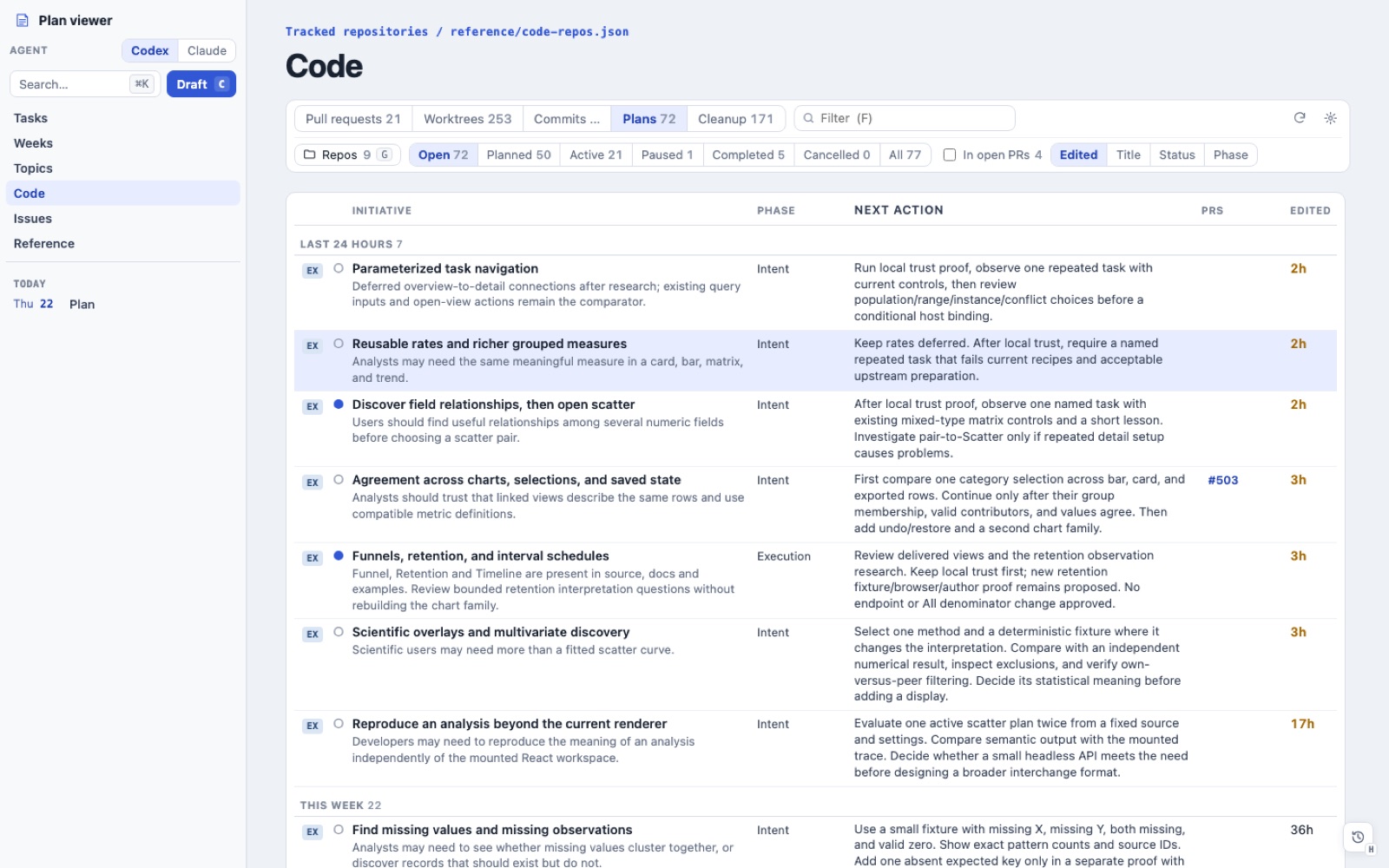
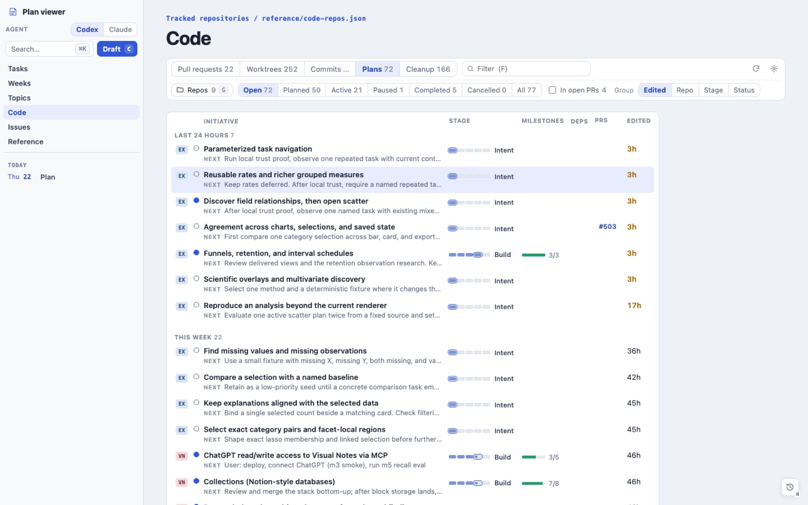
- Screenshot the current state at about 1440 px wide and at the project's narrow target (390 px, or the device Byron named). Save the images to `./tmp/10x/<slug>/before-*.png`. Make sure `tmp/` is git-ignored; if it isn't, add it to `.git/info/exclude` instead of committing a change to `.gitignore`.
- Walk the main job once as a user would, using realistic data. Note every point where you had to hunt, scroll, read raw data, or guess.
- List the screen's contents: regions, controls, and the data shown. Also note what the data *could* support that the UI doesn't show yet.

### 2. Diagnose

Score the current UI from 0 to 10 on each lens. Give one line of evidence per score, and keep this brief:

| Lens | 10 looks like |
|---|---|
| Job clarity | The main question the user brings is answered in the first viewport, without scrolling or clicking |
| Information architecture | Every item appears once, in one obvious place; there are no repeated headers or a grab-bag of buttons |
| Density | Real content fills the viewport; there's no idle chrome, oversized padding, or stacked cards |
| Disclosure | Detail is one hover or click away (hover card, popover, or inspector), never dumped inline or hidden behind three clicks |
| Interaction | Selection, filtering, sorting, search, keyboard, and linked views all work and feel fast |
| Stability | Nothing shifts when you click, filter, load, toggle views, or open a menu |
| Fit and finish | Alignment, type, color, and states look deliberate and consistent with the rest of the app |

The two or three lowest lenses are where the 10x comes from.

### 3. Generate ideas, then choose

Write 8–12 ideas across these levels. **At least four must be structural,** meaning they change what the user can do or see, not how it looks:

- **Remove:** delete low-value sections, metric tiles, dividers, duplicate headers, and dev-only or raw JSON output.
- **Restructure:** use master/detail, a left rail plus table plus inspector, a table instead of cards, a merge of two pages into one, or a split of an overloaded one.
- **Reveal:** show net effect instead of a raw event log, worst-first ranking, before/after views that share one layout, counts and deltas computed from real data, or a question-led entry point.
- **Empower:** add a command palette or search with match highlighting, filters with scope made obvious, keyboard navigation, inspect-in-place with a hover card that expands into an editor, a full-screen view with pan and zoom, or copy and export actions.
- **Polish:** apply type scale, color, icons, motion, and states. Polish is welcome, but it is never the whole answer.

Run `consider-contrast` inline. Compare two or three coherent bundles on dimensions that come from this target's job, not on generic effort or risk. Choose one bundle, or a hybrid of them, that would make Byron say "this is radically better." For a large, open-ended target, you can use the image generation tool for two or three concept frames first, but build from code rather than copying the images.

### 4. Implement end to end

- Build in vertical slices that each work on their own. Keep every existing capability and interaction working, or name what you removed and why.
- Reuse the app's components and tokens. When the same pattern shows up three times, extract one shared piece instead of copying it.
- Use real or realistic example data. If the examples, demo data, or fixtures can't show off the new UI, update or add two or three of them.
- Fix bugs you find along the way, and list them.
- If Byron also asked for cleaner code, use the least new code that does the job, and delete the paths you replaced.

### 5. Verify (bounded)

Do one full round, one round of fixes, and one confirmation round, then stop.

- Take screenshots at about 1440 px, at about 800 px, at the narrow target, and in dark mode if the app has it. Save them as `after-*.png` next to the before images.
- Run the interaction checks: the main job end to end; filter, brush, and select; toggle each view away and back; open each popover and dialog; and use the keyboard. Look for layout shifts, lost state, and console errors.
- Run the project's checks (typecheck, lint, and tests), and run [references/repeat-corrections.md](references/repeat-corrections.md) as a checklist against the after screenshots.
- **If you can't view images, fail fast.** When opening a screenshot fails or times out twice in a row (for example "hook did not respond"), stop trying. Each attempt can block for about 10 minutes. Keep capturing screenshots for the PR, but check layout with a script that measures overflow, overlap, clipping, contrast, and console errors. Try one more image read just before delivery. If that fails too, the visuals are unverified: never describe them as checked.

### 6. Deliver and hand off

- Follow Byron's delivery instruction: stacked PRs (a real `gh stack`, per the `gh-stack` skill), one PR, or a commit. With PRs, use Conventional Commit titles and attach before/after screenshots with `gh pr edit --attach`. Never commit screenshots.
- If you didn't view the after screenshots yourself, say the visuals are unverified: start the PR body with `> **Visuals unverified:** I couldn't view these screenshots. I checked layout by measurement only. Please look before merging.`, and say the same in HANDOFF.md and as the first line of your reply.
- Write `./tmp/10x/<slug>/HANDOFF.md` with:
  - the target, the inferred goal, and how to run the app and reach the screen
  - the scores before and after
  - what changed, grouped by the user-visible effect
  - the ideas you didn't pick, and why
  - known rough edges and a prioritized list of what `100x` should look at
- Reply in this order:
  1. what the user can now do, grouped by effect
  2. bugs fixed along the way
  3. **Decisions for you:** each judgment call, with its default
  4. the handoff path, plus a one-line `/100x <target>` to run next

## What 10x is not

- It's not a restyle. If every change sits in the Polish bucket, go back to step 3.
- It's not more chrome. More pills, badges, tiles, cards, dividers, or status dots almost always make the screen worse.
- It's not a redesign that throws away the app's identity. Stay consistent with the rest of the app unless Byron asks for a new look.