The trajectory graph was close enough that the remaining problems were hard to describe as code.
I could point at a terminal and say it felt backward. I could see a branch floating too far from its parent. I could tell that labels needed more room. Those observations were useful, but each one landed in a layout system where springs, collision, direction, compaction, and cooling were all moving the same nodes.
The work got substantially easier once I could change those forces on screen and move the simulation forward and backward a tick at a time. The debug controls did more than shorten the feedback loop. They exposed places where the model itself was not doing what I thought it was doing.
This is the narrower algorithm-tuning chapter that followed the broader visual work in Learning to zoom out a data-flow visualization.
Start with the direction the graph should read
The first request sounded simple: terminal nodes should appear below or to the right of their parent. Context nodes should sit above or to the left of the components that consume them. The graph should generally read from top-left to bottom-right.
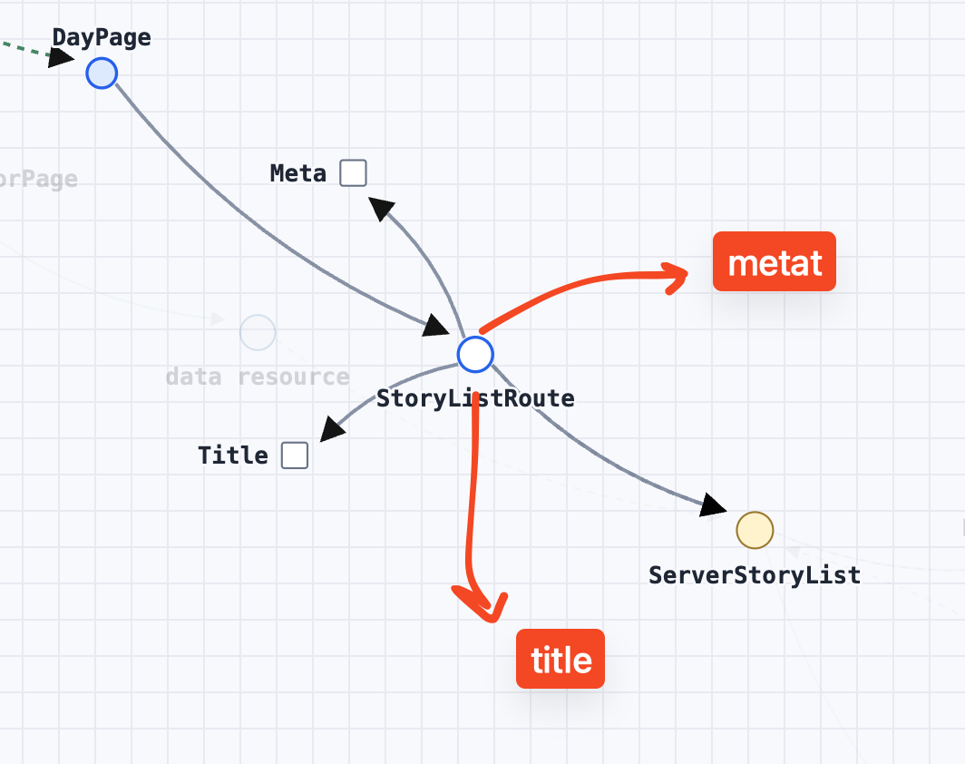
The first implementation tried to fix the layout after the simulation. It would run a normal force layout, then score candidate positions for terminals and contexts. That could improve one class of node, but it created a split model: the simulation found one answer and a cleanup pass moved nodes to another.
The better model was to treat direction as another force. Every tick combined several desires:
- connected nodes want a target distance,
- overlapping marks and labels want separation,
- ordinary edges prefer a down-right angle,
- context edges prefer the opposite direction,
- later ticks pull excess whitespace out of the graph.
No single desire gets to assign a final coordinate. They negotiate.
Correct direction still left too much space
Once the graph had a reading order, it was easier to see how much empty space remained.
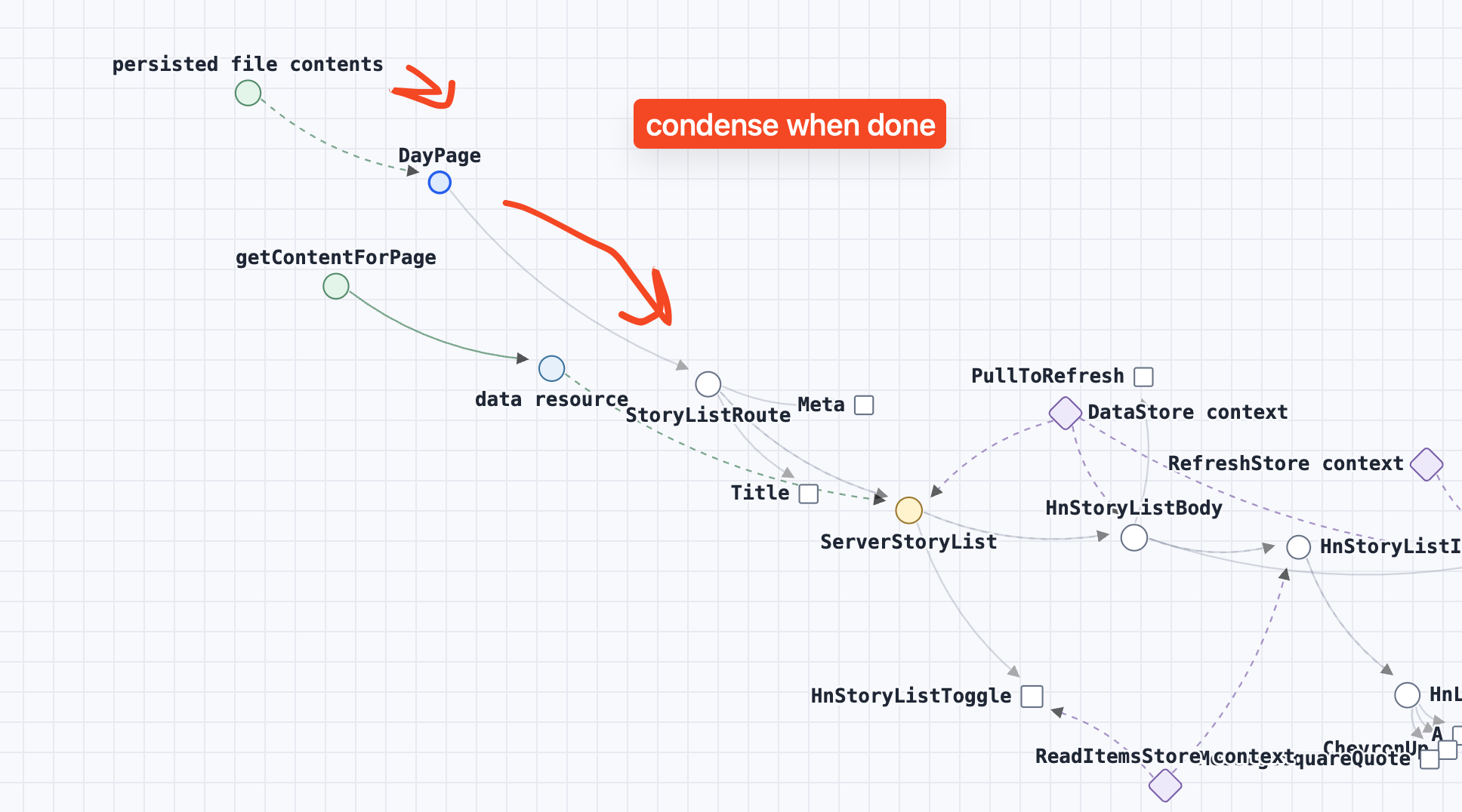
I did not want to scale the final coordinates down. A final geometric shrink can recreate the collisions the simulation just worked to remove. Instead, compaction became a late-stage desire inside the same loop. Early ticks had more freedom to establish direction. Later ticks faded the broad depth anchors, strengthened the target-length springs, and applied a mild pull toward the graph center. Collision stayed active through the whole process.
That gave the algorithm a useful order of operations without turning it back into a list of hard layout phases.
Labels are geometry
The next failure was more literal. Labels jumped between sides of their nodes, and the collision model treated every label as though it were a circle around the mark.
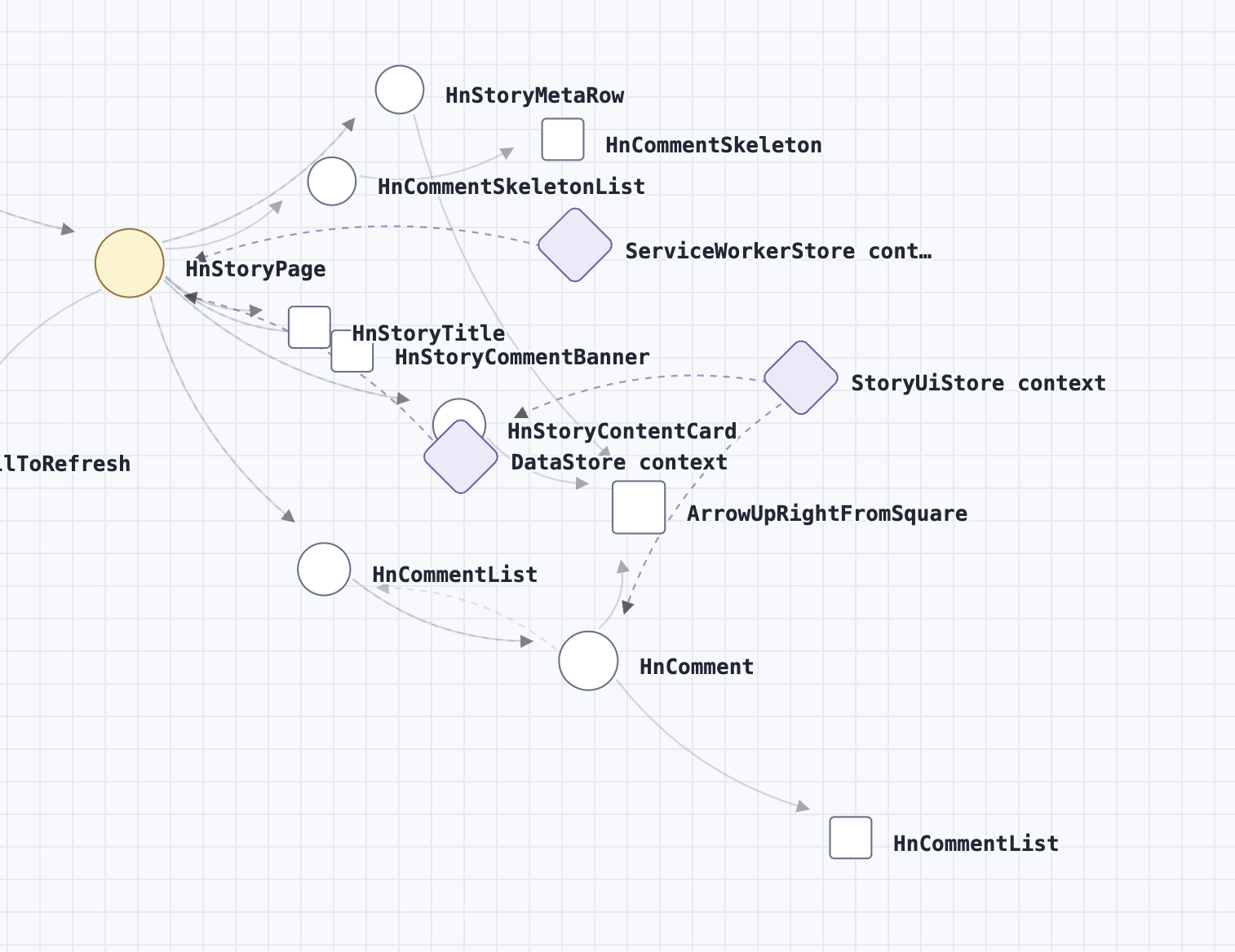
The correction was to make the visual grammar part of the layout math:
- labels render consistently to the right,
- the canvas reserves enough right-side width for them,
- collision uses a rightward text rectangle,
- terminal squares and rotated context diamonds use their actual mark footprint,
- a separate mark gap describes how much empty space should remain between shapes.
This distinction later mattered in the debug controls. Mark gap sets the requested clearance. Collision sets how strongly the simulation enforces it. They can look like the same knob in a settled graph, but they answer different questions.
The force arrows caught a real bug
I added a force overlay because I wanted to see where each node would go next. The first version made the internal result visible as a set of arrows.
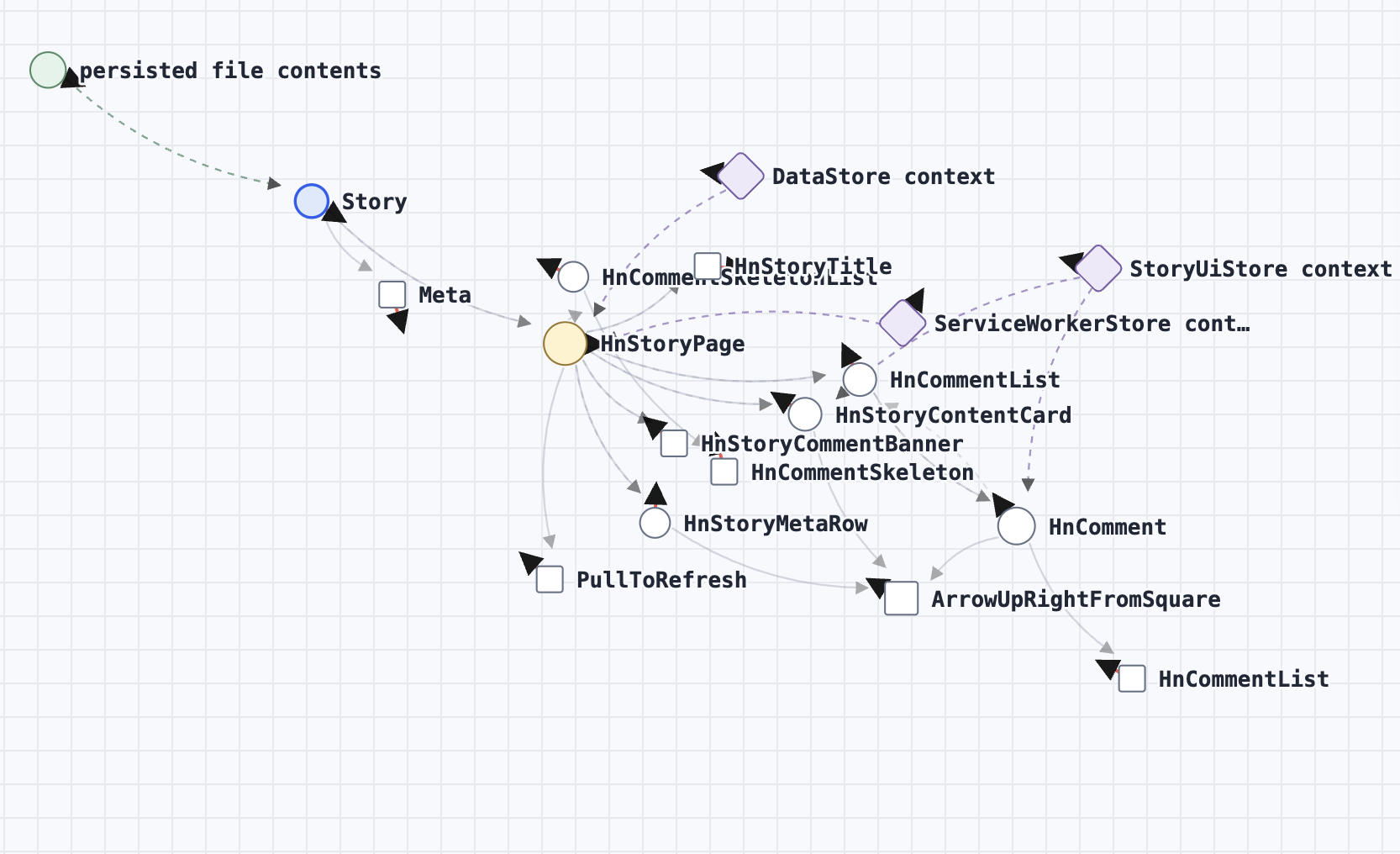
My first interpretation was that each arrow pointed to roughly where its node would land. Clicking Tick +1 immediately showed that interpretation was wrong.
The display had a styling problem—the debug shafts were red while the marker heads inherited the normal black edge color—but the larger problem was in the simulation controls. Tick +1 did not advance the existing run. It changed the requested total from, say, 160 to 161 and replayed the full simulation from its initial positions.
That meant one extra tick could also change the previous 160:
- cooling was normalized against a different total,
- compaction used a different schedule,
- the displayed arrow came from the previous run,
- separation left behind velocity that affected the replay.
The overlay converted a vague feeling of instability into an exact invariant: the endpoint of a force arrow should be the position produced by the next tick.
The corrected version replays debug actions in their actual order, uses absolute iteration for cooling, caps a normal tick at 12 graph pixels, and renders the cloned next-tick displacement one-to-one. In the browser check, a sampled arrow ended at (261.5271, 355.9196). After one tick, the node landed at exactly that coordinate.
A fixed fringe corridor became a wall
The next design goal was to reserve the dense middle of the graph for structural trunk nodes. Terminal and nearly terminal nodes should move toward open space around the outside.
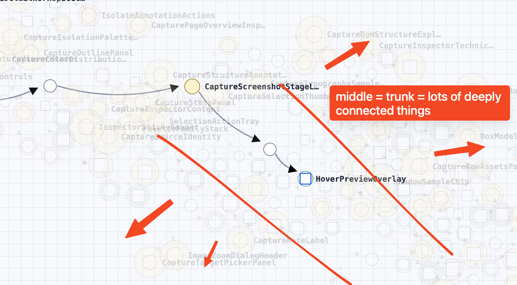
The first force encoded that idea as a fixed diagonal corridor. In a screenshot it looked plausible. During iteration it behaved like a wall. A node could be pushed to one side of the diagonal, then struggle to cross back toward the nodes it was actually connected to.
The replacement was local rather than global. A fringe node samples nearby non-connected nodes, treats dense or highly connected neighbors as more mass, and moves away from that local density. Directly connected nodes are excluded from the avoidance calculation, so graph structure can still pull a terminal across any imaginary diagonal.
That was a useful correction to the mental model. “Reserve the middle” described the result I wanted, but a fixed middle was not the mechanism that produced it.
Branches can drift together
Even with terminal tethers, whole subtrees could remain internally tidy and still drift far from their parent.
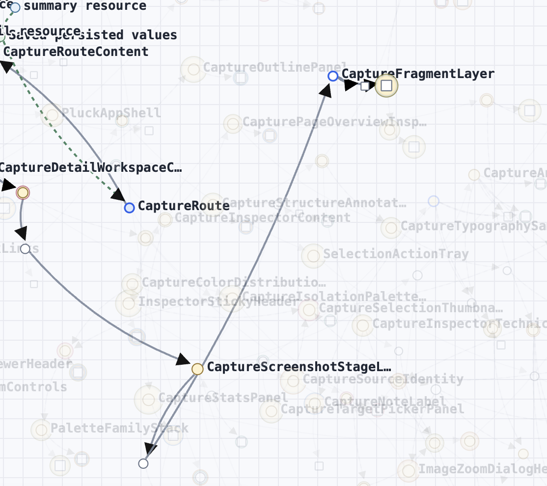
Ordinary link springs cool toward zero. That is usually useful because the layout needs to settle. It also means a branch can stop receiving enough corrective force after it has drifted.
The added subtree cohesion is persistent and inward-only. Exclusive parent-to-child bridges retain a pull after the normal spring cools, weighted by the number of exclusively owned descendants behind that bridge. Larger detached branches therefore have a stronger desire to reconnect. Shared children and context relationships are excluded because they have legitimate competing pulls.
Terminal edges are excluded too. They already have a specialized parent tether, and applying both forces to the same leaf overpowered its downstream-angle constraint.
The controls became the working surface
By the end, the useful defaults were not guessed in code. They were found by working directly against the graph:
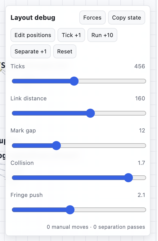
The panel made several different kinds of work cheap:
Tick +1,Run +10, and the tick slider exposed how the layout changed over time.- Moving backward made it possible to compare the same transition again.
Forcesrevealed the exact next displacement instead of asking me to infer it.Separate +1isolated collision work from the normal simulation.- Wider slider ranges made extreme settings available as diagnostic tools.
Copy stateand editable positions turned a visual preference into concrete coordinates and parameters.
The important result was not the exact five default values. Those values belong to this graph and this visual scale. The durable part is that the layout became inspectable.
A force-directed graph is easy to treat as a function that accepts nodes and returns positions. That boundary is too opaque while the algorithm is still being designed. I needed time, forces, collisions, and parameters to exist on the same screen as the output. Once they did, “this looks wrong” became a much shorter path to the specific desire that was missing—or the bug hiding underneath it.
The companion interactive, Building a force-directed graph one desire at a time, reconstructs the algorithm from a single spring through the crowded case.
Source: byronwall/tsx-data-flow