I wanted an overwhelming data-flow analysis.
That was the phrase I kept using while working on the route views in TSX Data Flow. I know a real application has hundreds or thousands of render sinks, component handoffs, resources, contexts, shared UI primitives, and persistence boundaries. A route table saying there was one path was obviously not enough. A tiny curated diagram was not enough either. I wanted to see the thing.
The mistake was assuming that every piece of that analysis needed equal visual weight.
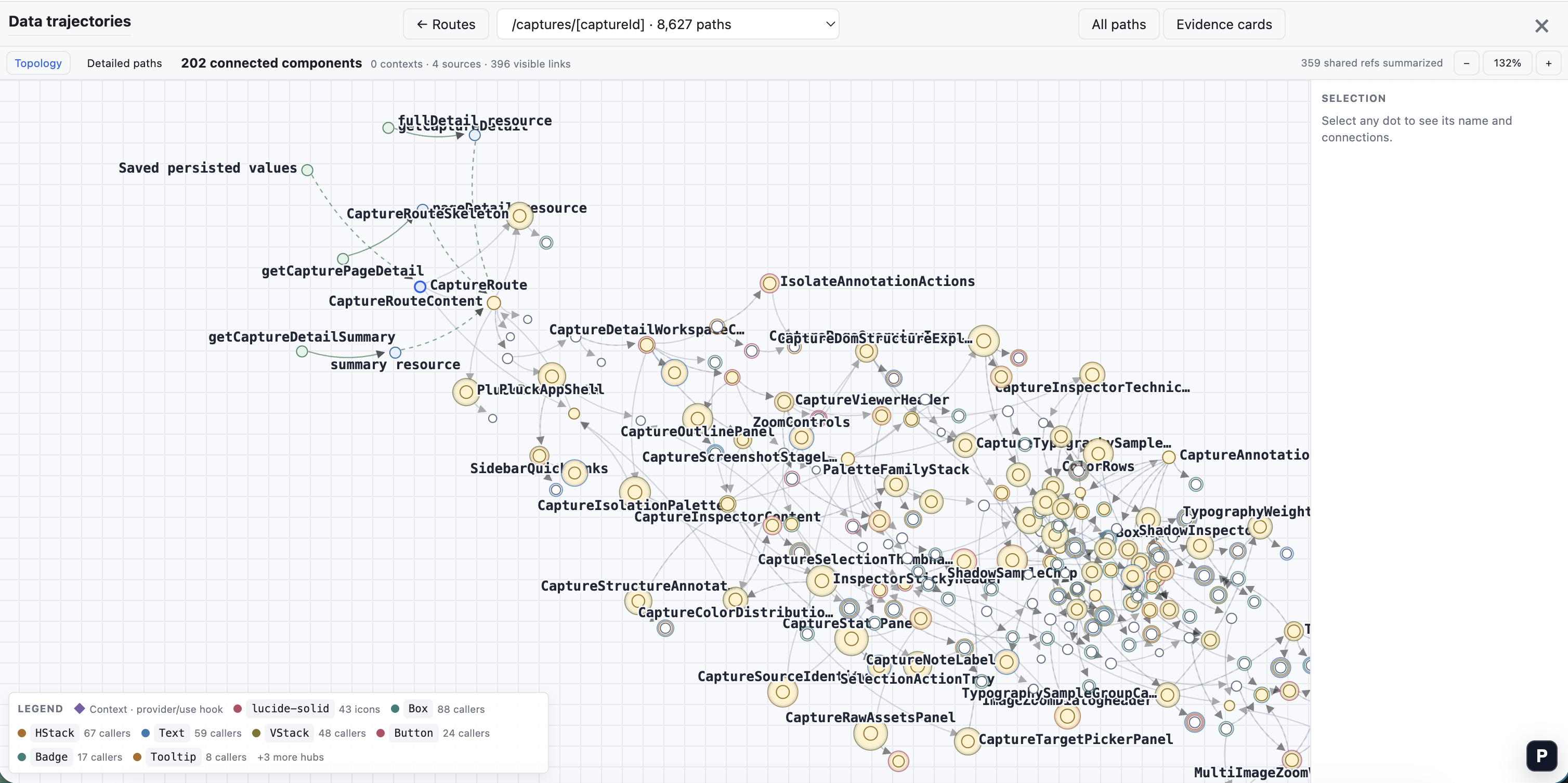
The view I am starting to like still contains a lot: the current Pluck capture route has 202 connected components, 396 visible links, and another 359 shared references summarized into hubs. The difference is that the graph is now willing to say that a route component, a terminal leaf, a common Button, and one of 43 Lucide icons are not equally important to draw.
This is a visual log of how I got there. Most of these intermediate versions were not good, but they were useful because each bad view exposed a more specific rule.
The first trajectory was too literal
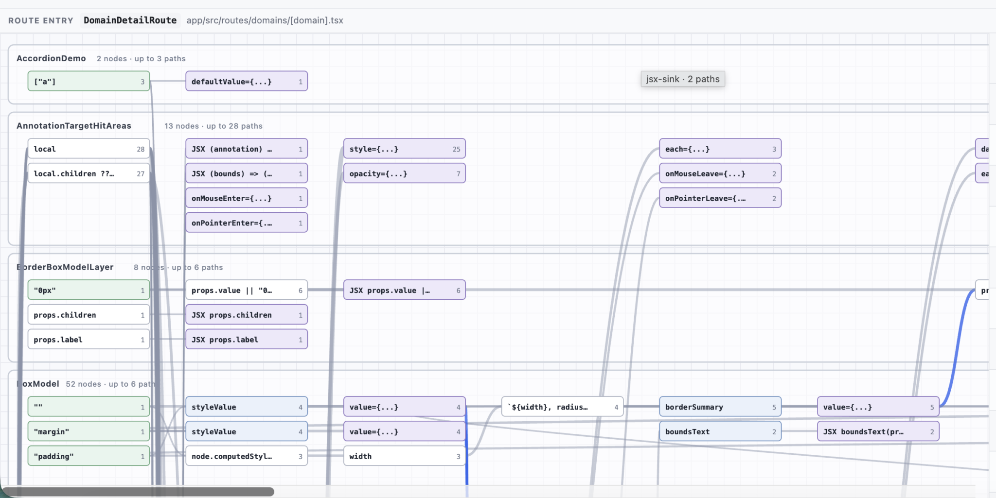
The first route trajectory was a left-to-right lane of cards. I liked the basic ordering because a data flow should have some sense of source, transformation, and sink. In practice, though, the view consumed a huge amount of horizontal space. Clicking or expanding evidence reset the scroll position, the gaps did not carry an obvious meaning, and a blue line appeared without explaining what it proved.
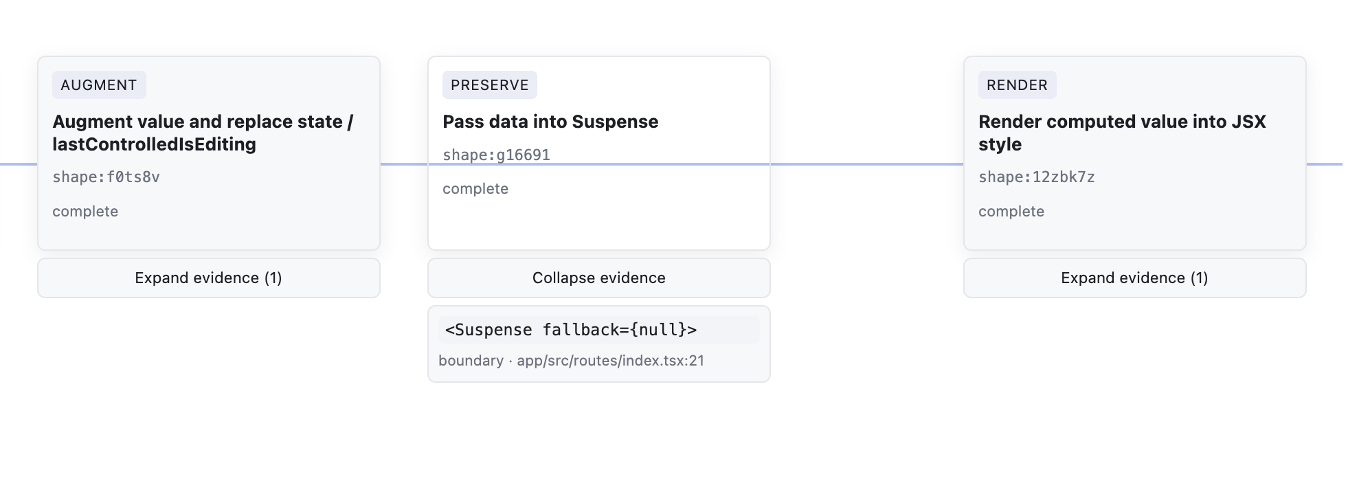
The cards also showed source lines simply because the analyzer had them. An import line is exact evidence, but it is rarely the first thing I need to understand. The interface was exposing the analyzer's intermediate representation instead of answering what happened to the value.
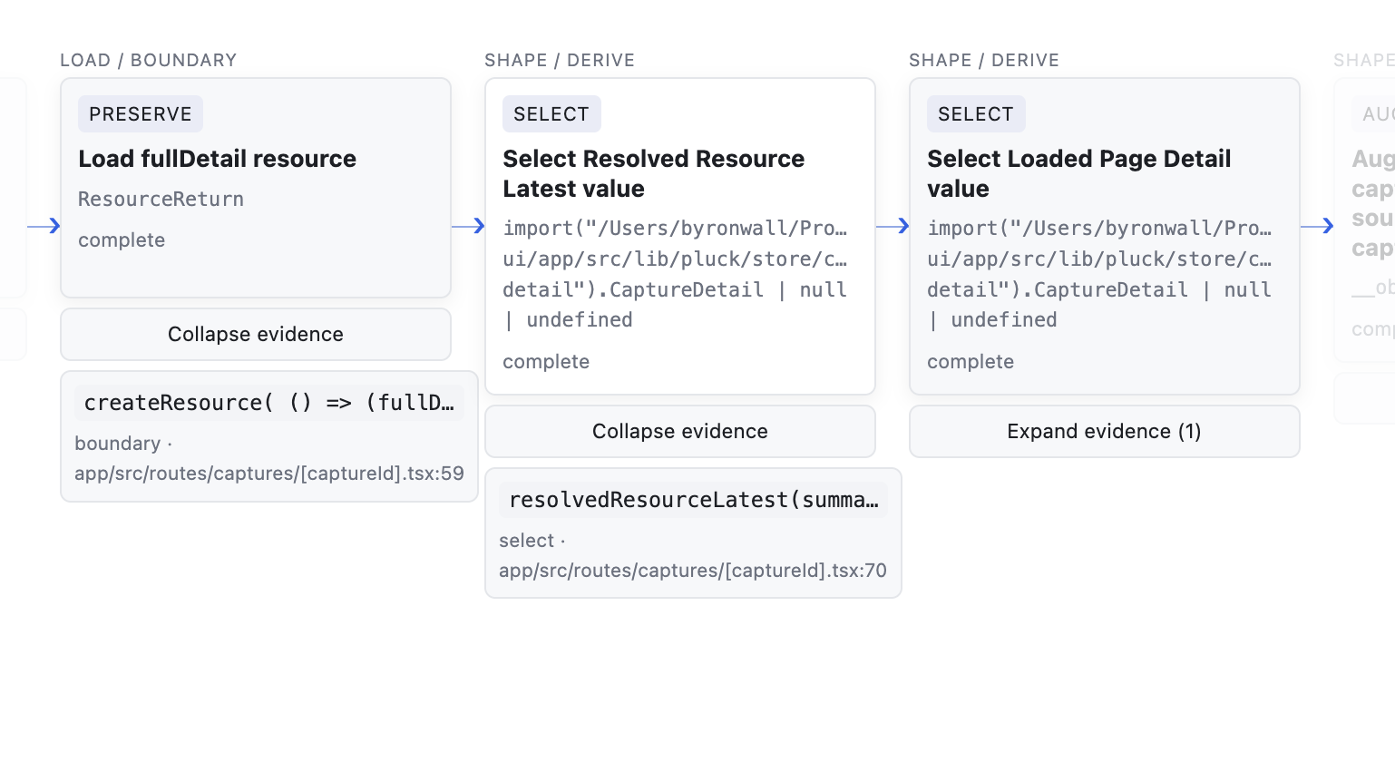
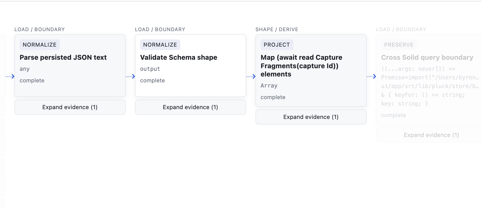
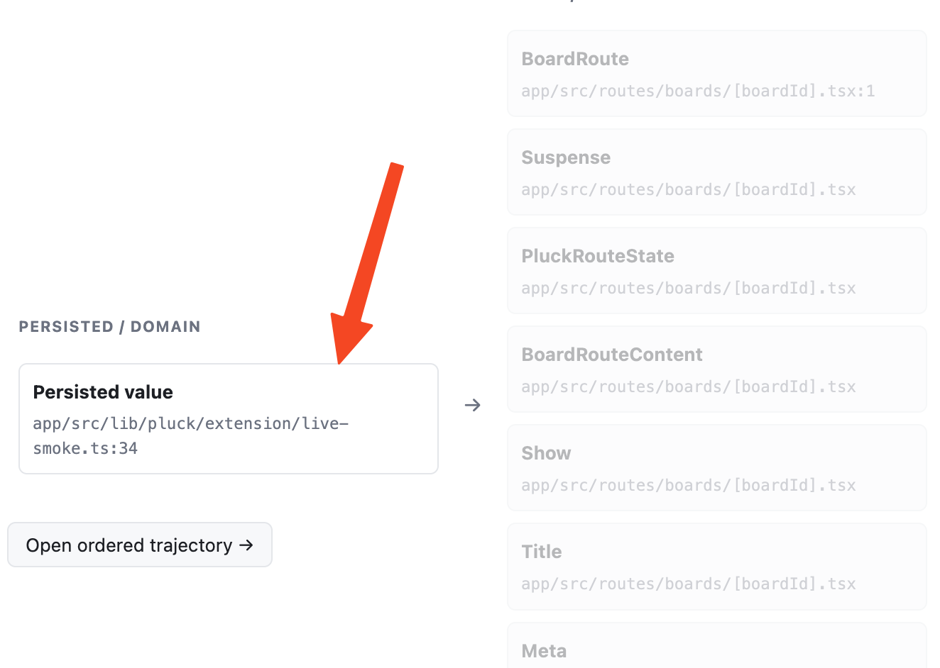
The larger problem was that the route-context page implied a story it could not support. Data appeared on the left, a flat list of components appeared in the middle, and one terminal renderer appeared on the right. A board value was obviously used in more than one style attribute, so why was there one consumer? Why were the middle components flat? What did the arrows mean?
Then one screenshot exposed an outright modeling error: Suspense appeared in the sequence even though the data was not passed into it. Independently discovered expressions had been stage-sorted and chained as if each output fed the next.
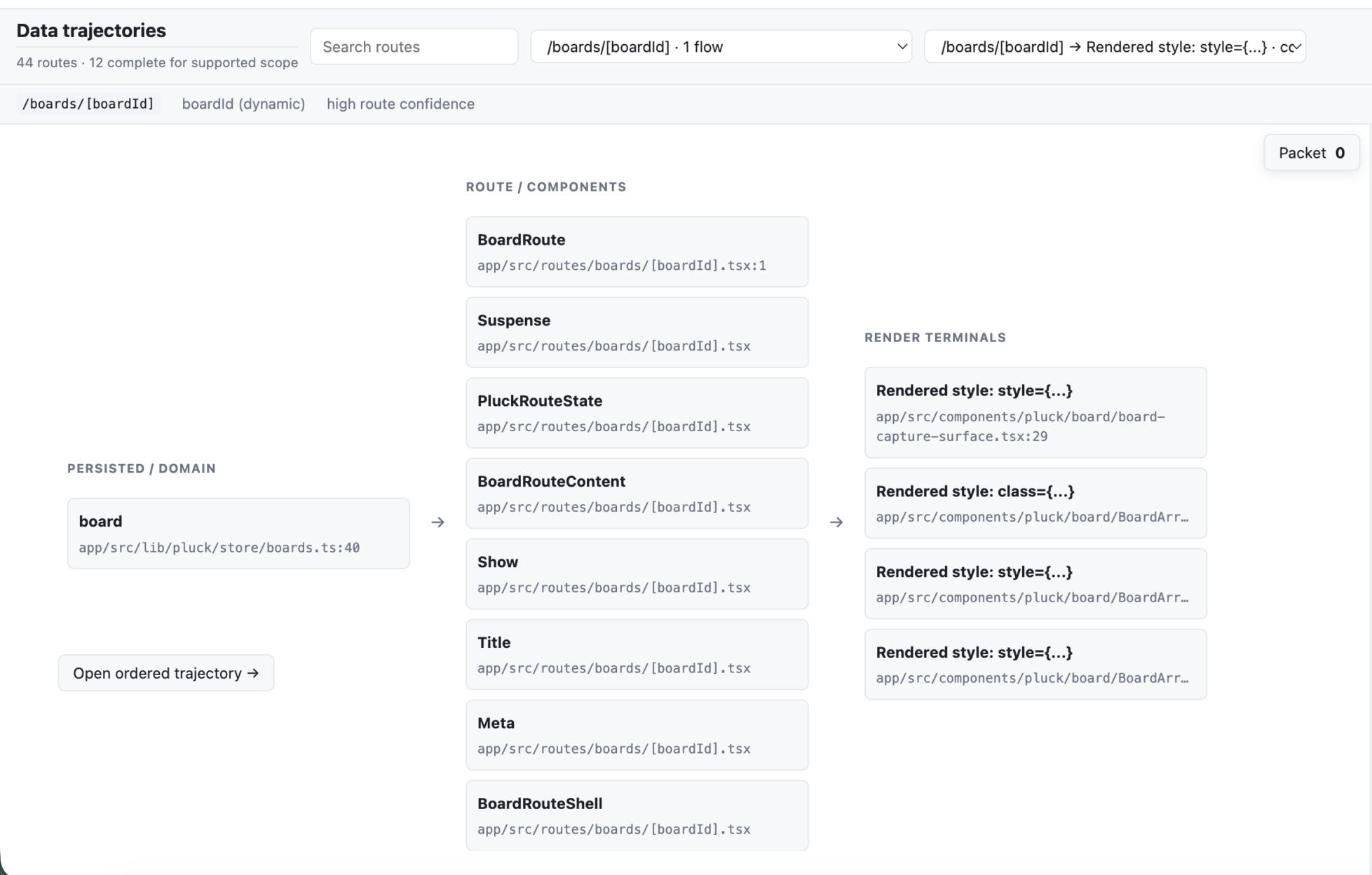
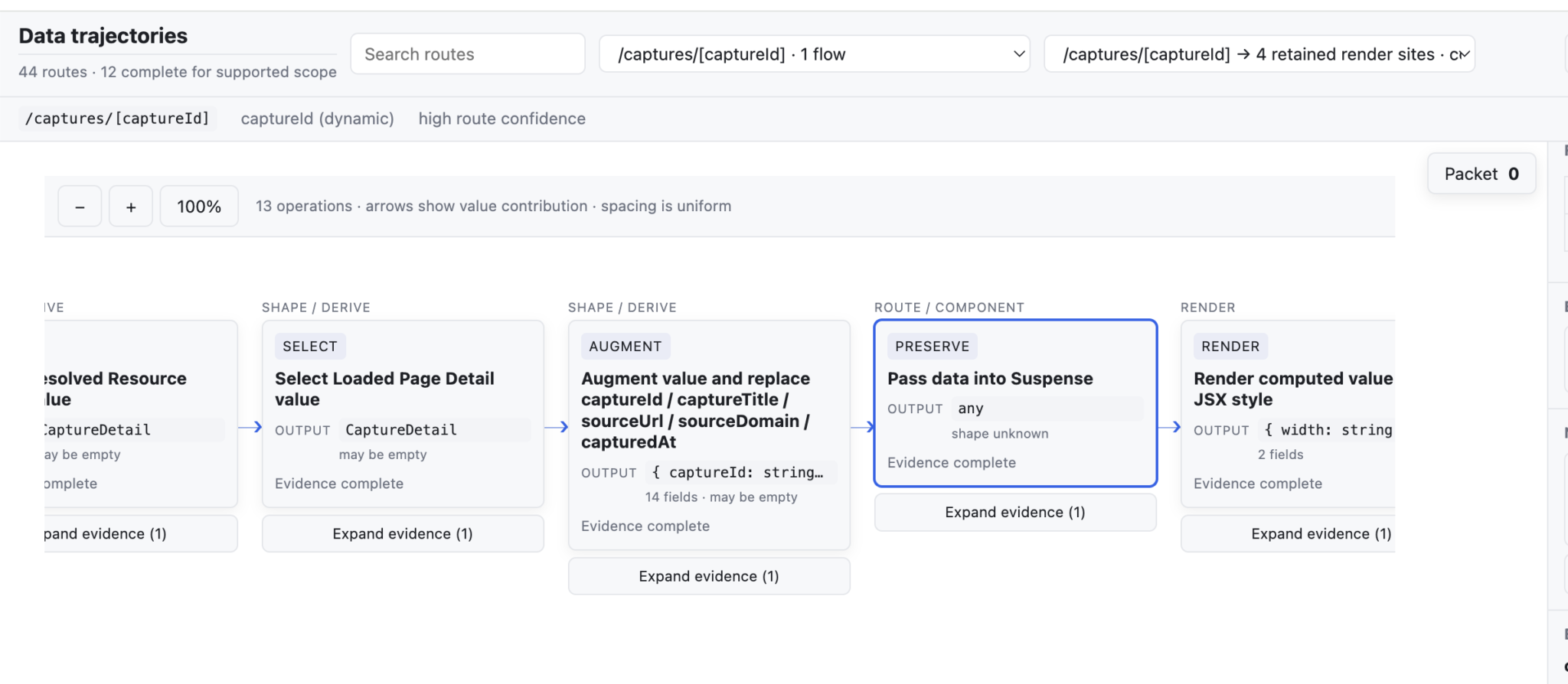
Suspense made the diagram look more complete while making the underlying claim false. The synthetic arrows had to go.That was the first important boundary: a line is a claim. If the analyzer has not proved a value handoff through an argument, return, prop, or context, the UI should show a break or separate evidence. It should not invent a clean chain.
Getting all the paths on screen
The next version swung in the opposite direction. I asked for the large node-and-edge diagram because the route table was hiding the scale of the analysis.
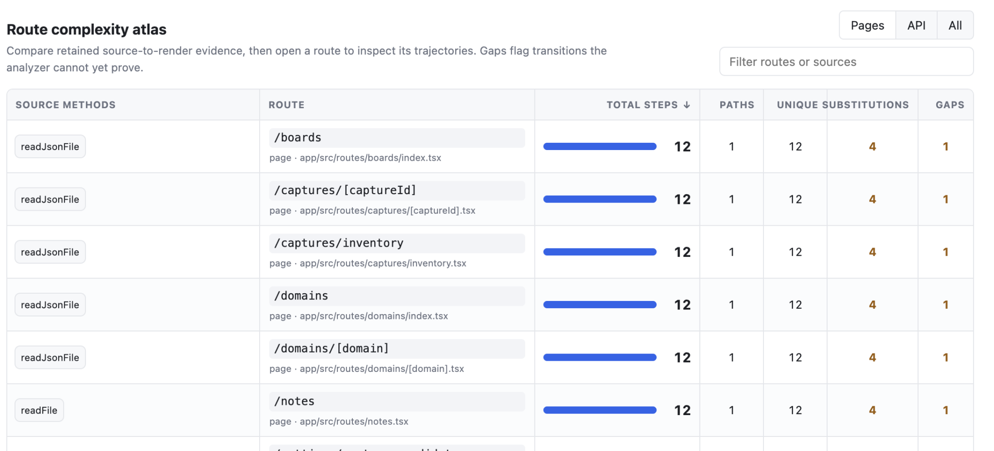
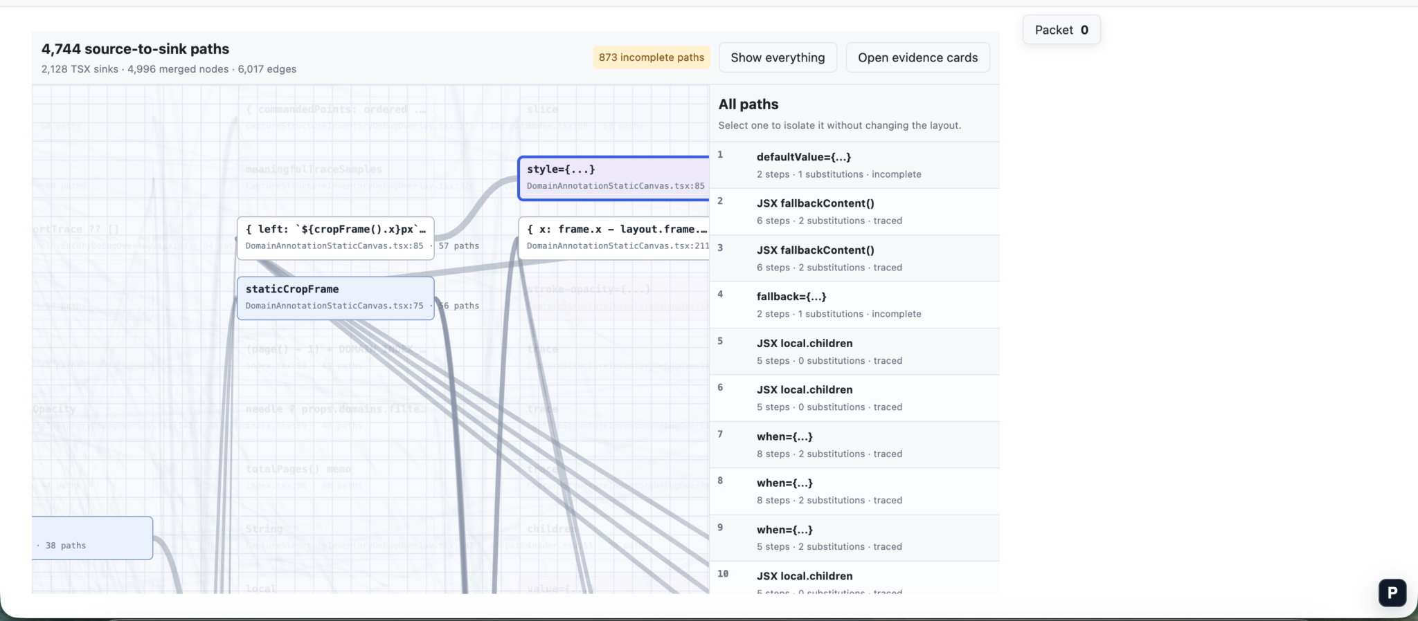
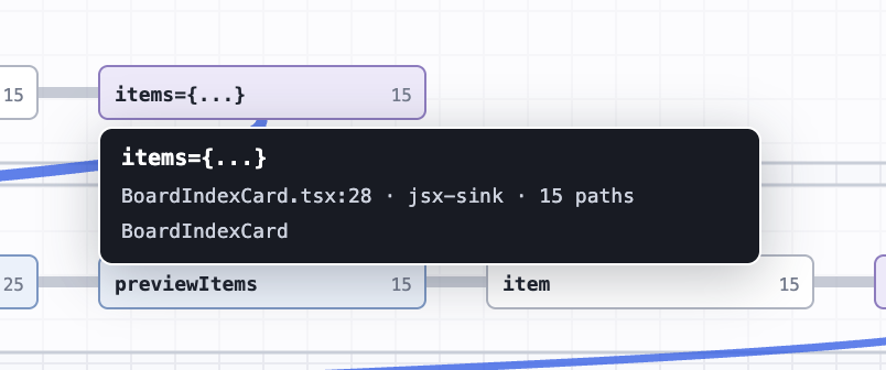
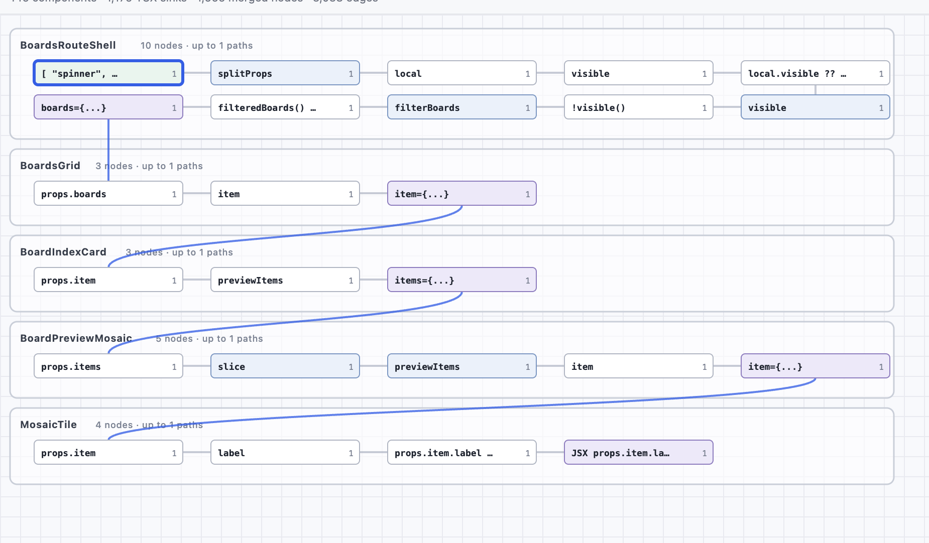
Grouping by component helped because it introduced a real hierarchy. A field such as board.description does not simply end at a source expression; it crosses component boundaries as props. Those component-to-component edges are often the part I care about when deciding where to refactor.
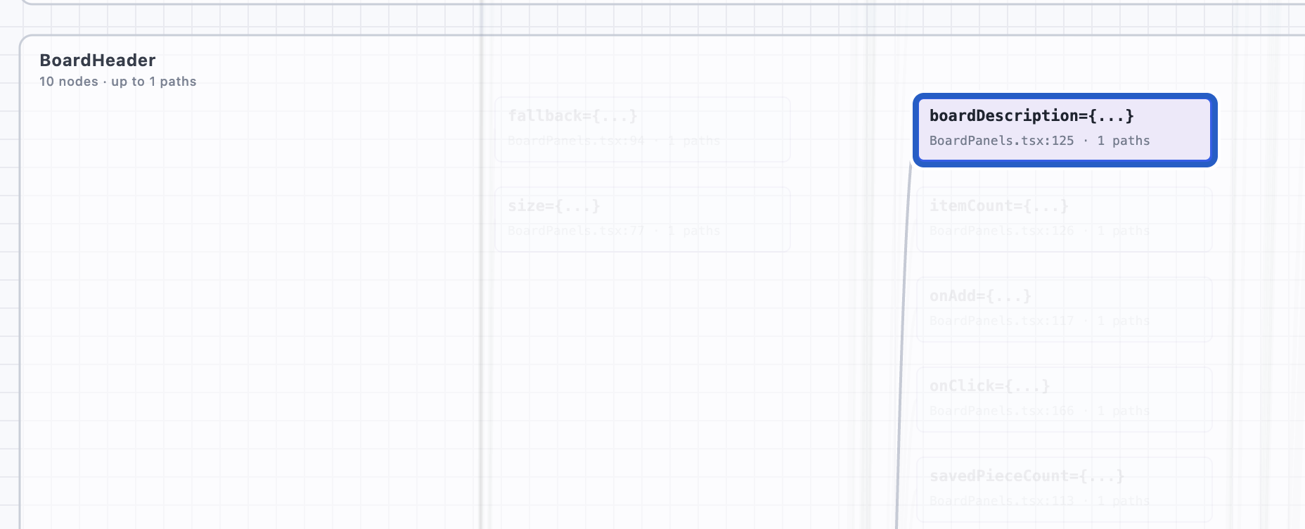
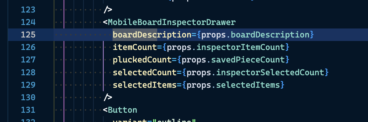
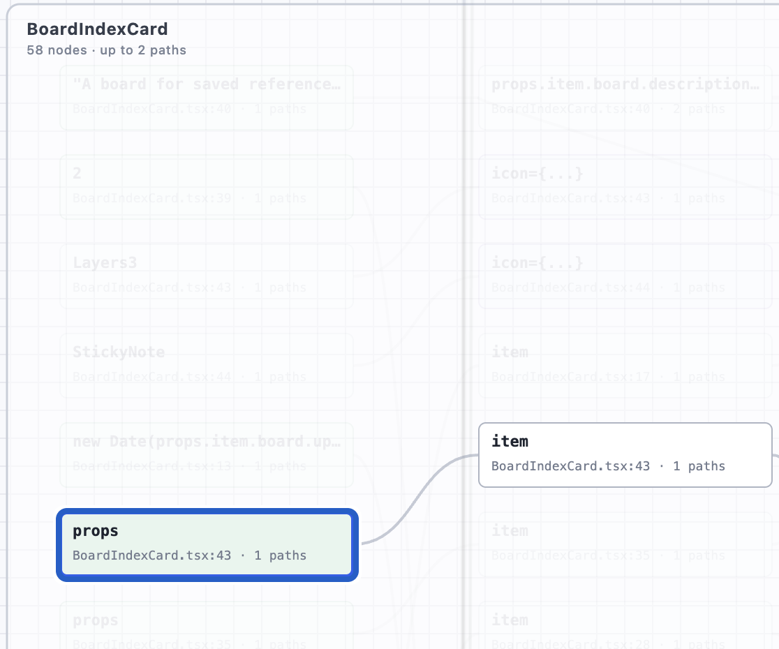
The useful request at this stage was compression. One-line nodes. Narrower widths. Full-viewport rendering. Hover for source snippets. Explicit complex-path isolation. I was spending too much time panning just to find the path I wanted.
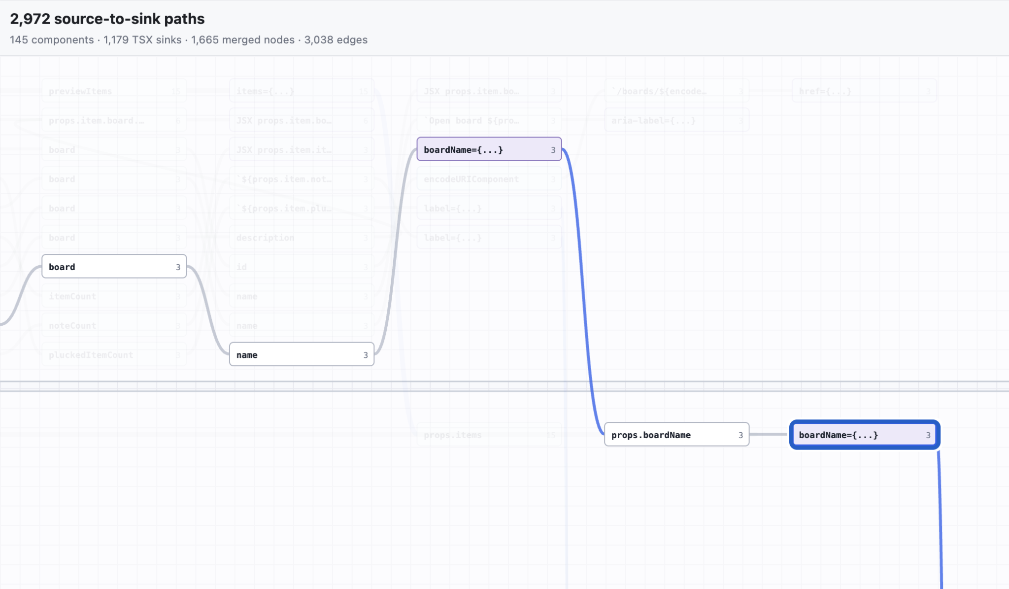
Another recurring problem was the analyzer promoting mechanically unusual facts. “Shared across four components” appeared at the top even when the shared content was not useful. One case literally reported undefined as the shared value.
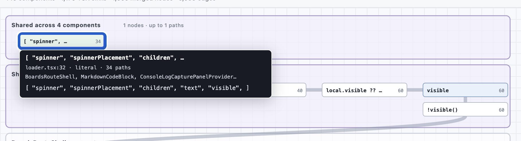
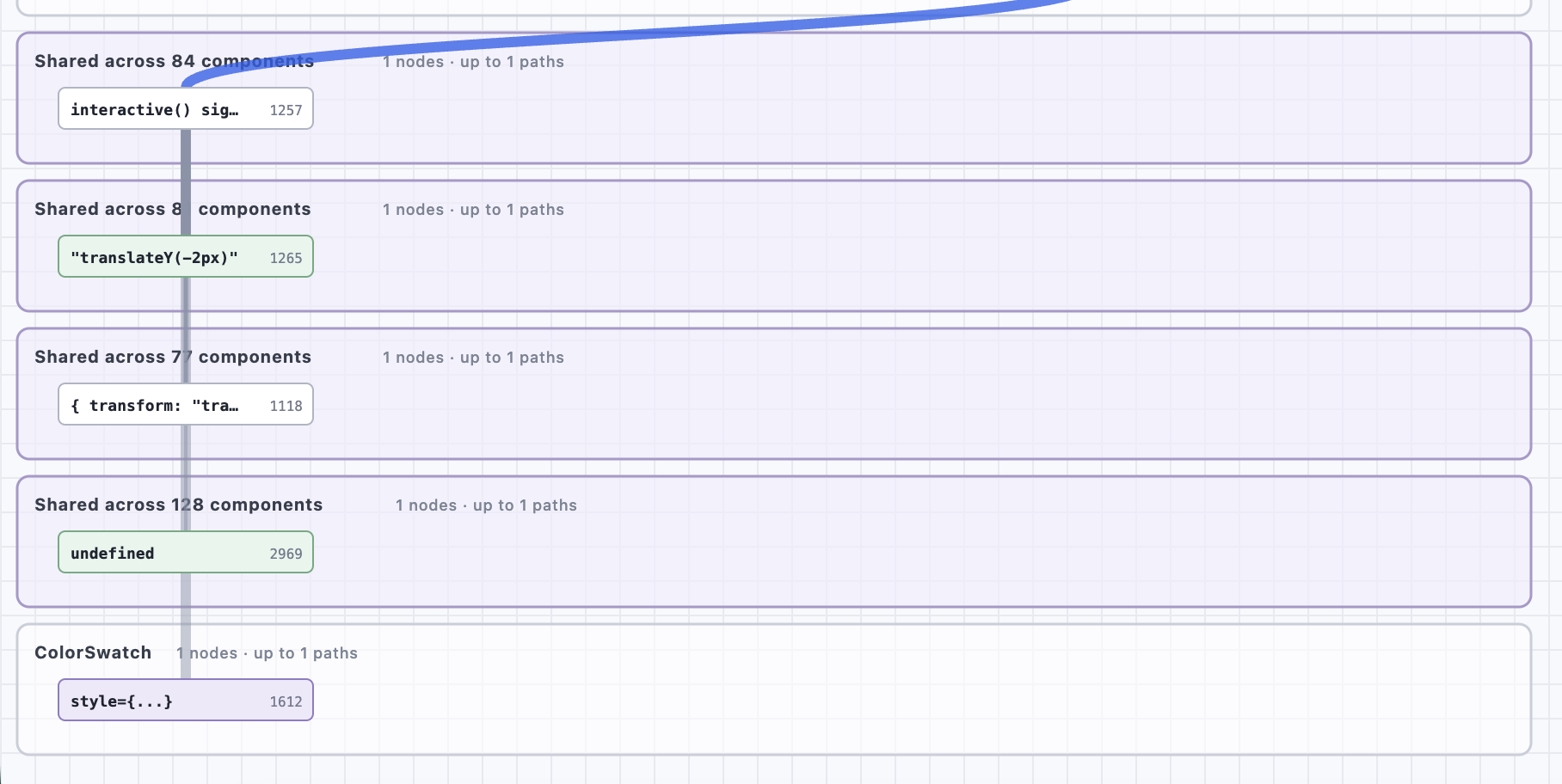
undefined made the ranking problem hard to ignore.The last improvement in this family was small but important: distinguish the actual route entry from the first component retained in a trace. A long path needs to tell me whether I am looking at the route root or merely where the available evidence starts.
The force-directed topology experiment
The card lanes kept trying to make one path legible at full detail. What I still lacked was the big-picture connectivity. I wanted to zoom out, connect dots with lines, and see the component structure around a route.
The first force-directed version was immediately more fun. That matters. I could move around, spot clusters, and form questions before reading every label. It was also a mess in predictable ways.
Common primitives such as Button consumed a huge amount of edge space. The better representation was not another pile of arrows. A high-degree shared reference could become a hub color, with a small matching ring on each connected node. The graph would preserve the fact of the relationship without giving every relationship a separate line.
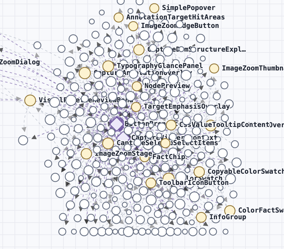
Button was the first obvious case where an explicit edge per reference was the wrong visual vocabulary.The graph also changed the value of every pixel around it. Tall toolbars that were acceptable on a report page were expensive here. I kept asking to combine controls until the interface occupied two compact rows.
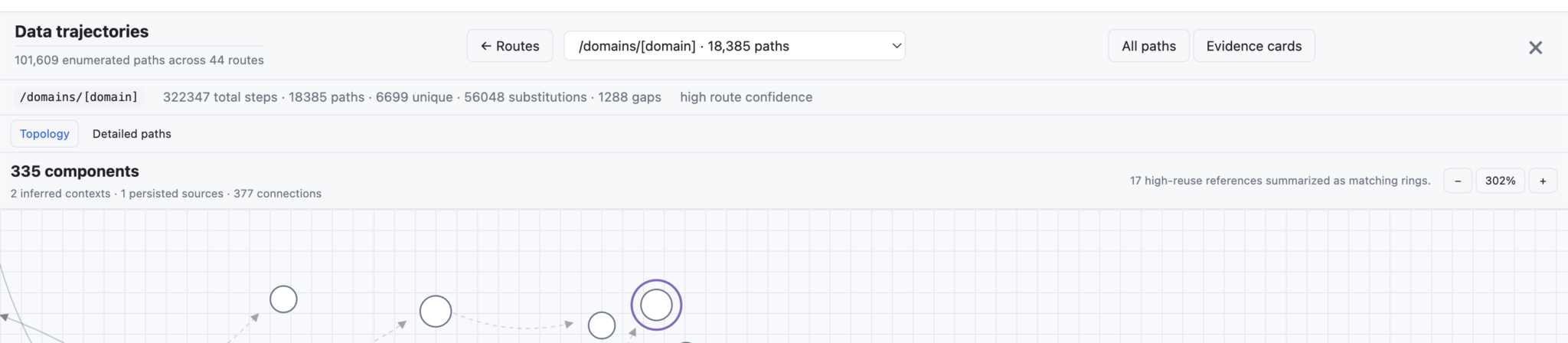

Learning what not to draw
Most of the remaining iteration was subtraction. The purple context diamond and its surrounding edges formed a rat's nest. ButtonPropsContext occupied a large part of the canvas even though it was implementation detail for a common UI primitive. Components from unrelated routes appeared because they happened to use the same shared component.
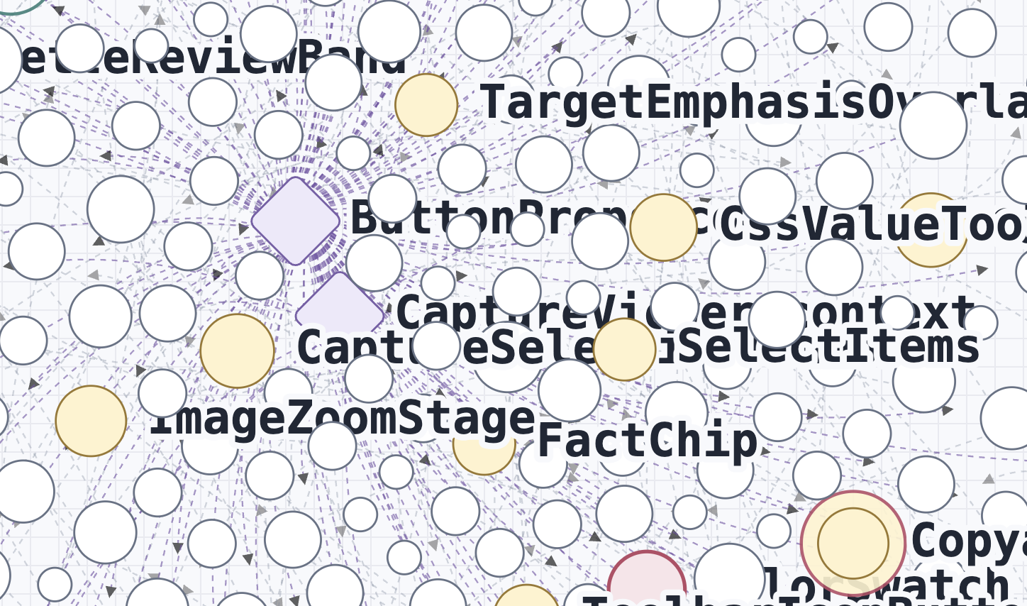
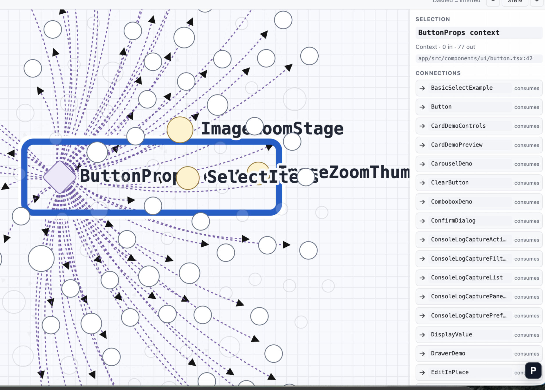
ButtonPropsContext did not warrant this much attention.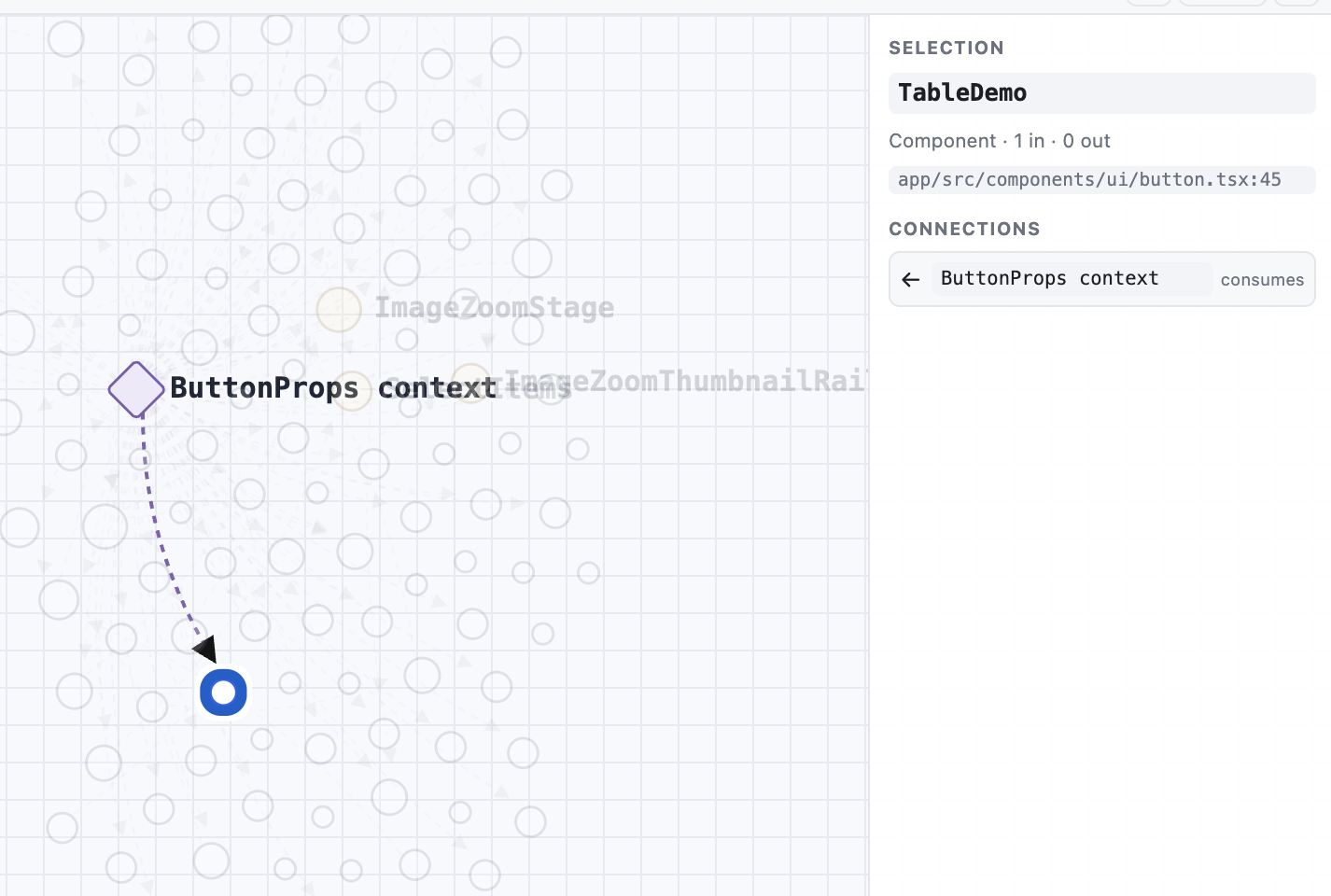
Once the graph was route-scoped, disconnected nodes became suspicious. So did connected nodes placed far apart. A force layout can optimize an abstract energy function and still violate the visual meaning I expect: if two nodes are each other's only relationship, they should probably be close.
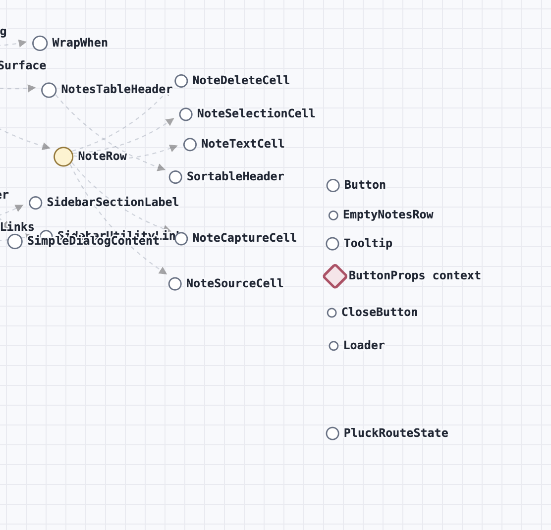
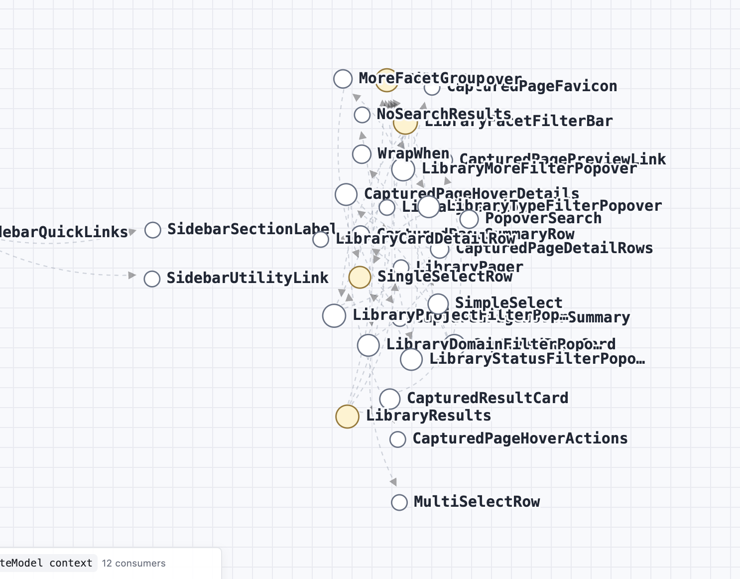
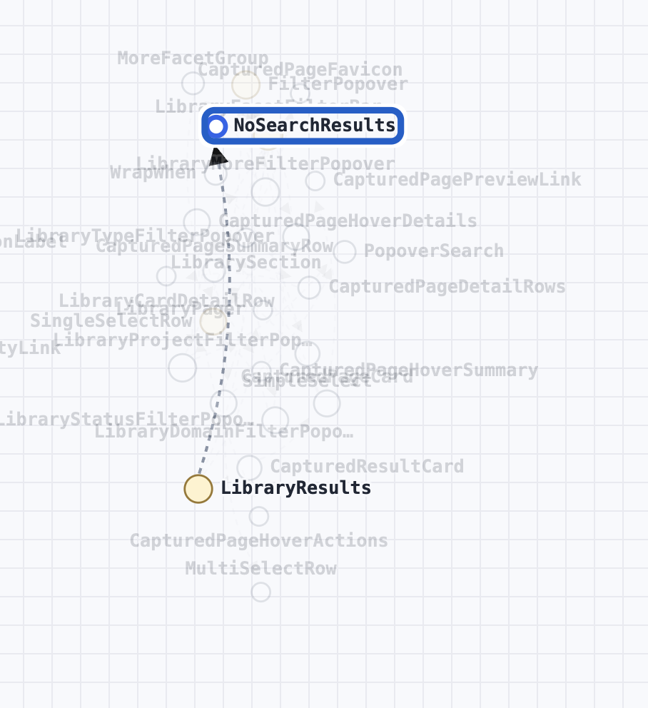
Removing noise cannot remove structure. When the Library filter route lost the component that tied its children together, the graph became cleaner and less true. The same thing happened when thick hub rings covered labels.
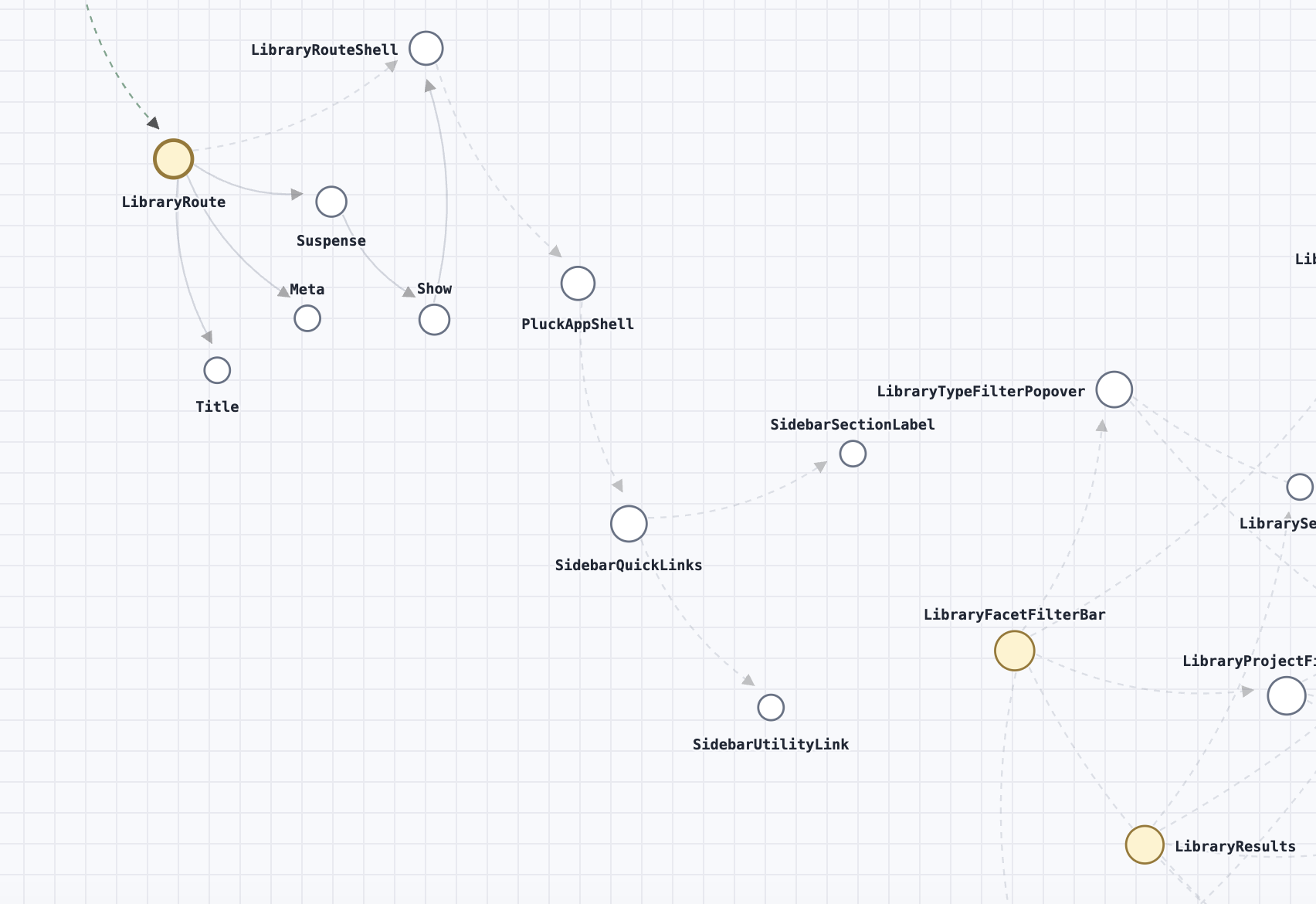
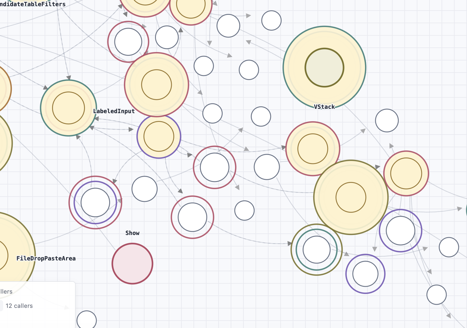
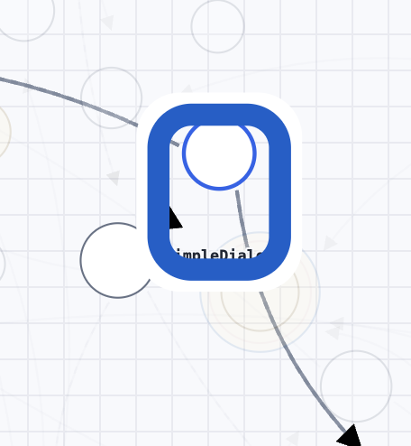
Lucide icons were another high-degree family. The useful fact is usually that a component renders one or more icons from lucide-solid, not that every icon deserves an arrow across the graph. Grouping the package into a ring preserved that signal.
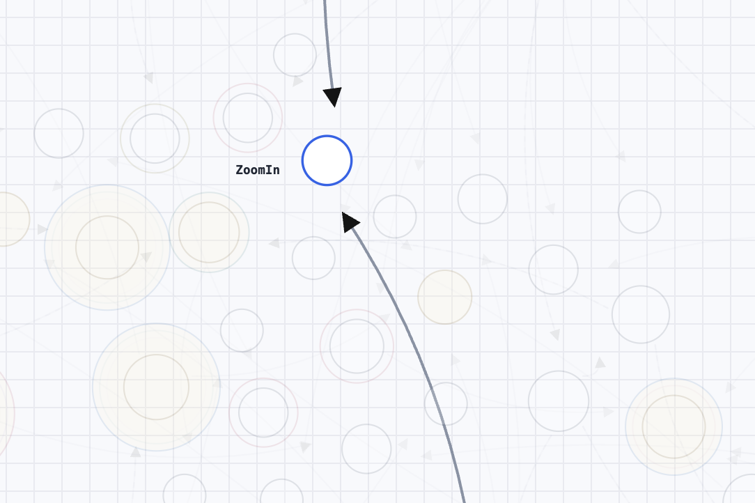
Keeping the graph truthful
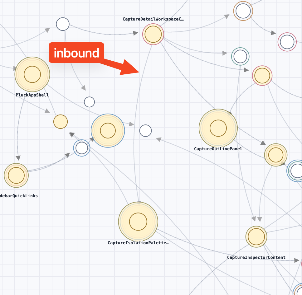
The topology was getting visually close while still missing the part I originally cared about: how data arrives. On the capture inventory route, a createResource calls a server handler. That boundary needs to appear. Otherwise the graph explains component topology while stopping just before the source of the data.
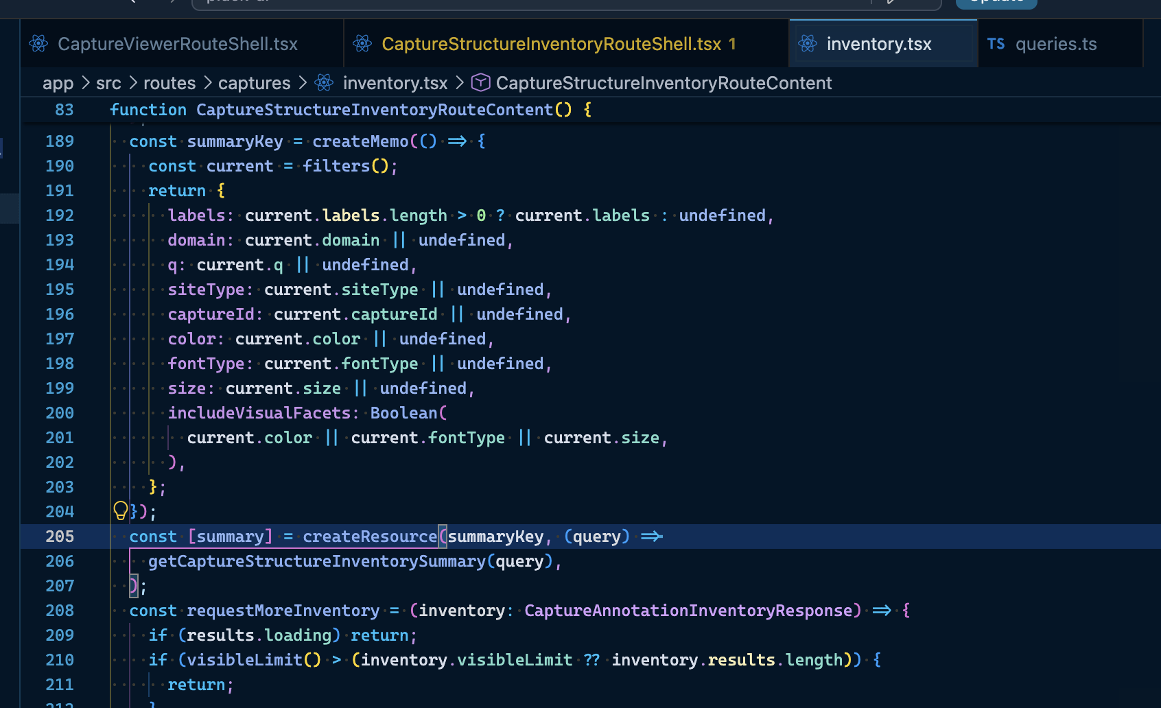
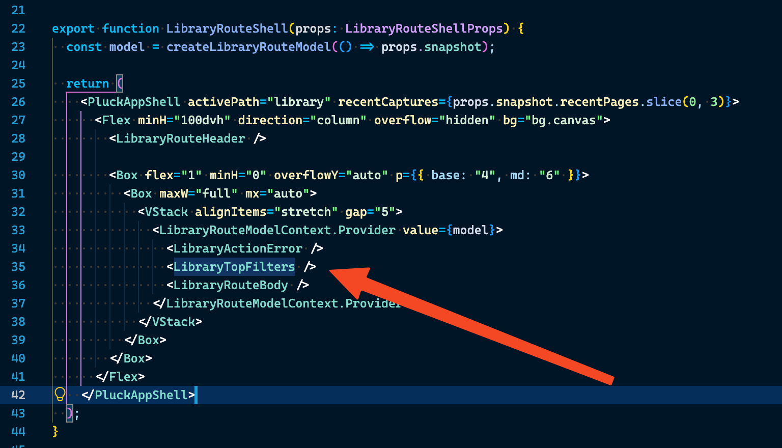
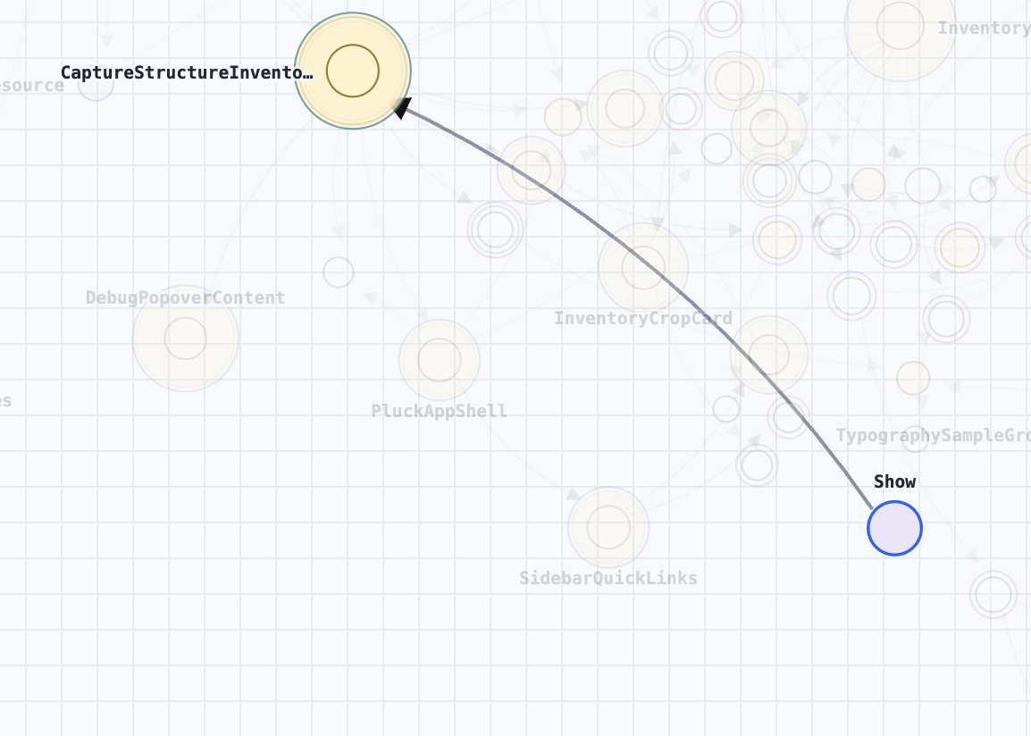
createResource and server source were exactly the incoming path I wanted to see.Adding upstream traversal introduced another class of false structure. A Show appeared as if it wrapped a route shell even though that connection did not exist in the source. Suspense could also close a cycle. Then a broad cycle-prevention rule hid legitimate inbound lines.
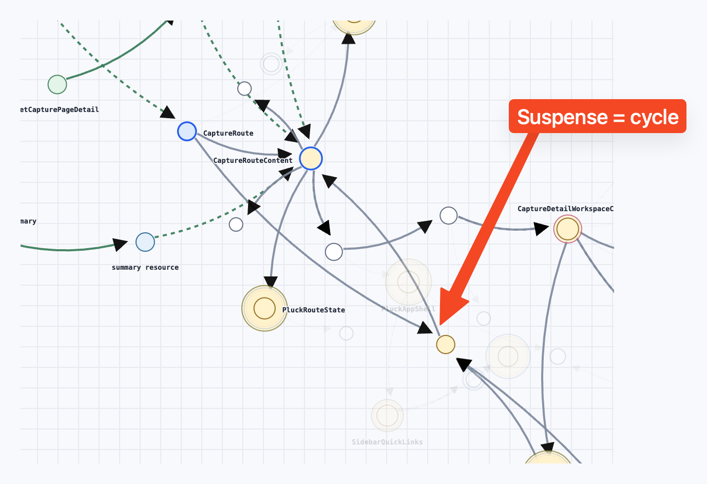
Zoom created a separate legibility problem. If text shrinks with graph coordinates, there is no useful zoom level: zoom out and the labels disappear; zoom in and the overview disappears. Labels need screen-space behavior so that zoom changes topology scale without making text impossible to read.
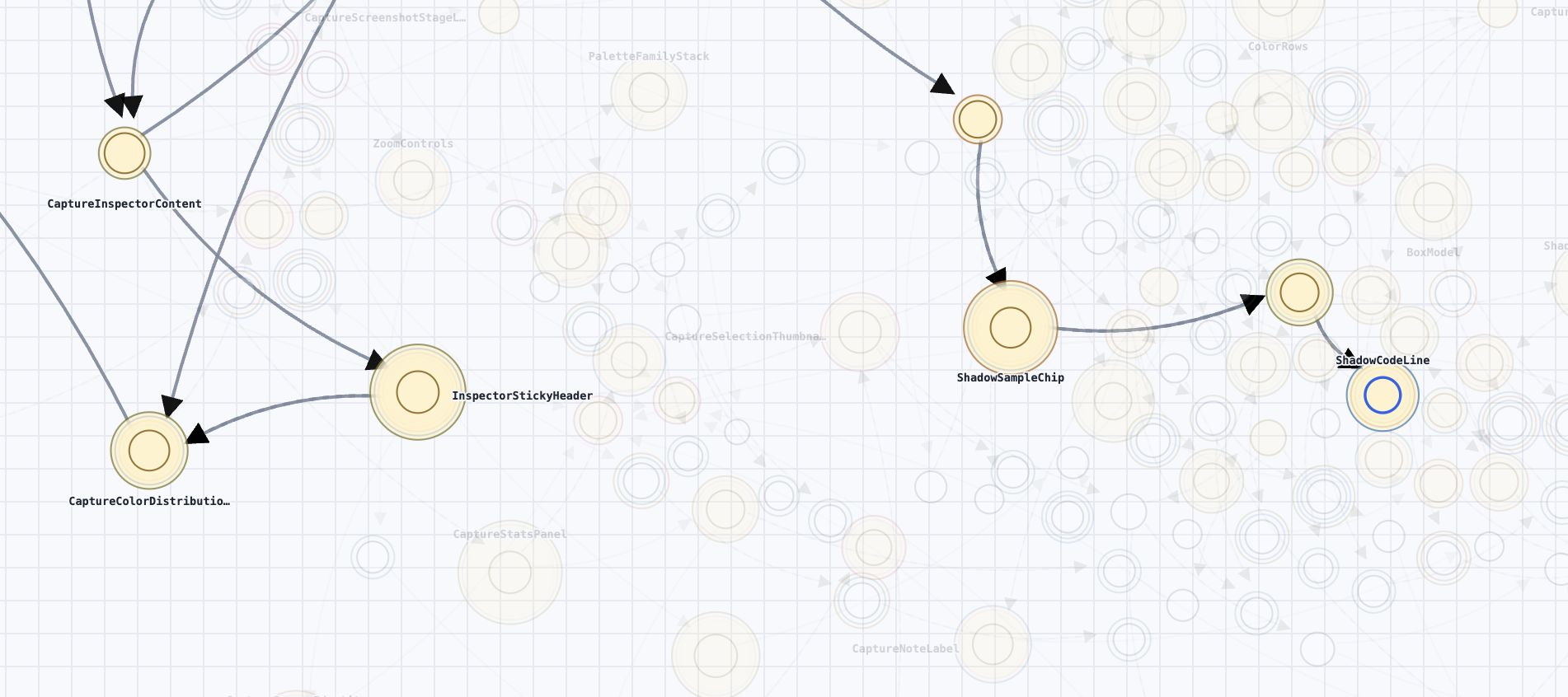
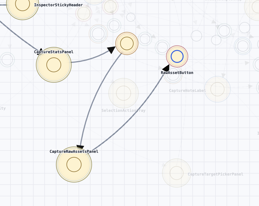
Finally, cycle prevention had to be edge-specific. “This node is reachable somewhere downstream” does not mean “this inbound edge closes a cycle now.” The graph should keep legitimate direct inbound relationships and reject only the particular edge that completes the loop.
The view that is starting to work
The current overview is still dense. It should be. The route is dense.
What feels different is that the density now has levels. The full graph provides shape. Common shared references are summarized. Data sources remain visible toward the edge. Component clusters occupy the center. Labels stay readable. The inspector is persistent but does not take over the canvas.
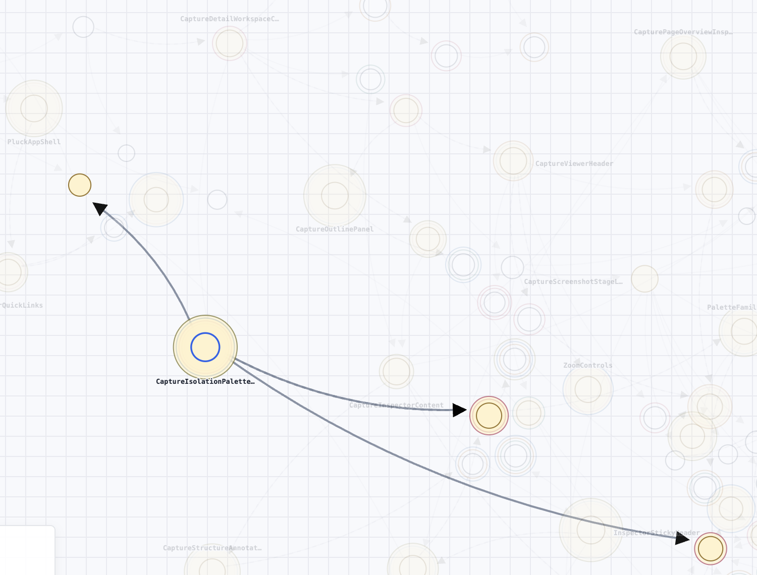
Selection then changes the job of the same map. The unrelated topology remains as faint spatial context while the selected component's contributors and consumers become the working view. This is where fading now feels useful. In the early card lane, fading removed content I still needed to read. In a zoomed-out map, it preserves where I am while letting a smaller subgraph come forward.
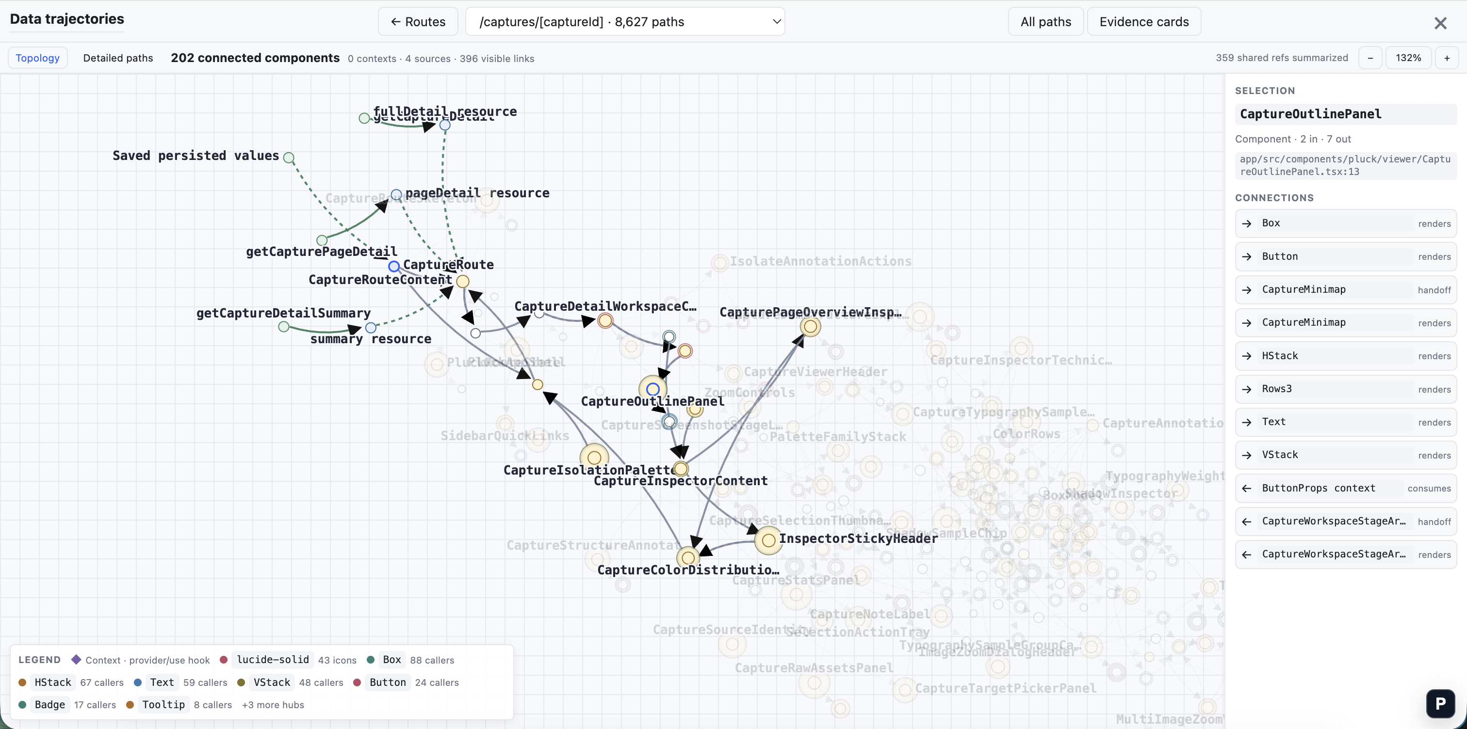
CaptureOutlinePanel turns the full topology into context for one inspectable neighborhood.The design rules I am taking from this
The graph feels better because several choices are working together:
- Start from a route. A universal repository atlas is interesting, but a route gives the graph a useful boundary and a concrete question.
- Draw explicit edges for relationships worth following. Summarize high-degree shared components, contexts, and icon packages with rings or hubs.
- Keep real hierarchy. Component boundaries, route entry, data sources, and terminal renderers should survive compression.
- Let geometry carry meaning. Single-purpose leaves belong near their parents. Unrelated routes do not belong in the graph. A disconnected node should be explainable.
- Keep labels in screen space and details in progressive disclosure. Zoom should reveal topology, hover should provide quick source evidence, and selection should open persistent detail.
- Treat every edge as a claim. False completeness is worse than an honest gap.
The main change in my own thinking is that “overwhelming” should describe the coverage of the analysis, not the treatment of every mark on screen. I still want all the paths. I just do not need all of them yelling at me at once.
Source: byronwall/tsx-data-flow