Draftably's diagrams looked like every other diagram tool: six pale pastels, the same tight padding everywhere, one sans-serif font. Nothing was wrong with them. They just weren't opinionated about anything.
I wanted two things. Diagrams should be easy to match to a design system. And the defaults should be varied and professional enough that you might not bother. The two things I most wanted to change were node padding and color.
Pick a direction first
Before any code, I had the agent compare a few approaches. It could recolor the existing pastels, build five independent style bundles, or build five presets over one shared set of diagram tokens. Recoloring keeps the same pale treatment and the same spacing. Independent bundles give the most variety but make a brand change painful. Presets over shared tokens give both: each preset has its own personality, and a design system only has to override one small vocabulary.
The one thing I added was that one theme had to be editorial, with serif titles, and that the type should vary across the set. A palette swap alone would leave every theme looking like the same tool.
This was the concept sheet. It was a drawing of the idea, not a capture of working themes:
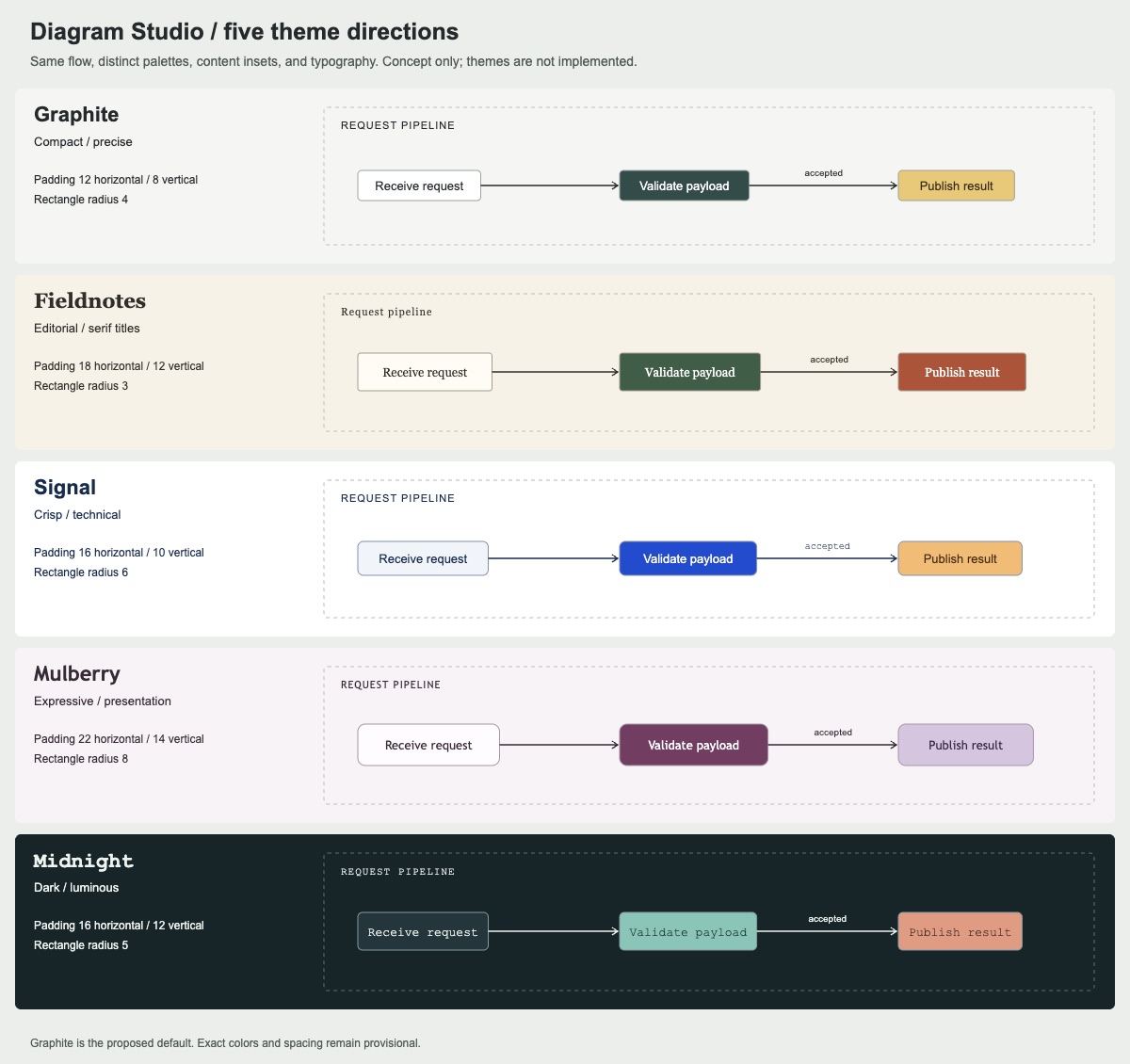
The same diagram, five ways
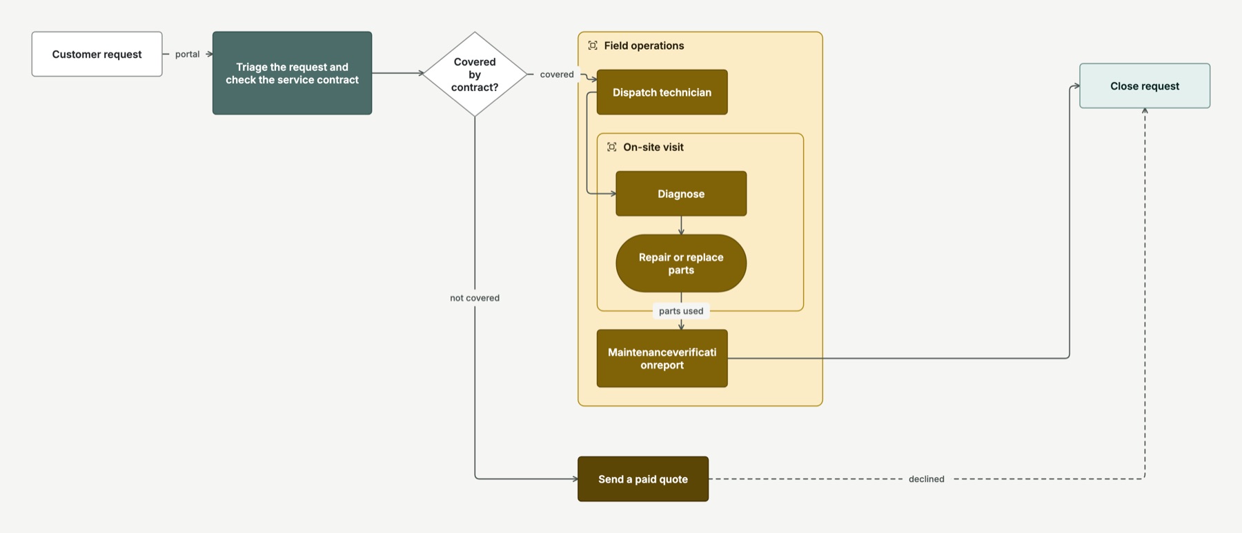
Here are the shipped themes. They all render one deliberately awkward test diagram: wrapped titles, a long unbreakable word, a diamond, nested groups, connection labels, one explicit size and one pin.
Graphite, the default. It is compact and mostly neutral, with deep green for the focal step and ochre for a branch.
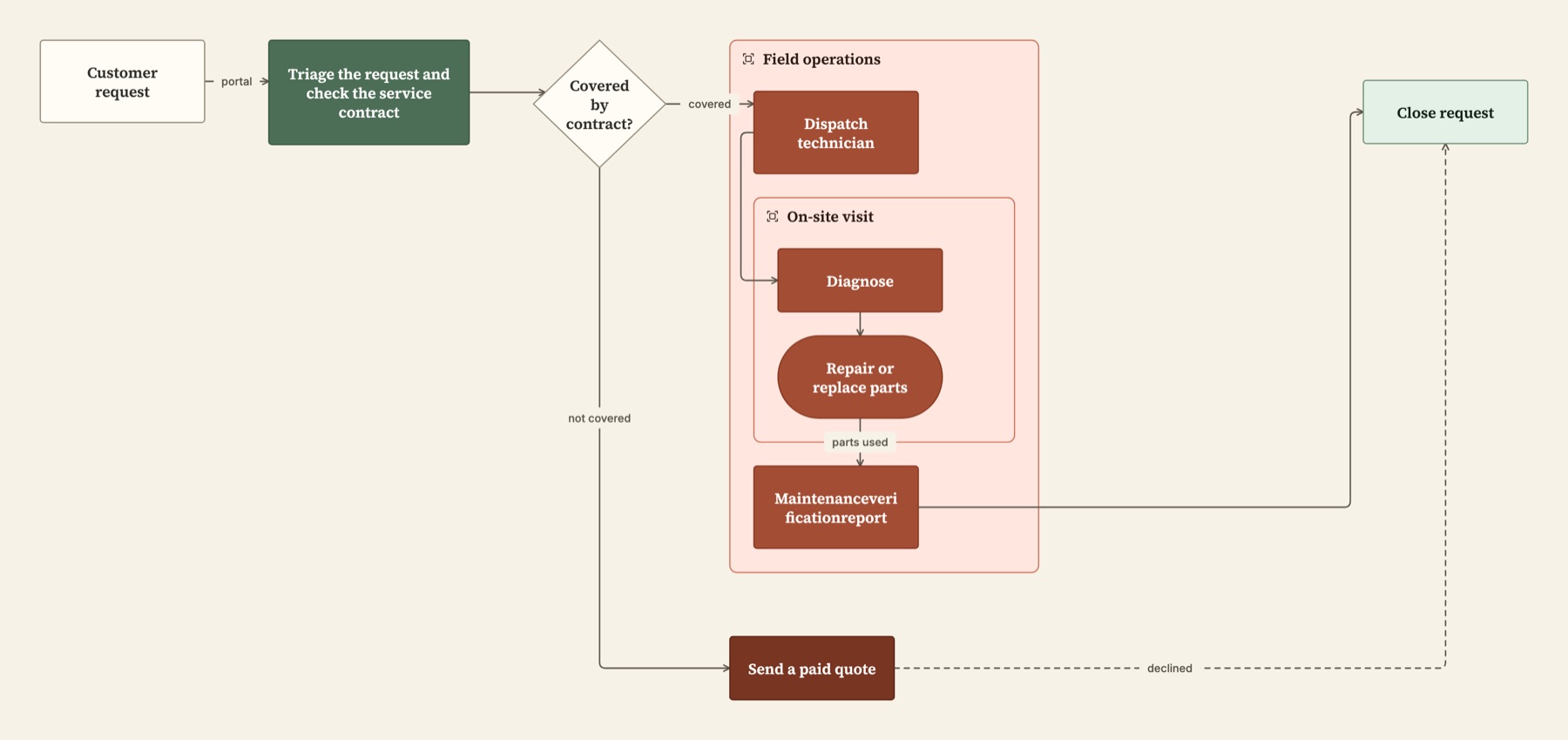
Fieldnotes, the editorial one. Source Serif titles on warm paper, forest and clay, nearly square corners and more vertical room.
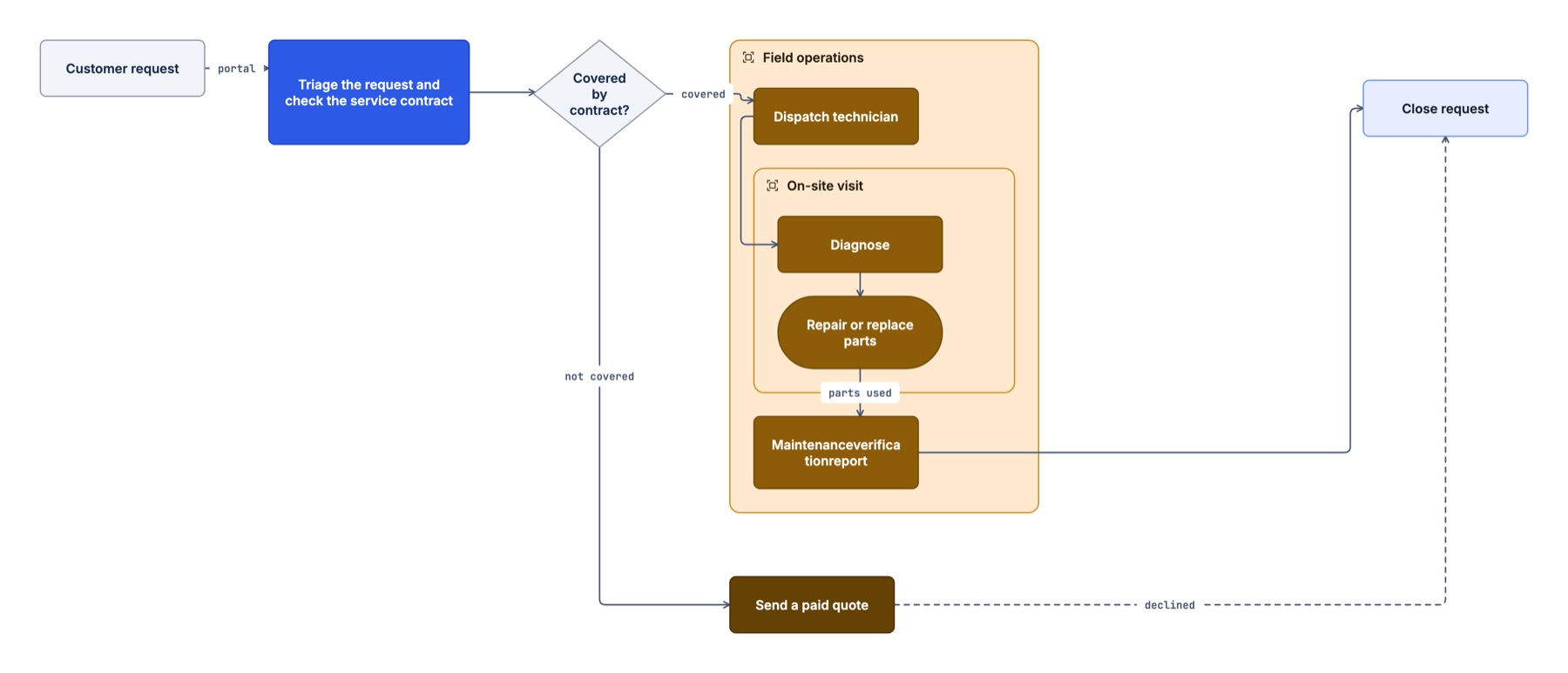
Signal. Solid cobalt for important steps on a white ground, with monospace connection labels.
Mulberry. Berry and lilac with the most generous padding. This is the presentation theme, for fewer and larger steps.
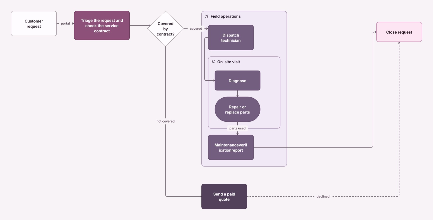
Midnight. Dark ink with teal and coral, and monospace titles. It is a full theme, not an inverted light one, so it exports correctly against its own background.
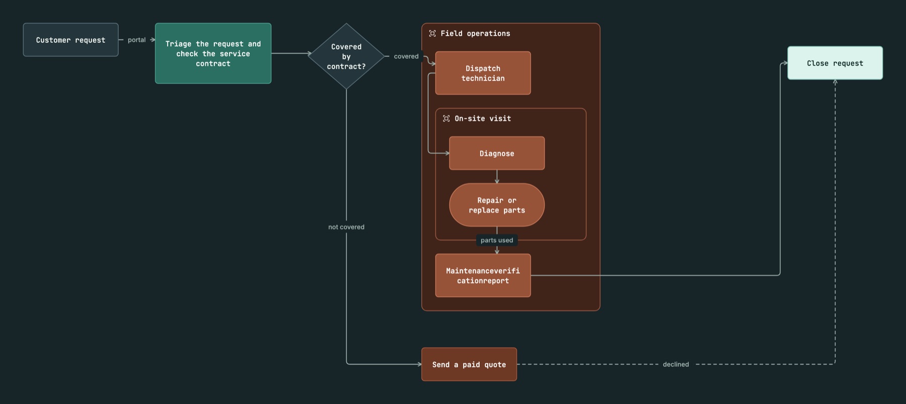
The long word breaks mid-word, "Maintenanceveri / ficationreport", in every theme. That's what the fixture is for. It fits inside the box, but the break isn't pretty.
Padding moves things. Color doesn't.
The difference between those themes isn't only color. Padding and title fonts change node sizes, so they change the layout. Mulberry's diagram is visibly taller than Graphite's. Colors and shades never move anything.
That shows up when a diagram names its own colors. This RAG assistant example asks for blue, mint, amber and violet directly, so those families stay put across themes. The theme still changes the canvas, type, spacing and neutral surfaces:

So if you want a theme to really own a diagram, use primary and secondary instead of named hues. Those are the theme's own accents, and they change with it.
Getting text to fit
The hard part wasn't picking colors. It was making text wrap the same way everywhere. The compiler sizes nodes, the viewer draws them, and the CLI exports SVG without a browser. If any of the three measures a serif title differently, a label overflows in one place and not another.
So the fonts are bundled (Inter, Source Serif 4 and JetBrains Mono) and the compiler wraps titles using stored width tables for them. The compiler, the canvas and draftably inspect --svg all break lines identically, and exports embed the fonts they use. Explicit sizes stay exact. If a title doesn't fit a size you set, you get an overflow note rather than a silently resized node.
Each color family also has numeric shades from 50 to 950. Lower is always lighter, even in Midnight. The shades are generated so that title text stays at 7:1 contrast on pale fills and 4.5:1 on dark ones.
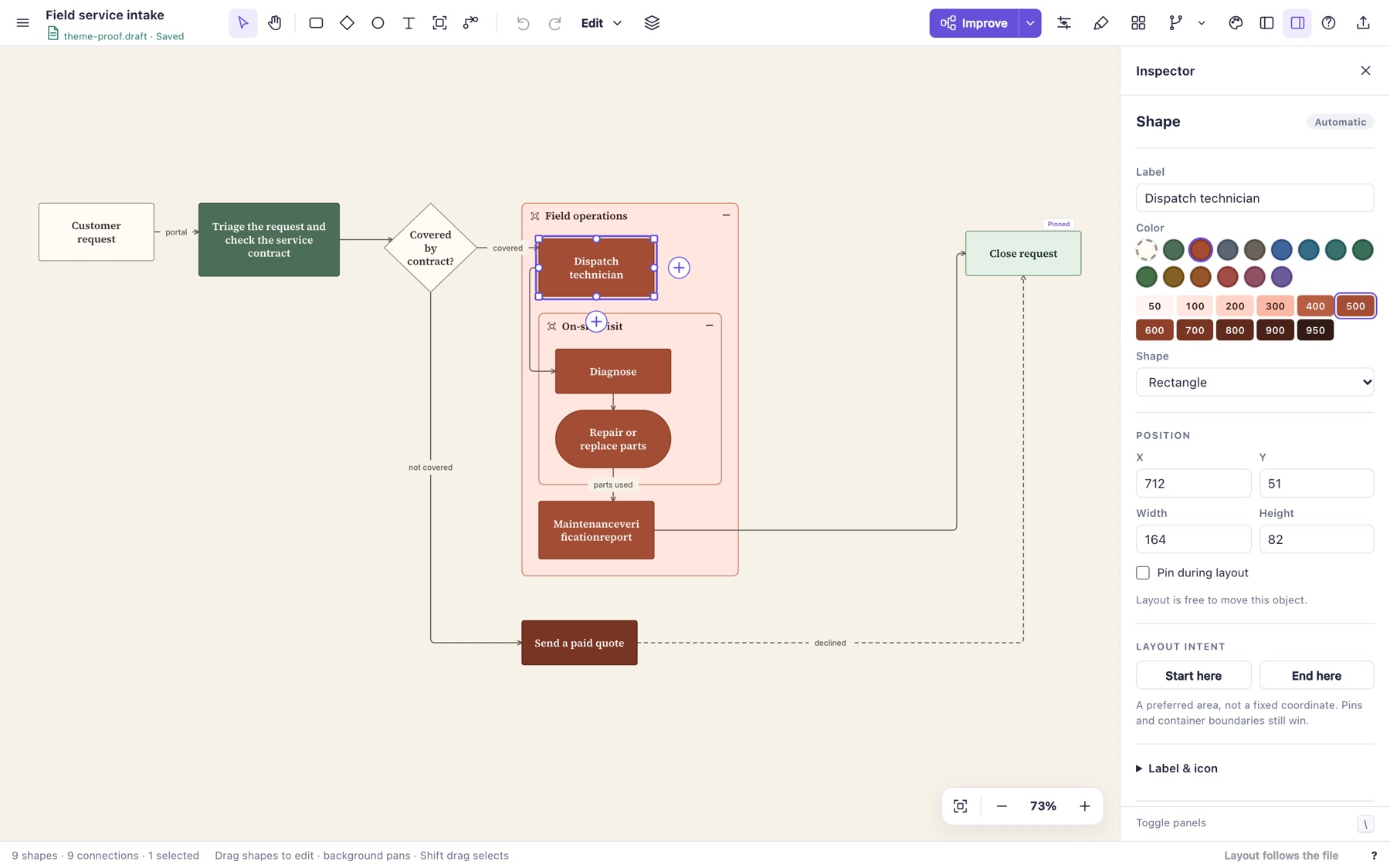
It lives in the file
A theme is one line of the diagram file, and anything you don't write comes from the preset:
theme fieldnotes padding-x=18 padding-y=12 radius=3 title-font=serif
theme-color brand shade=100 fill="#EAF1ED" stroke="#9AB4A4" ink="#244431"
theme-color brand shade=800 fill="#244431" stroke="#244431" ink="#FFFFFF"
node focus "Main step" color=brand shade=800
That brand family is the design-system escape hatch. You define the few shades you actually use, and every node can reference them. The viewer's Appearance menu rewrites the theme line, clears the old preset's overrides and keeps your own brand colors.
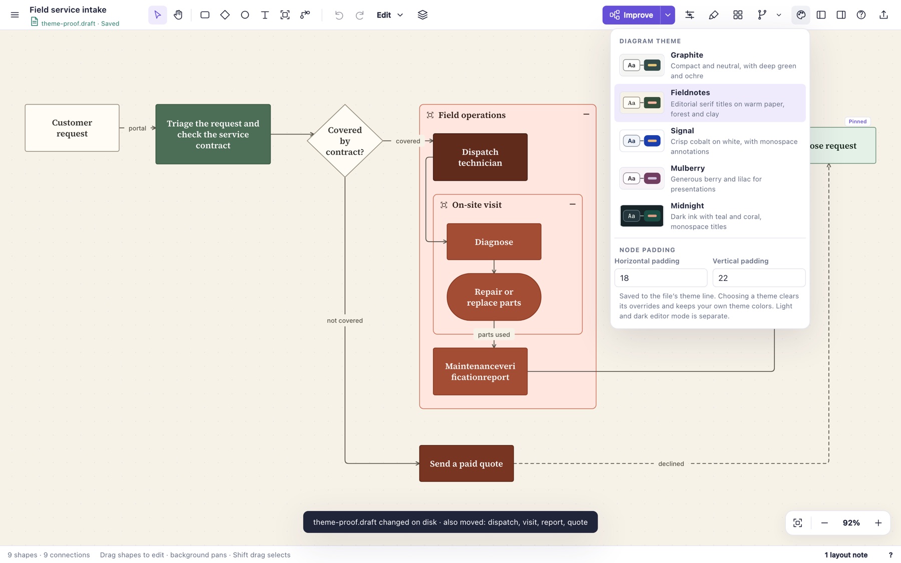
Because the theme is in the file, an agent can set it as easily as I can. The next test is matching a real design system with only a brand family and a few overrides. That will show whether the token set is small enough.
Source: byronwall/draftably