This project started as a 50-minute voice memo about two things that kept collapsing into each other: a better brainstorming interface and a hosted AI use-case generator.
The first version of the idea was much broader than the product that exists now. I was thinking about grids, nested cells, zooming, tagging, saving, alternate dimensions, personal profiles, lead generation, and what happens when a brainstorm needs to turn into actual work. There were enough ideas in the memo to build several products.
The useful move was to pick one end state: upload a resume, find a handful of AI opportunities that fit the work, and leave with one practical next step.
The public source is byronwall/finy-my-ai-fit.
Starting with the giant dictation
My first Codex prompt did not ask it to start coding. It asked it to separate the product from the backlog:
Run through the transcript from a dictation I did in brainstorming-tool-and-ai-use-case-generator-with-hierarchical-grid-ui.md .
Capture all the unique jobs to be done. I was describing several different things. My goal is to get a live site running with the "real" ai use case example using some sort of the grid display described. I don't want to lose all the other ideas thouhg. So process it all and generate some markdown docs.
That produced a set of jobs-to-be-done, an MVP spec, a grid model, a preserved opportunity backlog, and a complete HR business-partner example. This mattered because the memo itself kept changing altitude. One minute it was about dropping in a LinkedIn PDF. The next it was about a general-purpose hierarchical brainstorming surface.
Two lines from the dictation became the product boundary:
Just a simple drag your LinkedIn profile PDF over into our form, we run it through, use case audit, and you're off to the races.
And later:
How's this thing end?
The answer could not be “keep exploring the grid forever.” The end needed to be a small plan or a prompt that moves the user into real work.
Mocking the shape before building it
Once the product documents existed, I asked:
Looks good, use $imagegen to build mockups
The generated direction was warm, editorial, and fairly conservative: ivory canvas, forest green, serif headlines, and a dense three-by-three grid. The mockups were useful because they made the interaction concrete before the application existed.
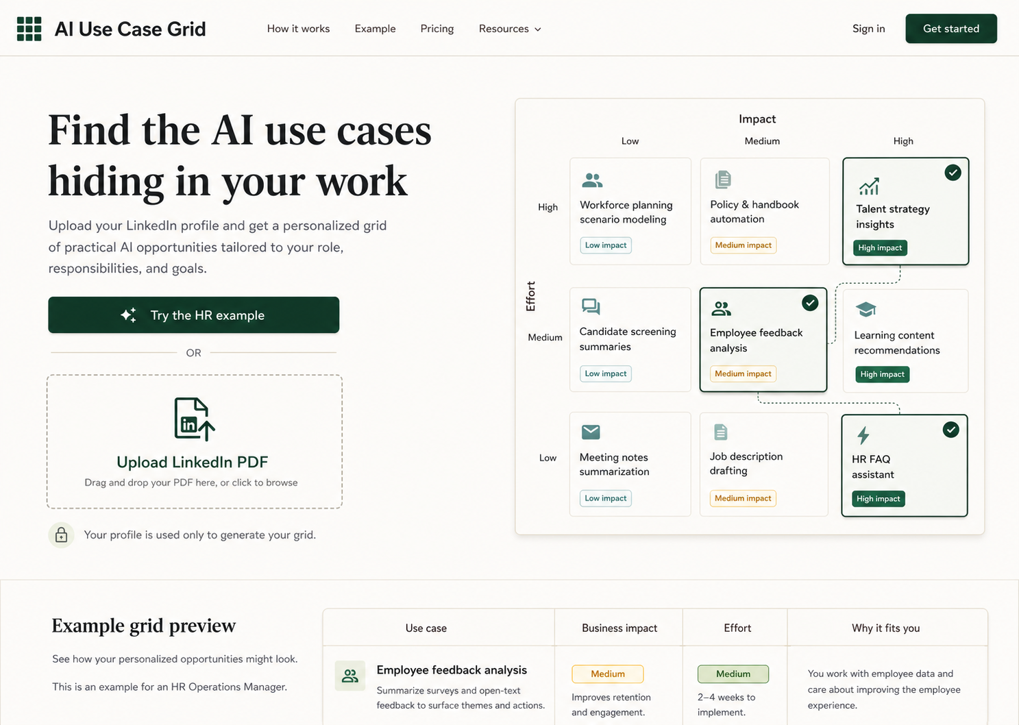
The first working application followed that direction closely. It had the grid, feasibility badges, selections, saved ideas, hidden ideas, cell-level “Explore this area” actions, and a detail inspector.
It worked. It was also doing too much.
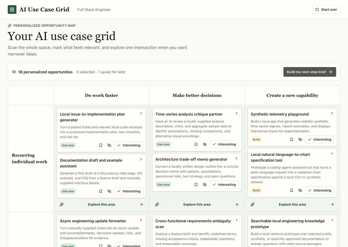
The visible problem was density. The deeper problem was that I had not yet decided which interaction was the product.
Reworking the input and generation flow
A second dictation was more specific about the path into the tool. It called for resume upload, better grounding, a small preference step before the expensive generation, stable loading states, model traces, and a clearer final conversion step.
Codex split generation into stages:
- Extract profile facts and propose several grounded directions.
- Let the user select any number of those directions or continue broadly.
- Generate the full opportunity grid after that choice.
That change bought two things. It reduced the chance of generating a detailed answer in the wrong direction, and it gave the user a quick way to steer without turning the landing page into a questionnaire.
The input also got simpler. The entire landing page became a PDF drop target. Optional context stayed optional. Once a resume was attached, the 0/100 helper disappeared so the interface did not imply that another hundred characters were required.
The current landing page is much more direct than the original mockup:
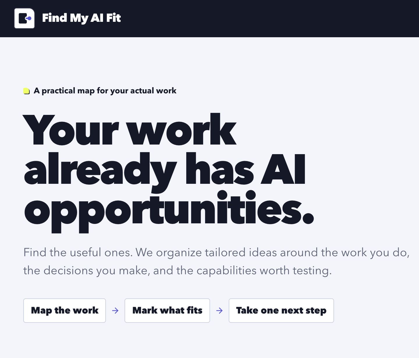
The design moved from warm editorial SaaS to a sharper system built from ink, periwinkle, citrus, and a cool canvas. The typography became larger and more blunt. The edges became harder. The upload path became the obvious place to start, while the HR example moved into a fallback role.
The grid became a checklist
The biggest product improvement was subtraction.
At one point the grid supported saving for later, hiding, opening a detail inspector, and generating narrower ideas from each cell. Those were all reasonable features in isolation. Together they made the user solve the interface before solving the actual problem.
My prompt finally stated the simpler model:
For the final grid of answers, I think I really want the main cell to be clickable as "interesting". I thnk that really is the only thing that is needed. The other optiojsn to save for later and hide are not really needed here. This is a simple checklist exercise in my mind now.
Check items (or narrow) -> build brief -> done.
The inspector disappeared. Save and hide disappeared. The entire card became the “Interesting” control. The sticky header shrank and kept only the actions that mattered while scrolling.
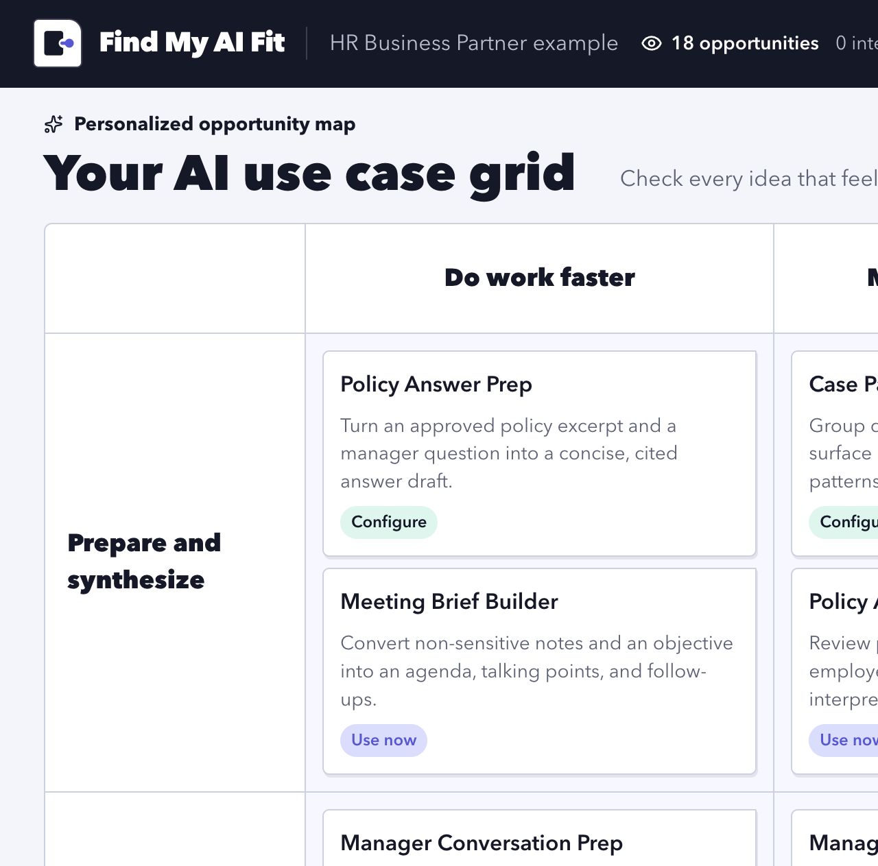
There was still a real need for exploration, but it did not belong eighteen times inside the matrix. This prompt moved it to one place:
Let's get rid of the "generate narrower ideas" button and flow. Instead have a single button in teh top right that says "generate more ideas...". It should then show a modal that offers choices/directions and a big text input for the user to give feedback.
The resulting dialog asks a few multiple-choice questions, accepts free-form direction, replaces the visible grid with a fresh set, and keeps prior sets in history.
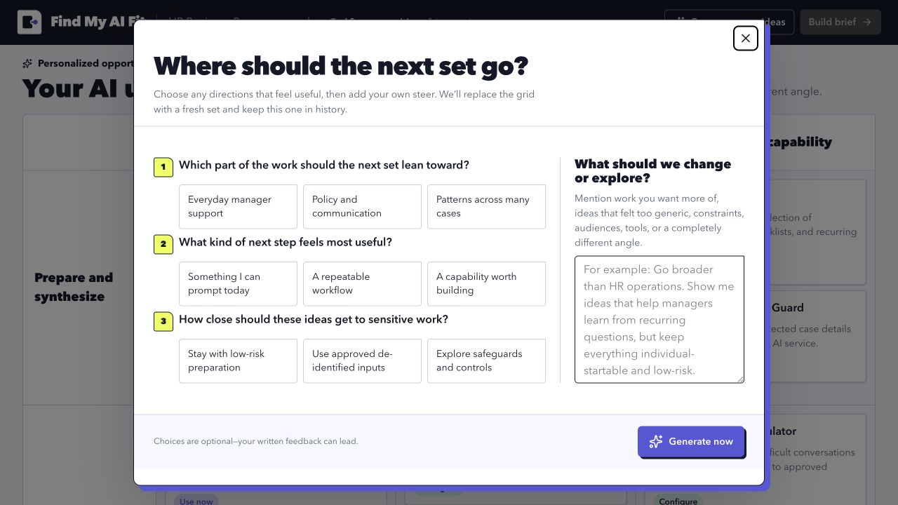
That feels like the right boundary. The grid stays readable. Deeper steering is available when someone asks for it.
Making the end useful
The final brief took several passes because it was easy to generate a lot of plausible text and call it an output. The first result still looked like a report about selected ideas. What I wanted was a plan.
I asked for the page to start with a more meaningful synthesis, show supporting details without flattening everything into one long document, recommend a starting point for each selected item, and render the prompt as normal prose even though the copy button still preserved the raw prompt.
The current brief leads with one first experiment. Selected tasks sit below as evidence. A user can copy the prompt, download the full brief, or ask for implementation help, but the useful result is not gated behind the lead-generation path.
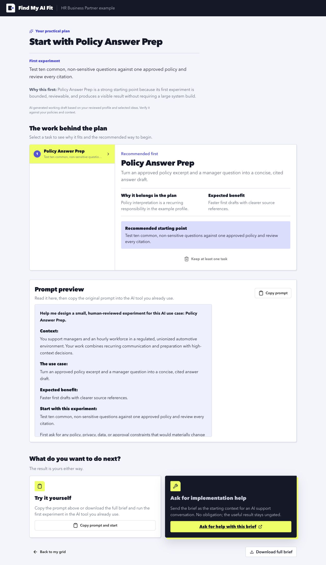
This is the main thing the early product thinking got right: the brainstorm has to end. The interface can help someone move from wide ideas to specific possibilities, but at some point it needs to expand one of those thin cards back into enough detail to do real work.
The branding exercise
The product started with the descriptive name “AI Use Case Grid.” It explained the interface but not the value. I used the Impeccable design work to define the audience and product role first: a useful standalone tool, a portfolio project, and a lead-generation experiment for working professionals.
Then I asked Codex to work through domain ideas in the actual Namecheap interface:
Given this discussion, give me 20-30 domain ideas. Use namecheap to verify they exist. I tried
aiusecases.combut it was taken and not very unique. Think of some interesting seams to explore, play with them, rate them, see what's working best, then check availablility.
This went unusually well. Codex explored naming seams instead of returning one undifferentiated list: personal fit, guided discovery, practical artifacts, and more active brand names. It checked 60 candidates in Namecheap and found 25 available normal-price .com domains. UseCaseCompass.com, PromptMyWork.com, and PracticalAIPlan.com were strong, but FindMyAIFit.com described the personalized resume angle most directly.
I bought it, then continued the same workflow:
Ok, I bought FindMyAIFit.com. Please generate a contact sheet of favicon + icon options. Do stuff that is simple and clean.
The icon pass included another useful check. One of my preferred marks was visually close to an existing software icon. Rather than treating the generated contact sheet as the finish line, I had Codex compare the mark, review likely conflict risk, and work through color variants using the actual product palette.
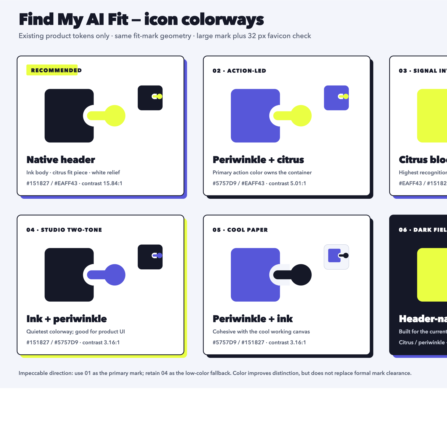
Codex then updated the Namecheap DNS records for the new domain, including correcting the www record for the self-hosted setup. The same tool that had helped search and compare names carried the process through purchase, icon iteration, and DNS configuration. That continuity was the best part of the branding exercise.
What changed my mind
The first mental model was a hierarchical brainstorming product with a use-case generator inside it. The current model is smaller: a resume-to-opportunity map that helps someone choose one useful experiment.
The grid survived because it makes a large answer scannable. Most of the controls around it did not survive. Progressive disclosure survived, but it moved into one “Generate more ideas” dialog and one detail area in the final plan. Lead generation survived, but it became an optional next step rather than the price of getting the result.
That is probably the useful default for this product:
resume
  -> grounded directions
  -> opportunity map
  -> mark what fits
  -> one practical plan
There are still broader brainstorming ideas in the original memo that are worth exploring. They no longer have to fit inside this application.