OpenGraph images are awkward to review one at a time. You can open the image route, change a query parameter, refresh, and repeat. That tells you whether one image rendered. It does not tell you whether the system still feels coherent across the homepage, blog posts, projects, long titles, missing artwork, and different image ratios.
I wanted to see the set, not guess at it. The useful artifact was a contact sheet made from the actual 1200 × 630 responses returned by the OpenGraph route.
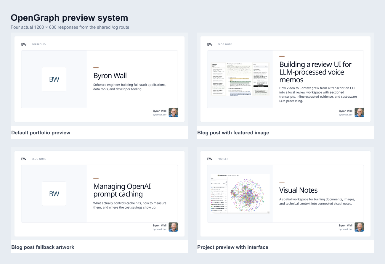
Render the real route
The first constraint was that these could not be mockups. Each cell needed to come from the same route that social crawlers would request.
The route accepts a title, description, section, and optional featured image. I made a small set of cases that exercised the meaningful branches:
- the default portfolio image;
- a blog post with a featured image;
- a blog post using fallback artwork;
- a project with a wide interface screenshot.
That was enough variation to make the shared structure visible without turning the test into a catalog of every post.
Collect the PNGs as browser assets
Opening the route in a browser proved that it returned an image, but browser screenshots were the wrong artifact. A raw image viewer can center, scale, or crop the response according to the viewport. Capturing the viewer risks testing the browser chrome rather than the OpenGraph image.
Instead, I loaded a temporary local page containing the four route URLs as ordinary <img> elements. The browser reported each image at its natural 1200 × 630 dimensions. I then collected those observed image assets and saved the PNG responses themselves.
The distinction is small but useful: the contact sheet should contain the server output, not screenshots of a page displaying the server output.
Assemble one review surface
Once the PNGs were local files, I resized each one to the same preview width, arranged them in a two-column grid, and added short labels underneath. The full-resolution files remained available for detail inspection, while the contact sheet became the fast comparison surface.
The grid immediately answered questions that were painful to hold in memory:
- Is the title scale consistent?
- Does a long summary crowd the footer?
- Does fallback artwork feel like part of the same system?
- Are interface screenshots being contained rather than cropped?
- Does the personal branding land in the same place every time?
It also made the intentional exception clear. The portfolio image could use a large portrait on the left while blog and project images kept the shared featured-card structure.
What the contact sheet caught
The first pass looked mostly right, but it exposed a missing portrait in the bottom signature. The WebP headshot worked on the site but did not render correctly inside the OpenGraph image pipeline. Looking at a single card, I might have accepted the empty space as a layout issue. Across four cards, the repeated omission was obvious.
The fix was to create a JPEG derivative of the current cropped headshot and embed it into the image render. A second contact sheet confirmed the portrait appeared in every shared footer. It also exposed that an older portrait was still being used by the homepage variant, which was easier to correct once all of the outputs were visible together.
That is the part of this workflow I want to keep. OpenGraph testing is not only a metadata check and not only a pixel check. It is a small visual regression set. Render a few representative cases, collect the real outputs, put them next to each other, and look for the thing that repeats.
Four images were enough here. That is probably good enough for most sites until the template gains another meaningful branch.