The first version of fawnix.rocks had a reading card, but it did not use the screen very well.
On desktop, the sentence editor sat near the top of the page. The rest of the viewport was mostly empty. The controls worked, but the page did not feel like a reading space. It felt like a small tool placed on a large blank canvas.
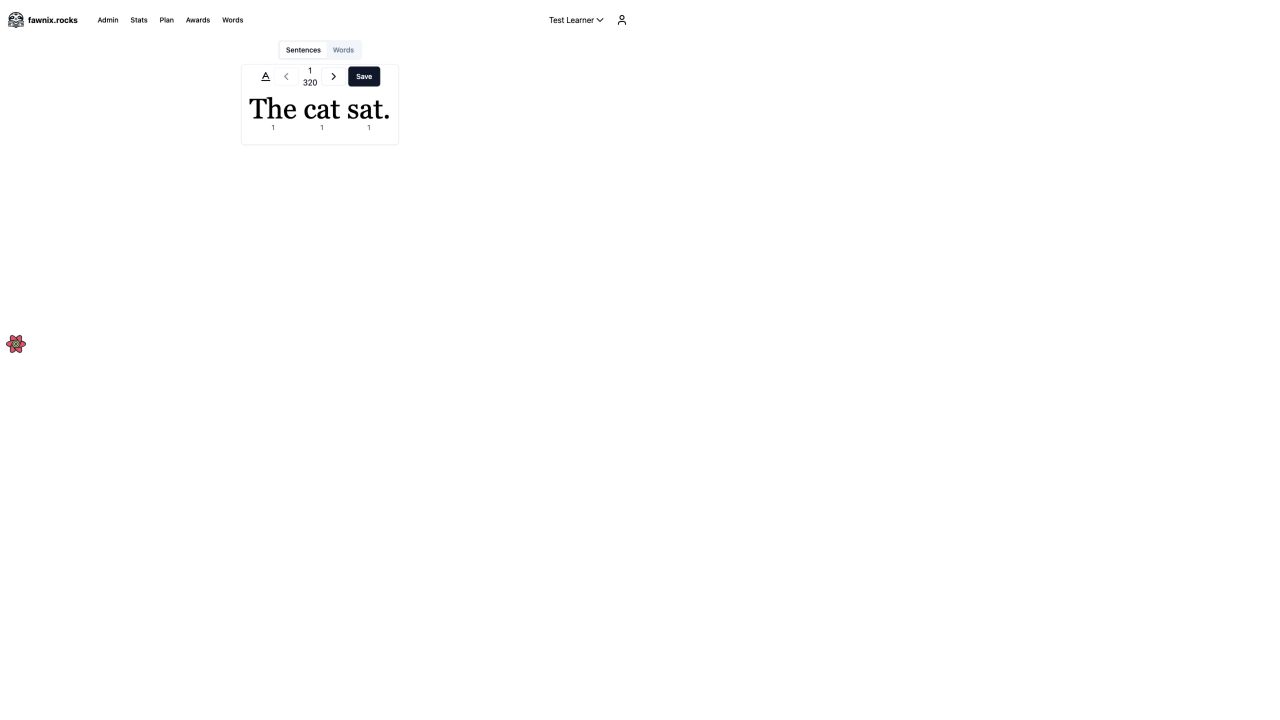
The baseline desktop reader had the right basic content, but almost no reading-stage presence.
The mobile version had the same problem in a smaller space. The controls were compressed into a narrow card, while the rest of the screen still had no useful job.
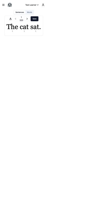
On mobile, the reading task was trapped in a small strip at the top.
The question was not whether the page needed more decoration. It was what the page should help a child do.
The screenshot comparison changed the direction
I used OX Alpha workers to compare the screenshots with the implementation and suggest possible directions. The useful part was not one perfect design answer. It was the contrast between several plausible answers.
The strongest direction was a calm reading-stage hybrid. It kept the warm tone of the existing product, but gave the sentence enough space to become the center of the page. The reader needed one clear object, a small number of obvious actions, and enough room for the words to feel readable.
The result uses a shared visual system across the reader and admin areas:
- a soft off-white page background
- dark ink-like text
- rounded cards with quiet borders
- restrained green actions
- amber reserved for celebration and focus
- larger serif text for the sentence itself
The visual system is shared, but the density is not. The practice screen should feel calm. The admin screens can carry more controls because their user is managing content.
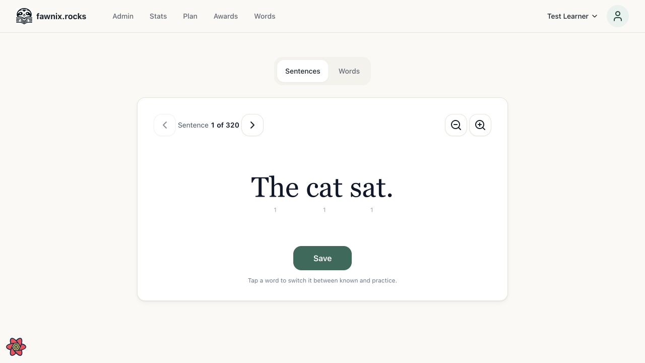
The desktop reader now gives the sentence a deliberate reading stage instead of leaving it in the corner.
On mobile, the header collapses, the tabs remain easy to find, and the card keeps the same basic order: navigate, adjust the view, read, then save. The layout changes shape without changing the task.
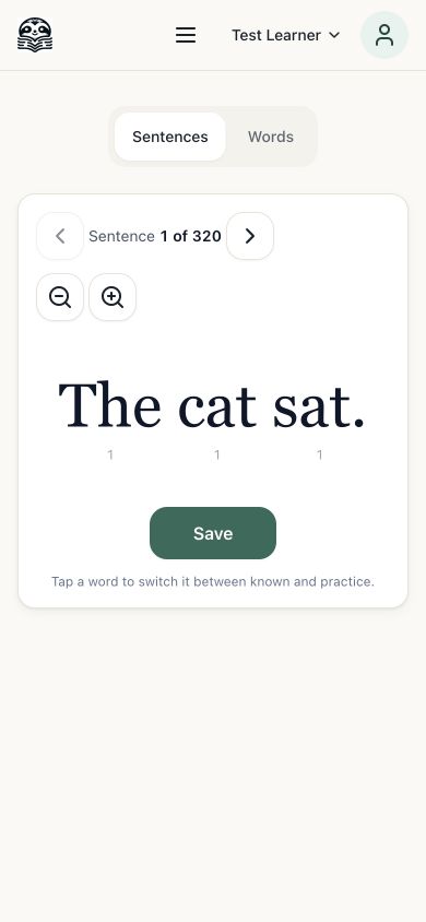
The mobile layout keeps the reading sequence intact while stacking the controls for the narrower viewport.
A child should not have to understand the layout before starting the practice loop.
The practice loop needed more than visual polish
The reader is built around short sentences and individual words. A word can move between known and practice states, and saving records the current work.
That creates a few accessibility questions. Are the controls understandable without relying on visual position? Can the practice state be identified without color alone? Does the interaction still work with a keyboard?
I worked through those concerns as part of the redesign. Words became real buttons with keyboard behavior, clear labels, visible focus, and non-color state cues. Icon-only controls received accessible names. Loading, empty, and error states became explicit parts of the interface instead of developer placeholders.
The content also exposed a repeated-word bug. Scoring matched words by their text, so tapping one occurrence could change every occurrence of that word. Scoring now uses each word's position in the sentence. One tap changes one word.
This is the kind of issue that a screenshot can reveal but cannot fully explain. The comparison showed where the interface felt wrong. The code and data review showed why the interaction could still fail after the layout looked better.
The admin screens had a different scale problem
The reading card only shows one sentence at a time. The admin list has to handle 320 sentences and 576 words.
A normal list can look fine when the first few rows are visible. It becomes a different problem when the browser has to mount every row, every action, and every piece of derived content at once. The admin pages needed search, editing, deletion, and generation controls without turning the whole page into one large render.
The target was a searchable TanStack Virtual list that mounts only 16 visible rows at a time. The sentence list still exposes all 320 records through search and scrolling, but the browser does not need to render all of them into the DOM at once.
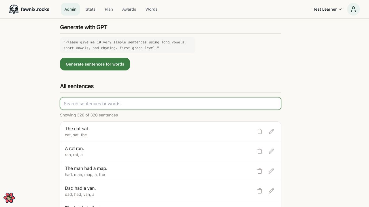
Sentence management combines generation, search, and row-level editing in one content workspace.
The words page has the same data-shape concern. It also has a separate add-words workflow because content entry is a different task from browsing the existing vocabulary.
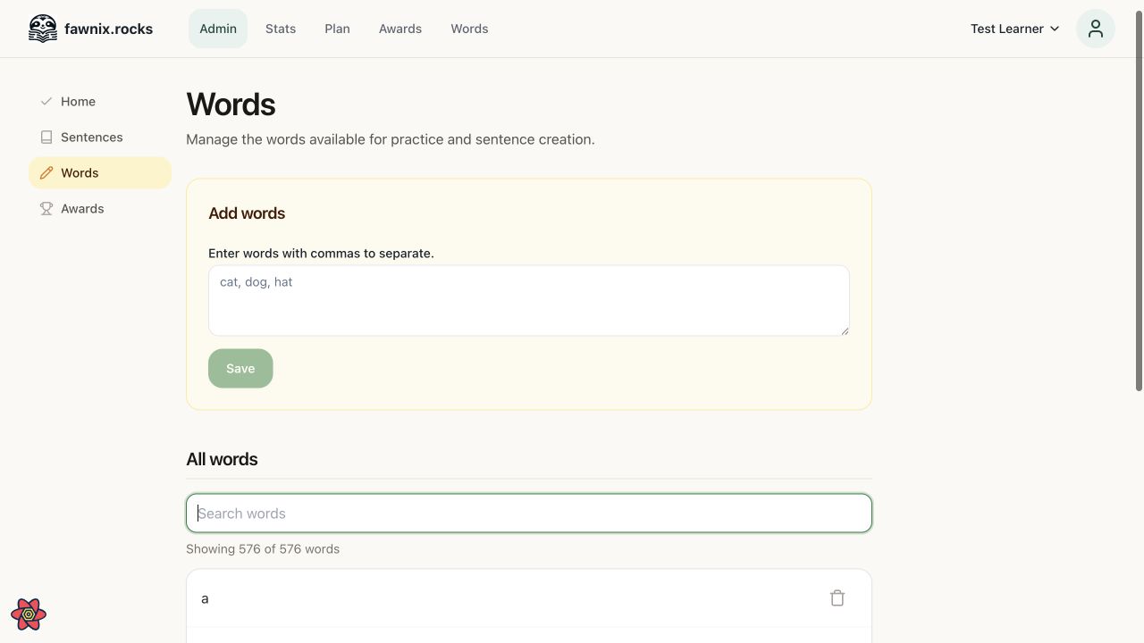
Word management separates adding vocabulary from searching the existing 576-word collection.
What OX Alpha actually bought me
The OX Alpha workers were strong at screenshot and code diagnosis. They could look at the baseline, identify the wasted viewport, compare design directions, and connect the visual problem to the relevant implementation. They also produced useful alternatives instead of treating the first plausible redesign as the answer.
They were capable of broad multi-file implementation, and the runs cost $0. That changes the economics of exploration. I could ask for a real design and code pass, inspect the result, and decide whether the direction was worth keeping.
The limits were just as clear.
Long runs often wrote their useful changes late. A worker could spend a long time reasoning through the task and still leave the most important implementation unfinished. The broad implementation also introduced three integration defects that were not obvious from a screenshot. The free daily rate limit stopped the virtualization worker before it could start.
Luna workers completed the virtualization and found the integration problems. They restored a missing global dialog, fixed mobile background scrolling, and replaced a browser API that did not match the application's support target. An independent browser pass then checked desktop, mobile, keyboard interaction, fixed-height lists, filtering, and the actual number of mounted rows.
So the practical model is not “the worker built the feature.” It is closer to this:
screenshot comparison
  -> design direction
  -> broad implementation
  -> independent TypeScript review
  -> browser review
  -> focused repair
OX Alpha was useful in the first two stages and part of the third. Luna was still necessary to complete the bounded implementation and repair the integration problems.
The redesigned fawnix.rocks is better because the work stayed tied to the actual user task. The reader now has a reading stage. The practice controls have clearer state. The admin pages acknowledge the size of the content. The worker comparison helped find the direction, but the final quality still came from checking what the code and browser actually did.