I plan larger pieces of work with a skill I call the software design sleuth. It takes dictation, notes, and the current repository and writes an initiative into docs/intent/: an intent brief, a shape brief, sometimes a plan and some research, and an initiative-map.json that tracks all of it. explorEDA has 14 of these folders now.
tk view already had an Initiatives tab. It listed each map as a card with its status, its milestones, and an expandable block of raw JSON. The font was small, and the documents were not there at all. The map is the index. The briefs are the part I want to read.
So I rebuilt the tab as a reader.
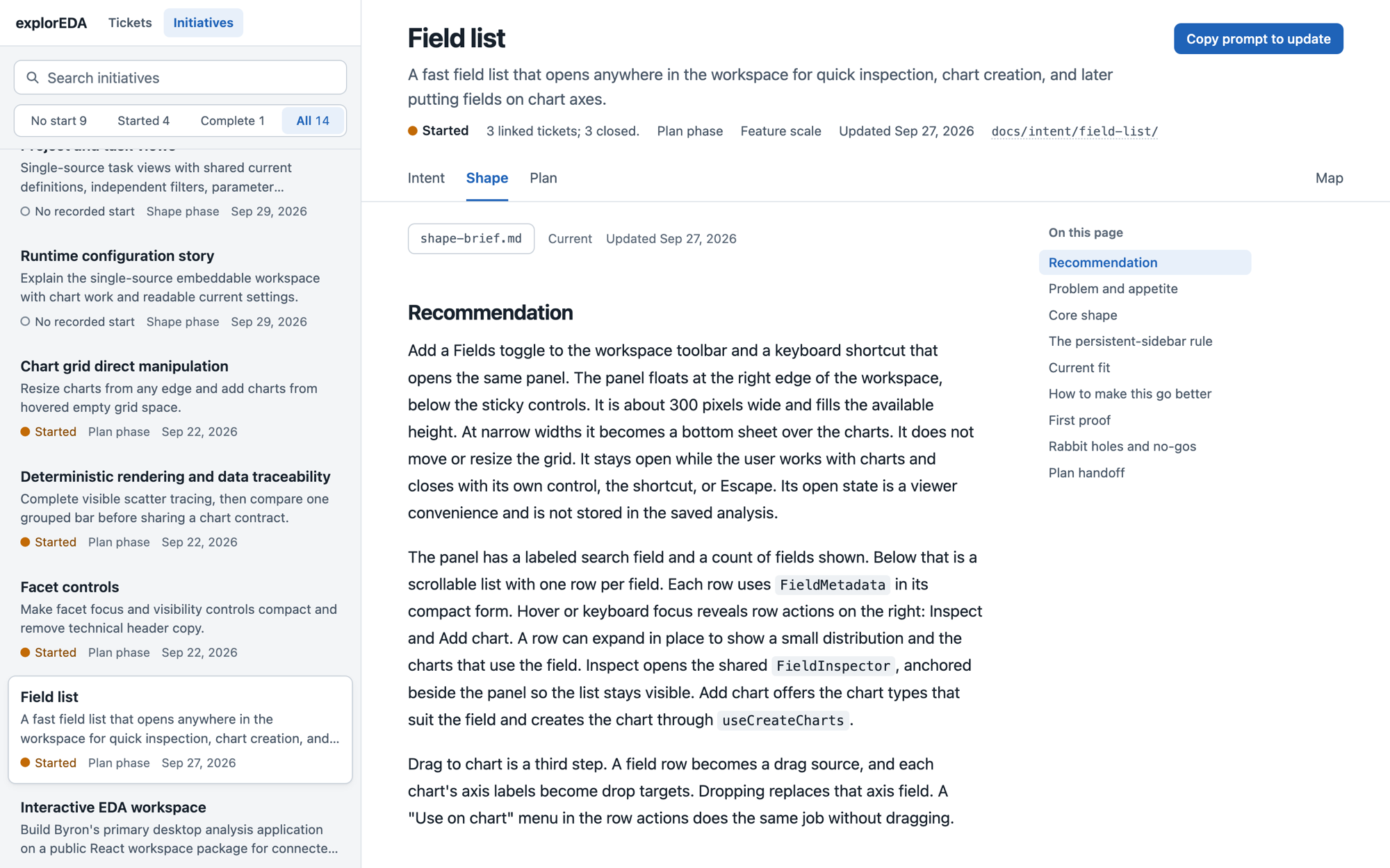
The list is on the left, with a search box and a filter for work status. Pick an initiative and the right side shows it, with one tab for each Markdown file in its folder. Intent, shape, and plan come first, then any research documents. Switching initiatives keeps the same kind of document open, which makes it easy to read one shape brief after another.
The document text is the largest type on the page, because this is the part I read. Tables, nested lists, and task lists render. A link to another Markdown file in the project opens in the reader, and Back returns to where I was. Wide windows get an outline of the headings.
The map without the JSON
I did not want to read raw JSON. But the map holds things the briefs do not: milestones, claims traced back to their sources, open questions, and a history of what changed. The Map tab lays that out as a page.
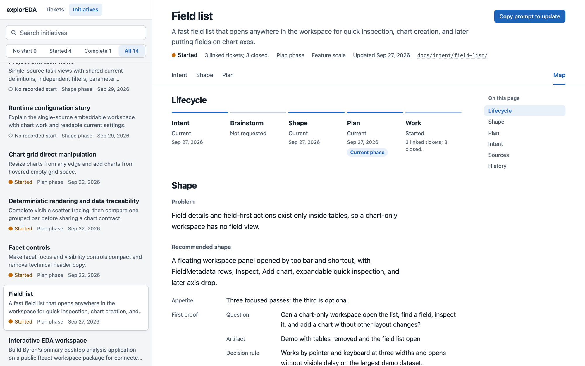
The lifecycle row shows which documents exist and which phase is current. Below it are the shape, the plan with its milestones and linked tickets, the claims, the sources, and the history. Clicking a linked ticket opens it in the graph.
The maps are not uniform. Across my projects there are 67 of them, and their fields differ. Any field without a layout of its own still appears in a generic one, so nothing in the file is dropped.
Smaller choices
The page header sits above the list only. The reader runs the full height of the window, and the document tabs stick to its top edge once I scroll. The first version stacked a site header and a tab row above everything, and that was a waste of vertical space on a page built for reading.
The tab, the selected initiative, the open document, the search, and the filter all live in the URL. A refresh puts me back in the same place, at the same scroll position.
The viewer does not edit initiatives. To change one, the Copy prompt to update button copies a prompt that names the sleuth skill and gives the full paths of the initiative folder, its map, and the document I have open. It ends with an empty comments section. I paste that into an agent and add my notes.
Images in documents are still a text placeholder. I will probably have more changes after reading a few initiatives this way.
Source: byronwall/ticket