The Vaultwarden update post needed one image near the top. The idea seemed simple: put my old process on the left and the Codex process on the right.
My old process was two steps: redeploy the container, then hope the vault came back. Codex did something much more deliberate. It found the running version, chose a compatible target, checked the existing backup, made a clean backup, copied it off the server, changed the container, and verified the result.
The first diagram contained all of that. It also proved that having the right boxes is not the same as explaining the process.
Version 1: the idea was clear, but the route was not
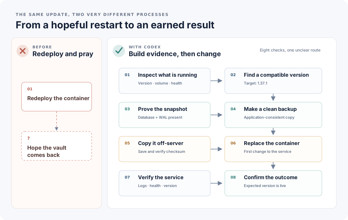
Version 1 had the right contrast and the wrong reading burden.
The left side worked immediately. It was intentionally sparse and a little uncomfortable. The right side had eight tidy cards with arrows between them. Each card made sense on its own.
The trouble was the sequence. A reader could scan down the columns, move across the rows, or treat the cards as separate checks. The diagram knew the order. The reader had to infer it.
I ran the image and its intended message through a diagram-review skill. The first review scored it at 8.2 out of 10. More useful than the score was the diagnosis: the high-level contrast was clear, but the right side had stronger card pairings than a step-by-step path.
The skill recommended four named phases:
- Inspect
- Prove rollback
- Change
- Verify
That was the structural fix. The diagram did not need more decoration. It needed a route.
Version 2: name the phases
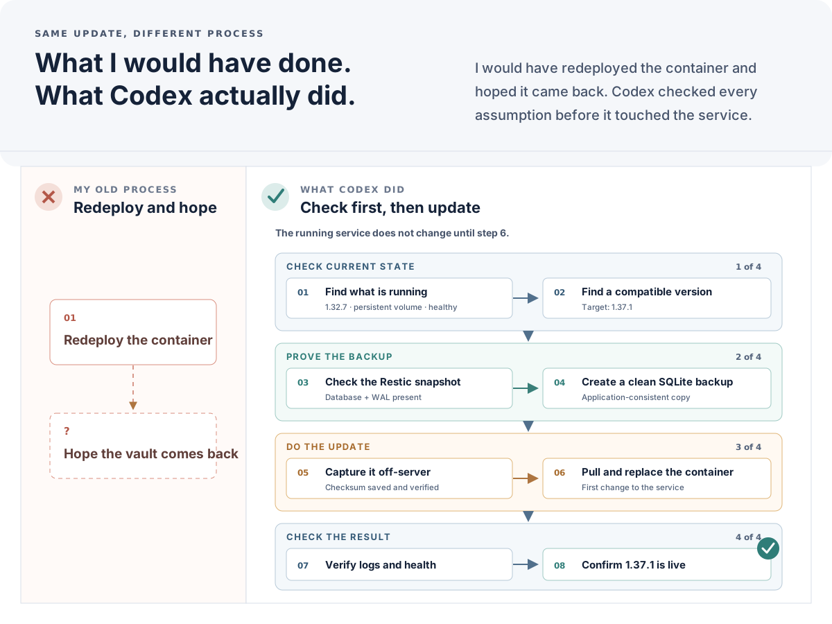
Version 2 made the process teachable by grouping the eight checks into four phases.
The phase bands changed the diagram from a list into an argument. Codex did not perform eight equally weighted tasks. It established the current state, proved the rollback path, made the change, and checked the result.
I also made the first mutation explicit. Nothing touched the running service until step 6. That small line carried a lot of the trust story.
The second review scored the revision at 9.1. The main structure now worked. The remaining issues were smaller and more concrete: the handoff between phases was easy to miss, several support lines were too dense, and the final success mark looked attached to a card instead of the whole process.
That is where the review skill became especially useful. A second pass did not repeat the first critique. It found the next layer of friction.
Version 3: make it work inside the article
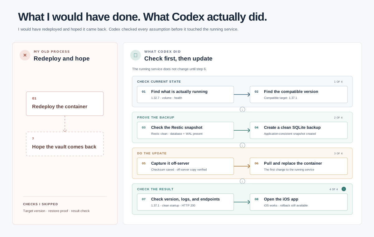
Version 3 keeps the phase structure, shortens the copy, clarifies each handoff, and fits the article.
The last pass tightened the diagram instead of redesigning it again. I replaced ordinary handoff arrows with clear transition markers. I shortened the card copy. I moved the success state to the end of the full sequence. I also added the checks Codex intentionally skipped, because the boundary of the verification matters too.
Then I looked at the diagram in the actual blog page. The header was consuming too much of a laptop screen. It had an eyebrow, a two-column title and subtitle, and enough empty space to feel like a second article header.
I removed the eyebrow and stacked the title over the subtitle. I also found a global paragraph margin leaking into the diagram component. Fixing those two things reduced the figure to 783 pixels tall at a 1440 by 900 viewport. The header itself dropped to 110 pixels. The complete comparison now fits in one laptop view.
That final change did not come from studying the SVG by itself. It came from seeing the diagram where a reader would see it.
What the skill actually changed
The skill reviews diagrams in a useful order: message, structure, reading path, relationships, hierarchy, legibility, consistency, and then polish. That order prevents a common failure mode where a reviewer starts adjusting colors while the reader still cannot tell what connects to what.
It also separates severity from taste. A broken reading path is a high-priority problem. A slightly weak border is not. For this diagram, that meant I could fix one structural issue in each pass:
- Version 1 needed phases.
- Version 2 needed clearer handoffs and less text.
- Version 3 needed to fit its real page.
The useful loop was simple: make the diagram, review the interpretation cost, fix the highest-priority issue, and render it again in context. I stopped when the remaining feedback no longer changed the reader's mental model.
The diagram-review skill
I included the exact Markdown source used for this review. You can download the skill as a Markdown file, or open it below.
Read the full skill1,313 lines of Markdown
# Diagram and Graphic Review Skill

## Purpose

Evaluate and improve diagrams, technical graphics, explanatory visuals, architecture diagrams, flowcharts, process diagrams, annotated screenshots, conceptual graphics, and similar visual artifacts.

The primary goal is not decoration. The goal is to make the graphic:

1. **Immediately understandable**
2. **Visually organized**
3. **Focused on a clear message**
4. **Easy to scan**
5. **Easy to follow**
6. **Appropriately detailed**
7. **Visually calm**
8. **Accurate and internally consistent**

Treat visual design as information design.

A successful graphic should help the viewer understand something faster and more accurately than prose alone.

---

# Core Principle

Every graphic should answer:

> **What should the viewer understand after looking at this?**

If that answer is unclear, determine it before optimizing layout.

Do not preserve complexity merely because it already exists.

Do not evaluate a graphic primarily on whether it looks polished. A beautiful graphic that communicates poorly is unsuccessful.

The priority order is:

1. Message
2. Structure
3. Reading path
4. Relationships
5. Hierarchy
6. Legibility
7. Visual consistency
8. Polish

---

# When to Use This Skill

Use this skill when reviewing or creating:

- Architecture diagrams
- System diagrams
- Data-flow diagrams
- Sequence-like diagrams
- Process flows
- State diagrams
- Dependency graphs
- Concept maps
- Decision trees
- Technical illustrations
- Infographics
- Annotated screenshots
- Explanatory graphics
- Comparison graphics
- Timeline graphics
- Workflow diagrams
- Entity relationship diagrams
- Presentation graphics
- Visual documentation
- Dashboard explanatory graphics
- Network or topology diagrams
- Before/after graphics
- Graphics embedded in articles or explainers

For conventional charts such as line charts, scatter plots, histograms, and bar charts, apply these principles but also consider chart-specific visualization rules.

---

# Operating Mode

When given an existing graphic, perform four phases:

1. **Decode**
2. **Evaluate**
3. **Restructure**
4. **Polish**

Do not jump directly to cosmetic changes.

---

# Phase 1 — Decode the Graphic

Before criticizing the design, determine what it is trying to say.

Identify:

- **Primary message**
  - What is the single most important thing the viewer should learn?

- **Supporting messages**
  - What secondary ideas support the primary message?

- **Audience**
  - Beginner?
  - Practitioner?
  - Expert?
  - Executive?
  - Mixed audience?

- **Visual grammar**
  - What do boxes mean?
  - What do arrows mean?
  - What do colors mean?
  - What do groups mean?
  - What does spatial position mean?

- **Expected reading path**
  - Where should the viewer begin?
  - Where should the eye move next?
  - Where should the viewer finish?

- **Required information**
  - Which elements are essential to understanding?

- **Optional information**
  - Which elements provide useful context but are not essential?

- **Incidental information**
  - Which details are present without meaningfully helping the explanation?

If the graphic has no obvious primary message, flag this as a first-order problem.

---

# Phase 2 — Evaluate

Evaluate the graphic along the following dimensions.

Use a 0–10 score for each dimension.

## 1. Message Clarity

Ask:

- Can the graphic's main point be stated in one sentence?
- Does the visual emphasize that point?
- Is the viewer likely to understand why the graphic exists?
- Are secondary details competing with the main idea?
- Does the title accurately frame the visual?

### Strong

The viewer can quickly explain what the graphic is showing and why it matters.

### Weak

The viewer sees many objects but must reverse-engineer the intended conclusion.

---

## 2. Visual Hierarchy

Ask:

- Is there an obvious starting point?
- Are primary elements visually stronger than secondary ones?
- Are section headings clearly distinguishable from labels?
- Are supporting details visually subordinate?
- Are all elements shouting equally loudly?

Hierarchy can be created through:

- Position
- Size
- Weight
- Whitespace
- Grouping
- Color
- Contrast
- Borders
- Typography

Avoid using all of these simultaneously unless necessary.

---

## 3. Layout and Composition

Evaluate:

- Alignment
- Spacing
- Balance
- Density
- Grouping
- Symmetry where appropriate
- Consistent dimensions
- Edge alignment
- Use of whitespace

Look specifically for:

- Almost-aligned boxes
- Arbitrary spacing
- Uneven padding
- Objects floating between groups
- Large dead zones
- Congested regions
- Unnecessary zig-zagging
- Excessive width or height
- Connections crossing unrelated areas

Prefer intentional structure over organic positioning unless the concept itself benefits from organic positioning.

---

## 4. Reading Path

A diagram should generally have a discoverable traversal.

Common reading patterns include:

- Left → right
- Top → bottom
- Center → outward
- Outside → inward
- Chronological
- Layered
- Hierarchical
- Input → transformation → output

Ask:

- Can the viewer tell where to begin?
- Does the eye naturally move through the explanation?
- Are arrows reinforcing the reading path or fighting it?
- Must the viewer repeatedly jump across the graphic?
- Do important relationships require tracing long lines?

If the intended reading path is complicated, consider dividing the graphic into stages.

---

## 5. Grouping and Structure

Use proximity and containment intentionally.

Ask:

- Are related items visually grouped?
- Are unrelated items sufficiently separated?
- Are containers necessary?
- Are there containers inside containers inside containers?
- Can whitespace replace some borders?
- Do groups have meaningful labels?

Prefer:

> proximity → whitespace → subtle container → strong container

Use borders only when a boundary itself carries meaning.

---

## 6. Relationship Clarity

Connections should communicate relationships, not simply connect objects.

Evaluate:

- Direction
- Arrow semantics
- Line styles
- Junctions
- Crossings
- Connection labels
- Cardinality where relevant
- Visual distinction between relationship types

Ask:

> Can the viewer explain what each line means?

Avoid decorative arrows.

Avoid using multiple line styles unless their semantics are explicit.

If two different relationships look identical, fix the visual grammar.

---

## 7. Complexity and Cognitive Load

Estimate how much state the viewer must hold mentally.

Look for:

- Too many nodes
- Too many relationship types
- Long labels
- Repeated information
- Excessive annotations
- Excessive color categories
- Deep nesting
- Multiple visual systems at once
- Too many exceptions

Important:

> Do not automatically solve complexity by shrinking everything.

Instead consider:

- Removing
- Grouping
- Collapsing
- Sequencing
- Layering
- Splitting into multiple views
- Progressive disclosure
- Creating overview + detail graphics

---

## 8. Label Quality

Labels should be concise and specific.

Prefer:

- `Fetch secrets`

over:

- `The application fetches the required secrets`

Prefer:

- `Secret Manager`

over:

- `AWS Secret Manager Service`

when context already establishes AWS.

Evaluate:

- Consistency
- Parallel grammar
- Unnecessary words
- Abbreviations
- Jargon
- Line wrapping
- Font size
- Label placement

Do not shorten labels until their meaning becomes ambiguous.

---

## 9. Visual Encoding

Every visual difference implies potential meaning.

Audit:

- Color
- Shape
- Size
- Border
- Stroke
- Fill
- Icons
- Line type
- Position

For each difference ask:

> Does this distinction encode information?

If not, consider removing it.

Avoid accidental semantics such as:

- One box being blue for no reason
- One arrow being thicker because of layout mechanics
- Similar concepts receiving different shapes
- Different concepts receiving nearly identical styling

---

## 10. Color

Color should primarily:

- Encode meaning
- Establish hierarchy
- Highlight attention
- Separate categories

Color should not compensate for poor structure.

Prefer a restrained palette.

A useful default is:

- Neutral structural colors
- One primary accent
- One secondary semantic accent when needed
- Explicit warning/error colors only when meaningful

Check that the graphic remains understandable without relying exclusively on color.

---

## 11. Typography

Use typography to establish information levels.

Usually keep the number of text treatments small:

- Graphic title
- Section/group heading
- Node title
- Supporting annotation

Avoid:

- Tiny text
- Excessive bold
- Many font sizes
- Arbitrary capitalization
- Long centered paragraphs
- Labels touching boundaries

Technical diagrams should prioritize readability over typographic personality.

---

## 12. Consistency

Check repeated objects systematically.

Equivalent concepts should generally share:

- Shape
- Dimensions
- Padding
- Typography
- Color
- Border treatment
- Connector treatment

Do not make every object unique.

Visual consistency allows the viewer to learn the graphic's grammar once.

---

## 13. Signal-to-Ink Ratio

For every visible element ask:

> What information would disappear if this were removed?

Candidates for removal often include:

- Decorative shadows
- Heavy borders
- Background panels
- Repeated labels
- Redundant legends
- Unnecessary icons
- Duplicate arrows
- Decorative gradients
- Excessive section chrome
- Fine-grained grid lines

Do not pursue minimalism as an aesthetic objective.

Remove elements when doing so strengthens the message.

---

## 14. Accessibility and Physical Legibility

Check:

- Text size
- Contrast
- Color dependence
- Dense areas
- Thin connector lines
- Small arrowheads
- Tiny annotations
- Low-resolution imagery
- Expected display size

Evaluate the artifact at its actual likely viewing size.

A graphic that works only while zoomed to 200% is not working.

---

# Phase 3 — Restructure

After evaluation, identify the smallest structural changes that produce the largest improvement.

Do not produce a flat list of twenty minor complaints.

Prioritize.

Use three levels.

## P0 — Message or comprehension failures

Examples:

- No clear main message
- Wrong visual form
- No understandable reading path
- Relationships are ambiguous
- Key concepts are missing
- Graphic is too dense to parse
- Important distinctions are invisible

These should be fixed before anything else.

## P1 — Structural improvements

Examples:

- Reorder sections
- Regroup nodes
- Reduce nesting
- Shorten connections
- Split overloaded graphic
- Improve hierarchy
- Simplify labels
- Establish consistent visual grammar

## P2 — Polish

Examples:

- Adjust spacing
- Normalize box sizes
- Refine typography
- Reduce borders
- Tune colors
- Improve arrowheads
- Adjust corner radius

Never allow P2 work to distract from P0 problems.

---

# The Compression Test

Try to describe the graphic using:

1. **One sentence**
2. **Three bullets**
3. **One visual flow**

If these three representations disagree, the graphic probably lacks a coherent information hierarchy.

---

# The Five-Second Test

Ask what a new viewer can understand within roughly five seconds.

They should usually be able to identify:

- What the graphic is about
- Major regions
- Where to start
- The dominant relationship or flow

They do not need to understand every detail.

If the viewer must read every label before understanding the structure, improve the hierarchy.

---

# The Squint Test

Mentally blur or visually shrink the graphic.

Ask:

- Are the major regions still obvious?
- Does one area dominate appropriately?
- Can the major flow still be seen?
- Are there accidental hotspots?
- Does the composition still appear organized?

At low detail, the structure should remain visible.

---

# The Line-Trace Test

For diagrams with connections:

1. Pick a major flow.
2. Trace it from beginning to end.
3. Count:
   - Crossings
   - Direction changes
   - Long jumps
   - Ambiguous junctions
   - Backtracking

Prefer direct routes.

A connection that requires visual detective work is too expensive.

---

# The Remove-One-Layer Test

If the graphic feels busy, determine whether one entire visual layer can disappear.

Possible layers:

- Containers
- Icons
- Annotations
- Secondary arrows
- Background fills
- Secondary metadata
- Step numbers
- Decorative titles

Removing one layer often improves a diagram more than individually tweaking dozens of elements.

---

# The Geography Test

Spatial position creates implied meaning.

Check whether:

- Things beside each other are actually related.
- Things above/below each other have a hierarchical or sequential relationship.
- Distance corresponds to conceptual distance.
- Isolated objects are intentionally isolated.
- Central objects are actually central to the concept.

Never treat placement as semantically neutral.

---

# Common Failure Patterns

## Box Soup

Symptoms:

- Many similarly styled boxes
- Lots of arrows
- No strong grouping
- No obvious starting point

Repair:

- Establish stages or regions
- Introduce hierarchy
- Reduce connections
- Make primary path visually dominant

---

## Container Russian Dolls

Symptoms:

- Boxes inside panels inside sections inside larger panels
- Excessive borders
- Large amount of visual chrome

Repair:

- Replace some boundaries with whitespace
- Flatten hierarchy
- Keep containers only where membership matters

---

## Spaghetti Arrows

Symptoms:

- Crossing connectors
- Long diagonal arrows
- Lines passing behind nodes
- Multiple lines sharing unclear junctions

Repair:

- Reorder nodes
- Introduce lanes
- Group relationships
- Duplicate a reference node if that substantially improves comprehension
- Split views when necessary

Logical purity is less important than reader comprehension.

---

## Everything Is Important

Symptoms:

- Bold everywhere
- Strong color everywhere
- Heavy borders everywhere
- Similar visual weight on all objects

Repair:

Choose what is:

1. Primary
2. Secondary
3. Contextual

Reflect that hierarchy visually.

---

## Diagram as Database Dump

Symptoms:

- Every component shown
- Every edge shown
- Every detail represented
- Technically accurate but visually unusable

Repair:

Create views for questions, not one canonical picture of reality.

For example:

- System overview
- Request lifecycle
- Authentication flow
- Persistence flow
- Failure flow

These can all describe the same system differently.

---

## Legend Tax

Symptoms:

The viewer must constantly consult a large legend to decode the graphic.

Repair:

- Use direct labels
- Reduce encoding categories
- Prefer familiar conventions
- Put explanation near the encoded element

---

## Label Avalanche

Symptoms:

- Paragraphs inside nodes
- Repeated qualifiers
- Multiple lines of metadata
- Tiny fonts

Repair:

Separate:

- Identity
- Important annotation
- Detailed explanation

Move detailed explanation outside the primary graphic when possible.

---

## Accidental Rainbow

Symptoms:

Many colors exist without strong semantic justification.

Repair:

Start again with neutrals and selectively add meaningful color.

---

## False Symmetry

Symptoms:

Two regions receive equal size or emphasis merely because symmetrical composition looks attractive.

Repair:

Let information importance determine visual weight.

---

## Premature Polish

Symptoms:

Time is spent on:

- Gradient
- Shadows
- Icons
- Color tuning
- Rounded corners

while the structure remains confusing.

Repair:

Return to message, grouping, ordering, and relationships.

---

# Choosing the Right Diagram Form

Before repairing a complicated diagram, determine whether its current form is appropriate.

| Need | Consider |
|---|---|
| Show sequence | Flow diagram |
| Show interactions over time | Sequence diagram |
| Show hierarchy | Tree |
| Show system boundaries | Architecture / container diagram |
| Show transformations | Pipeline |
| Show states and transitions | State diagram |
| Show dependencies | Dependency graph |
| Compare alternatives | Side-by-side comparison |
| Show layers | Layer diagram |
| Explain physical arrangement | Spatial schematic |
| Show one dominant concept | Annotated illustration |
| Show overview plus detail | Overview + focused detail views |

Do not force all information into a general-purpose node-and-arrow diagram.

---

# Diagram Density

Density is not inherently bad.

A dense technical diagram can work if:

- Regions are clearly separated
- Repeated patterns are consistent
- Important paths are emphasized
- Secondary information recedes
- Labels remain readable
- The viewer can progressively explore it

The relevant question is not:

> Is this diagram dense?

It is:

> Can the viewer efficiently extract structure from the density?

---

# Overview + Detail Strategy

When the diagram has substantial complexity, strongly consider multiple coordinated views.

## View 1 — Orientation

Show:

- Major actors
- Major boundaries
- Primary flow

Hide most implementation details.

## View 2 — Mechanism

Show:

- The specific interaction being explained
- Relevant subcomponents
- Important data or control movement

## View 3 — Detail

Show:

- Edge cases
- Failure paths
- Protocol details
- Implementation specifics

Do not make the overview carry every detail needed by the implementation view.

---

# Improvement Workflow

When revising a graphic, use this sequence.

## Step 1 — Write the message

Write:

> The viewer should understand that ______.

If there are multiple independent answers, consider multiple graphics.

## Step 2 — Identify essential objects

List only objects required to explain the message.

## Step 3 — Identify relationships

Define what each connection means.

## Step 4 — Establish groups

Group objects by meaningful concept.

## Step 5 — Choose a reading direction

Prefer a dominant direction.

## Step 6 — Place primary structure

Lay out major regions before individual nodes.

## Step 7 — Place nodes

Optimize for:

- proximity
- short connections
- alignment
- predictable scanning

## Step 8 — Draw primary flow

Make the main narrative obvious.

## Step 9 — Add secondary relationships

Keep them visually subordinate.

## Step 10 — Add labels

Use concise, parallel wording.

## Step 11 — Remove unnecessary structure

Delete visual elements that do not carry information.

## Step 12 — Apply polish

Only now adjust visual styling.

---

# Evaluation Rubric

Score each category from 0–10.

| Category | Weight |
|---|---:|
| Message clarity | 20% |
| Reading path | 15% |
| Layout/composition | 15% |
| Hierarchy | 10% |
| Relationship clarity | 10% |
| Grouping/structure | 10% |
| Cognitive load | 10% |
| Legibility | 5% |
| Consistency | 3% |
| Visual polish | 2% |

Compute an overall score if useful.

Interpretation:

- **9–10:** Exceptionally clear
- **8–8.9:** Strong
- **7–7.9:** Good but meaningfully improvable
- **6–6.9:** Understandable with friction
- **4–5.9:** Significant comprehension problems
- **0–3.9:** Graphic should probably be substantially restructured

A visually beautiful graphic should not receive a high score if comprehension is poor.

---

# Review Output

When reviewing a graphic, produce this structure.

## 1. Intended message

State in one sentence what the graphic appears to be communicating.

If uncertain, explicitly say so.

## 2. Overall assessment

Give:

- Overall score: `X/10`
- Strongest characteristic
- Biggest comprehension problem

Keep this short.

## 3. Scorecard

Score the important dimensions.

Do not mechanically discuss every criterion if it adds no useful information.

## 4. What already works

Identify specific successful choices worth preserving.

Avoid generic praise.

## 5. Highest-impact problems

List roughly 3–7 problems in priority order.

For each provide:

- **Problem**
- **Why it matters**
- **Change**

Example:

> **P0 — The two flows compete for the same visual path.**
>
> The viewer cannot determine whether the diagram describes startup configuration or runtime configuration.
>
> Split the graphic into two horizontal lanes labeled `Startup` and `Runtime`, while keeping shared AWS services in a third region on the right.

Be concrete.

## 6. Recommended structure

Describe the revised arrangement.

Include:

- Major regions
- Reading direction
- Relative placement
- Grouping
- Primary connection path

A simple ASCII wireframe may be used when helpful.

## 7. Simplification opportunities

Identify things that can be:

- Removed
- Combined
- Renamed
- Demoted
- Moved to annotations
- Moved to a secondary graphic

## 8. Polish pass

Only after structural recommendations, suggest:

- Spacing
- Typography
- Colors
- Borders
- Shapes
- Connector styling

---

# When Asked to Improve the Graphic Directly

Do not merely recreate the existing image more neatly.

First determine whether the structure should change.

Preserve:

- Correct concepts
- Important relationships
- Useful terminology
- Meaningful visual conventions

Feel free to change:

- Orientation
- Grouping
- Positions
- Number of panels
- Label wording
- Shape geometry
- Connector routes
- Visual hierarchy
- Amount of information visible
- Color system
- Diagram type

Prefer substantive improvement over visual fidelity to the original.

---

# Revision Comparison

When comparing an original and revised version, specifically assess:

- Is the message clearer?
- Is the reading path shorter?
- Are fewer visual decisions required from the viewer?
- Are important relationships easier to trace?
- Has clutter actually been reduced?
- Was any useful information accidentally removed?
- Did simplification introduce ambiguity?

Do not assume the revised version is better merely because it is cleaner.

---

# Technical Diagram Guidance

For software and architecture graphics:

## Prefer semantic layers

Typical layers include:

- User/client
- Application
- Service
- Infrastructure
- Persistence
- External system

Use only layers relevant to the explanation.

## Differentiate data from control

If both are shown, make their distinction clear.

## Label boundaries

Important boundaries may include:

- Process
- Machine
- Network
- Trust boundary
- Account
- Region
- Deployment
- Persistence boundary

## Avoid cloud-service logo soup

Logos can help recognition but should not become the primary structure.

Usually:

- Shape = conceptual role
- Label = identity
- Small logo = optional recognition aid

## Show important behavior, not inventories

A diagram explaining authentication should emphasize authentication interactions, not every deployed service.

---

# Explanatory Graphic Guidance

For conceptual or educational graphics:

Prefer:

- One idea per major region
- Strong narrative ordering
- Explicit transitions
- Examples close to abstractions
- Visual repetition for repeated concepts

Ask:

> What does the viewer know at this point in the graphic?

Do not require concepts that have not yet been introduced.

---

# Annotation Guidance

Annotations should explain something the picture itself cannot efficiently communicate.

Good annotations:

- Explain why
- Clarify an unusual edge
- Identify a transformation
- Highlight an exception
- Provide a useful concrete example

Weak annotations:

- Repeat the label
- Narrate obvious geometry
- Contain paragraphs of general documentation

---

# Graphics With Multiple Audiences

Do not attempt to satisfy beginner and implementation-detail use cases by making every detail simultaneously visible.

Instead use:

- Overview graphic
- Optional detailed graphic
- Numbered callouts
- Expandable details in interactive media
- Linked secondary diagrams

A visual may be simple without being simplistic.

---

# Final Quality Gate

Before declaring the graphic complete, verify:

- [ ] The main message can be stated in one sentence.
- [ ] A new viewer knows where to begin.
- [ ] The dominant reading path is obvious.
- [ ] Major regions are visible before reading labels.
- [ ] Related elements are grouped.
- [ ] Relationships have understandable semantics.
- [ ] Primary and secondary information have different visual weight.
- [ ] No important relationship requires unnecessarily difficult line tracing.
- [ ] Labels are concise and readable.
- [ ] Colors carry intentional meaning.
- [ ] Similar concepts use similar visual treatment.
- [ ] The graphic remains readable at its expected display size.
- [ ] Removing additional decoration would not make the message stronger.
- [ ] The graphic answers a specific question rather than attempting to document everything.
- [ ] Visual polish has not been used to disguise structural problems.

---

# Behavior to Avoid

Do not:

- Praise graphics without evaluating them
- Suggest generic improvements such as "improve spacing"
- Optimize aesthetics before information structure
- Preserve every existing element by default
- Turn every critique into a color or typography recommendation
- Recommend adding icons merely to make a diagram interesting
- Assume fewer elements always means better
- Assume symmetry always means better
- Assume a single diagram must contain the whole system
- Shrink text to make a layout fit
- Create complex legends for visual distinctions that can simply be removed
- Introduce decorative variation that creates false semantics
- Treat line crossings as merely cosmetic
- Accept ambiguous arrows
- Use color as the only way to distinguish important categories

---

# Preferred Decision Rule

When choosing between two revisions, prefer the one that reduces the amount of interpretation required from the viewer while preserving the information necessary for the message.

The best diagram is not the one with the most information.

It is the one where the viewer can most easily construct the correct mental model.